BEHIND THE SCREENS
Cinematographer Shane Hurlbut ASC reveals how alongside Rudy Mancuso – director, writer, actor and composer of Música – they approached an in-camera split-screen scene.
Rudy Mancuso, the director, writer, actor and composer of Música, and I had a series of seven three-hour brainstorms. During one of our deliberations, Rudy presented the idea of the in-camera split-screen scene. We had both Rudy and Haley, played by Francesa Reale, in their respective rooms. There was a white wall for Haley’s world, where everything was white on white. Her family had no personality, they were very upper-crust and closed off from the rest of the world. Rudy comes from a more blue-collar, immigrant family setting. Here are two drastically different worlds: one the upper crust couple from Montclair in New Jersey: the other from the immigrant neighbourhood of Iron Bound, Newark.

We were keen to show this in a split screen where Rudy’s side was painted with colour and Haley’s was devoid of colour and culture. The carpets appear moulded together his being an oriental design and hers, a grey and white rug. With the help of our production designer, Patrick Sullivan, another plug was created since we had already split the room in half for all the oners to open up. Rudy originally didn’t want to go about it the way most split screens are done. What’s unique about ours is that they’re having a conversation back-to-back and there’s a moment where they look into each other’s eyes and Haley reaches out across the split screen and breaks it.
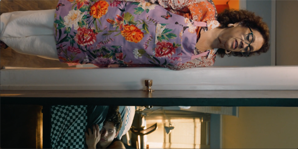
We really wanted to take the scene to another level and once the split screen was broken, the gig was up. From that point, we mounted the dolly, the desk, the chair and Rudy to the track. We slid Rudy back to his room where he had his ‘life coach’ Diego the puppet sharing advice and we went out of the split screen into his intimate conversation. Blocking-wise it was fairly simple. We lined the camera up exactly on the split screen. For the desk and Rudy’s chair being on a dolly, we used low-profile rollers, which allowed us to be seamless and quiet while Rudy continued his dialogue. If for any reason the dolly didn’t go far enough, our operator could then correct it and land at the perfect end shot of being in Rudy’s room.
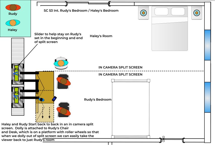
From a lighting standpoint, I wanted Haley’s room to feel white, clinical and sterile. We used two different colour temperatures to give Rudy’s environment a warmer feel. I created a ‘U’ of light and for Haley’s side of the room, I used warm battens that keyed Rudy when he turned around to have this warm light as if it were still in his room. In general, I didn’t want it to be a split screen regarding the lighting, I could bring his world lighting into her world as long as it didn’t touch her. The battens were aimed in a way that held a beautiful edge light and warm wrap from the battens when Rudy turned. When Haley turned, I put a series of daylight-balanced light mats above where Rudy was sitting and set them to 4300K to make her slightly cooler. This light was in more of a crescent shape only hitting her. You can see a bit of the blue light edging Rudy ever so slightly and a bit of the warm light edges her when they’re back to back. Once they turn to each other, it’s the warmth of Rudy and the coldness of Haley.

To light Haley’s room, I had an ARRI T12 to create nice stark hard shadows and for Rudy, we used an ACL jumbo as if they were these aircraft landing lights that are super focused to create unique shadows.
In the frame, there are trees outside his window while there is nothing outside of Haley’s window. His room has a little depth and texture. Hers is just blown out. We hung space lights outside the window along with a 12 by 20 bleached muslin. I made the lights on her side brighter, so it blew out that section of the bleached muslin and Rudy had the same bleached muslin but I didn’t have the lights as powerful on his side. The day ambiance we created in the room was two pipe lights that are inflatable and have LED strip lighting inside of them. We used two four-by-eights, one over his bed and one over her main room area on his side of the window and her bureau, so those created the ambiance in the room and each one had a different colour tone. Behind the camera, I had two Nanlux Dyno 650C’s that I’m bouncing into a bleached muslin as room tone coming from the camera direction.
I love that we were able to recreate the traditional “split screen” trope in-camera!
