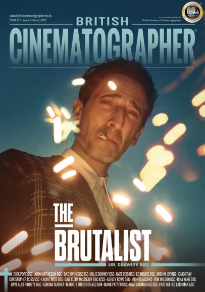
Introducing Light Cracks, the London Film School Graduation Film directed by Clara Pavía and lensed by Bo W. Giesen.
Suffering from derealisation, a young woman departs from her physical self to embark on a journey through her inner world in Light Cracks. Here, she must confront her inner demons in an effort to reconnect with the world around her, and most importantly, with herself.
British Cinematographer (BC): Please tell us a little bit about your filmmaking journey so far, as well as your influences and inspirations.
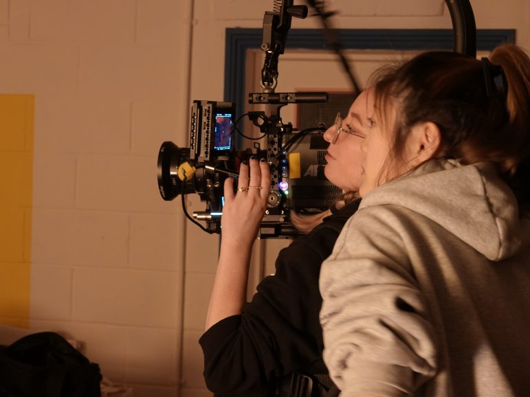
Bo W. Giesen (BWC): Driven by a passion for filmmaking since the age of 16, I initially aspired to be a director. My journey led me to study film and television in London, followed by a master’s in Filmmaking at the London Film School (LFS). During the first semester, while directing a short film, I discovered my true passion lay in cinematography.
Inspired by Rachel Morrison ASC’s groundbreaking work and recognising the challenges faced by women in the camera and lighting department, I transitioned to the camera department as a trainee. Falling in love with the craft, I progressed from clapper loader to my current roles as a focus puller and camera operator, with the ultimate goal of becoming a director of photography.
Throughout my journey at LFS, I’ve had the privilege of serving as the director of photography for various projects, including four graduation films, one of which was a feature film. One particular project, highlighted in this Q&A, allowed me to experiment and uncover more about my personal style, reinforcing my commitment to continuous growth and artistic exploration.
BC: Take us back to your initial discussions with director Clara Pavía regarding the visual approach for Light Cracks. What look and mood did you seek to achieve?
BWG: Engaging in initial discussions with the director, our focus delved into dissecting the script to comprehend the main character’s emotions and identify pivotal emotional moments. The narrative unfolds as a complex inner journey of a young woman, prompting our first crucial step: recognising and understanding these intricacies.
Subsequently, we embarked on crafting a visual style for this surreal world, where “nature” plays a recurring and significant role. Addressing questions like how to connect this surreal realm with our understanding of nature, and defining the desired audience experience became pivotal considerations.
Central to our vision were emotions such as cheerlessness, discomfort, confusion, and relief—keywords that encapsulated the intended tone of the film. Our goal was to ensure that the visuals authentically mirrored the character’s emotional landscape, translating her experiences into a compelling cinematic language.
BC: What were your creative references and inspirations for your film? What filming locations were used – were any sets constructed?
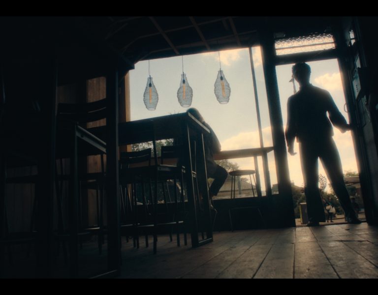
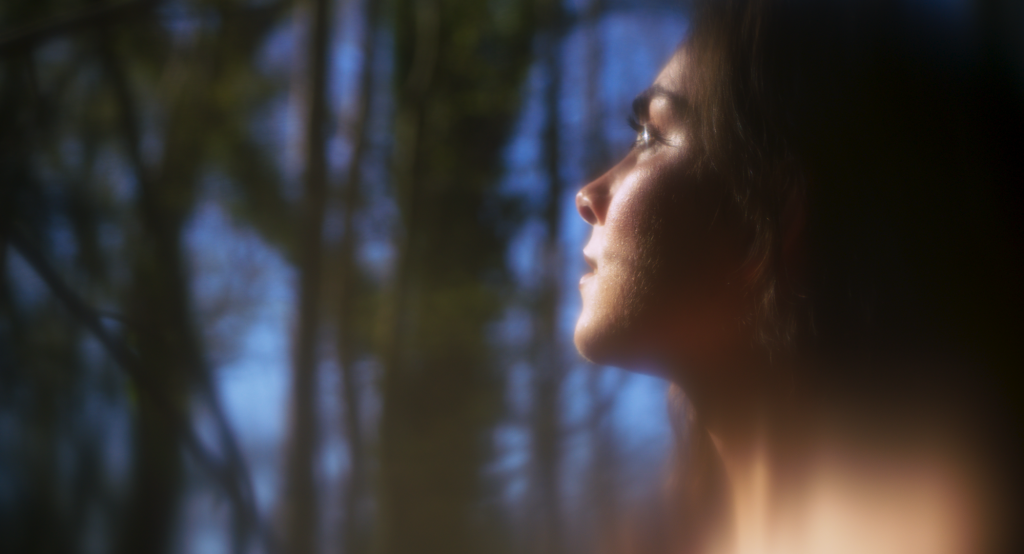
BWG: Inspired by a variety of films, we crafted scenes alternating between reality and a surreal world. Filming outdoors in the woods, we took cues from The Tree of Life, shot by Emmanuel Lubezki ASC AMC, and Stéphane Fontaine AFC’s work in Captain Fantastic. In reality-based sequences, we shot against the sun, using its brilliance for a captivating hard back light, creating flares, shadows, and reflections to enrich our visual storytelling.
For some exterior scenes, we remain within the main character’s inner world, requiring a distinction between nature in the real and surreal realms. Drawing inspiration from Sir Roger Deakins CBE BSC ASC’s work in The Assassination of Jesse James… and Larkin Seiple’s cinematography in Everything Everywhere All At Once, where tilt and shift lenses were employed, I was intrigued by the surreal atmosphere while maintaining a clear depiction of nature.
While these films used tilt and shift lenses to evoke unease and stress, I aimed for a comforting ‘dreamlike’ world. Experimenting with Vaseline during preparations, I explored the old trick of blurring frame edges. Yet, I took a unique approach by manipulating Vaseline strokes, introducing vertical blurring specifically on trees while preserving clarity on characters’ faces. Though complex, this method, requiring adjustments for each shot, yielded results that satisfied my vision for the project.
The remaining half of the film was filmed within a studio setting. For an intimate scene set in a bedroom, we drew inspiration from Sławomir Idziak PSC’s work in The Double Life of Véronique and cinematography in Euphoria, a recurring reference throughout our film.
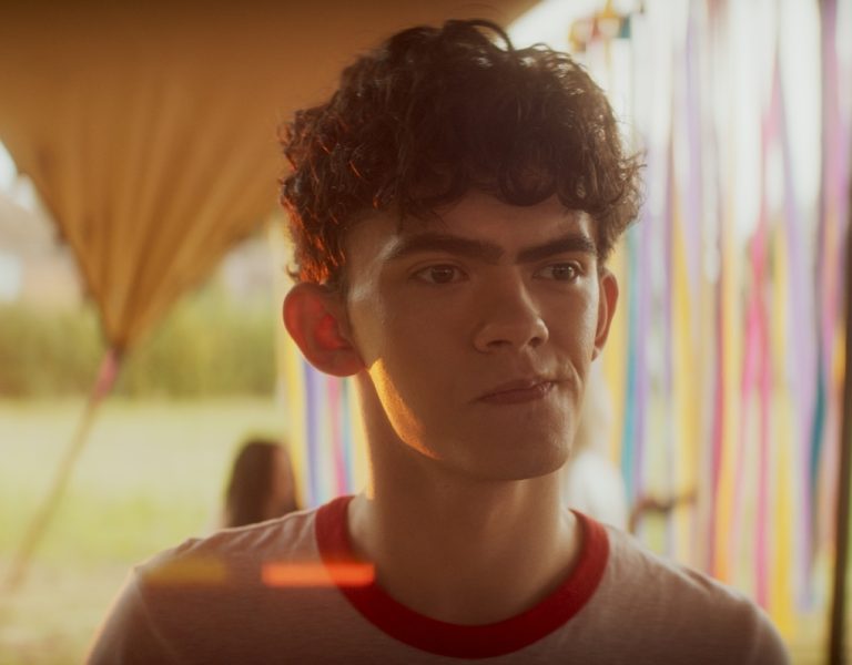
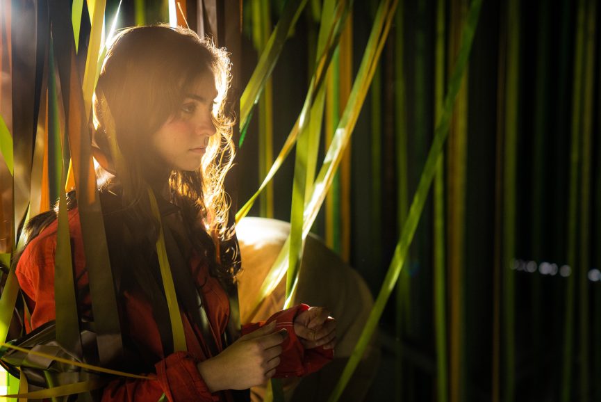
Concluding our filming, the remaining scenes were captured within yet another purpose-built studio. In this setting, the entire stage was adorned with hanging ribbons that replicated the colours of nature, specifically mirroring the wooded environment. Taking cues from the captivating visuals in Last Night in Soho by Chung-hoon Chung ASC, along with recurring references from Everything Everywhere All At Once and Euphoria, we explored the boundaries of the surrealist world. Playing and experimenting with the surrealist world, our focus was on exploring the extent of creative possibilities and ensuring a cohesive link to the real world, preventing it from feeling like two separate films. The primary solution to this challenge, of course, was through the careful use of lighting.
In this exploration, the key factor was, undoubtedly, lighting. While numerous references influenced our approach, these films served as our primary inspirations for navigating the intricate balance between the surreal and the real.

BC: What camera and lenses did you choose and why? What made them suitable for this production and the look you were trying to achieve?
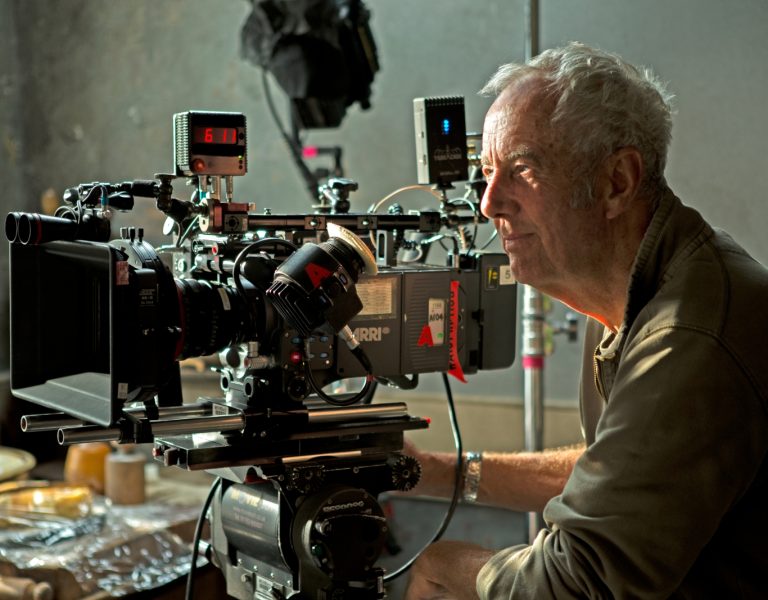
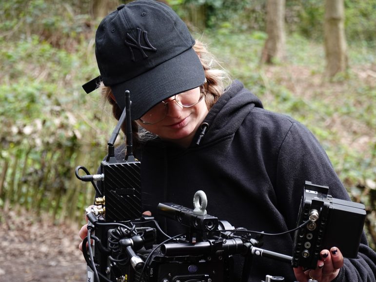
BWG: I opted for the reliable and high-quality ARRI Alexa Mini, ideal for our handheld and Steadicam shooting style. Paired with the Angénieux Optimo Style 30-76mm T2.8 lens, my choice marked a departure from prime lenses. I was drawn to the lens’s captivating flares, minimal breathing, and pleasing focus falloff when wide open. To soften the lens in studio scenes on a tight budget, we used stockings for a subtle dreamy effect, selected after a pre-light test.
BC: What was your general approach to lighting?
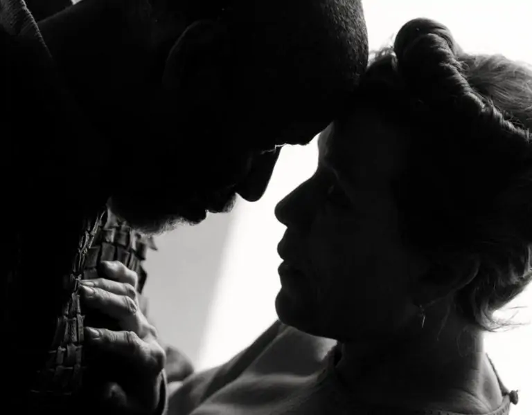
BWG: For the interior scenes, we employed various lighting techniques. In the intimate scene, we aimed to replicate the soft glow of a street lantern through a window. Embracing shadows, silhouetted shapes, and extreme close-ups of body parts, we pursued a stylised approach to maintain an air of ambiguity. This proved challenging during a night scene, especially with the need to convincingly blow out the window.
Complicating matters further, the almost entirely white room posed a challenge for effective lighting. By strategically blackening out areas to control light spill and relying on just one external light bouncing into a large poly, we overcame the difficulties and successfully lit the scene with the desired ambiance.
In our studio scenes, aligning the lighting with the real world was crucial. Utilising bright, spotlight-like lights on the grid to emulate the sun, we intentionally shot against the main light source, generating flares and backlights reminiscent of outdoor settings. The aim was to establish a visual connection between the interior and exterior, replicating similar shots, shapes, and shadows with our interior lights.
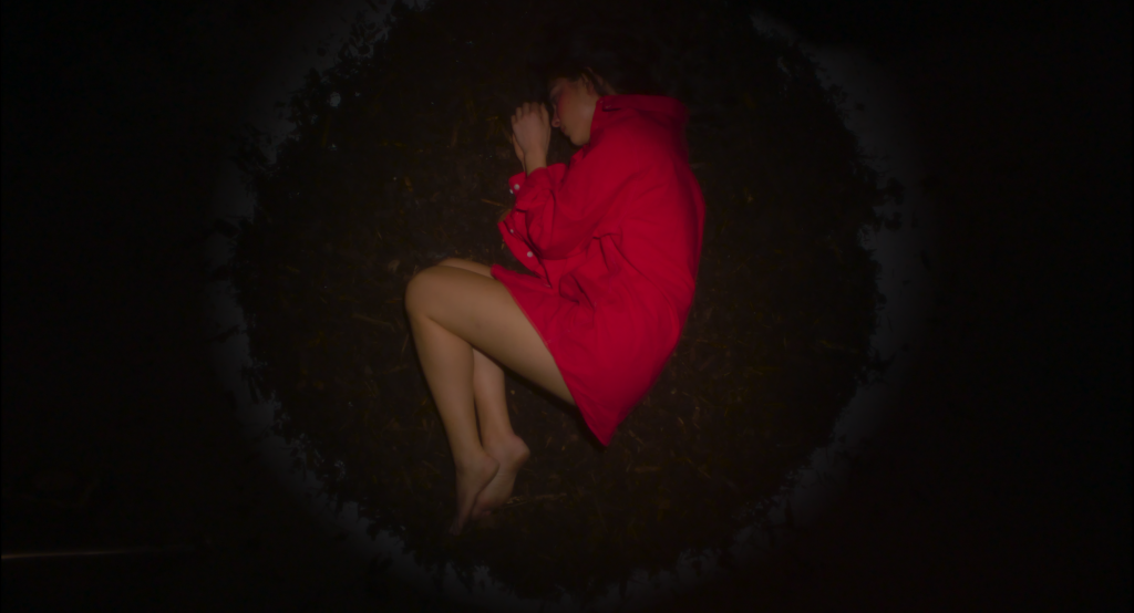
Throughout the narrative, specific moments were meticulously crafted to mirror the protagonist’s emotional states, each marked by distinct lighting arrangements. Notable instances included the portrayal of the protagonist as a ‘foetus’ and the depiction of her being ‘overwhelmed.’ The ‘foetus’ scene involved a top shot, capturing the main character on a bed of mud, illuminated in a perfect circle, akin to the imagery of a foetus in the womb.

BC: What was the trickiest scene to light?
BWG: The most challenging scene to light was undoubtedly the one we fondly call the “overwhelmed” scene. Our vision involved orchestrating lights around the main character, dynamically moving in synchronisation. To achieve this, we implemented two separate three-point lighting setups, meticulously timed to alternate and overlap, occasionally plunging into near darkness before another light took over. The complexity of this lighting arrangement presented technical challenges, requiring precise timing and the selection of appropriate colours for each light.
Leveraging Aputure lights and with the exceptional skill of my gaffer, Fu Xiao, we devoted considerable effort to fine-tuning until achieving the desired timing. For the colour palette, we opted for hues closely aligned with the natural tones in the film, incorporating shades of green, yellow, and red.
BC: Were there any other challenges of the shoot from a cinematography perspective and how did you overcome these obstacles?
BWG: The director and I encountered some minor challenges related to our mutual understanding. There were instances when the director proposed shots not initially planned, leading to initial confusion on my part. To address this, we engaged in more detailed discussions on set to ensure clarity in our intentions.
I eventually realised that the director valued the flexibility to make spontaneous decisions during filming. Consequently, we agreed to keep the shot list as a guide to capture essential story elements while allowing room for improvisation. Though adjusting to this new workflow took some time, I soon recognised its advantages. The use of Steadicam and handheld camera styles throughout the film provided us with creative freedom, fostering the emergence of fresh ideas not confined to the original shot list.
However, in my enthusiasm for this process, there were moments when I risked losing sight of what was specifically crucial for the film. It prompted me to step back and question the purpose behind certain creative choices. Was it merely for aesthetics, or did it contribute to the portrayal of the character’s intricate inner journey? Grounding myself with this question ensured that I remained focused on the primary goal – telling a compelling story.
BC: Who did the grade and what look were you trying to achieve in it?
BWG: Our grading was entrusted to Colin Foulkes at Goldcrest, and it was a pleasure collaborating with him. Colin brought his own ideas to the grading process, fostering a true sense of collaboration. His passion for the project was evident, particularly in his commitment to preserving the integrity of the studio scenes.
Our primary objective was to achieve a cohesive look throughout the film, ensuring that the real and surreal worlds, while distinct, seamlessly coexisted within the same cinematic universe. To achieve this, I provided several references, and together, we experimented with various approaches. In the end, we settled on a look that satisfied not only me but also the director and Colin, solidifying our collaborative vision for the film.
BC: What was your proudest moment from the production process? Is there a specific scene or shot that you’re especially proud of?
BWG: My proudest moment in the production process undoubtedly revolves around the interior studio scene, which demanded extensive preparation. Collaborating closely with the production designer, we engaged in numerous lengthy meetings to strategically position lights and ensure seamless coordination between our departments. Given the intricacy of the set, meticulous planning was crucial, necessitating a precise layout of each light beforehand. (see a diagram in the link of the plan with the ribbons and lights combined)
The challenge arose from the net-shaped ribbons strung around the grid, making it complex to hang and rehang lights. Once a light was in place, adjustments during the shoot were limited. However, through careful planning, an extended pre-light day, and the exceptional efforts of our lighting team, we successfully illuminated the entire set with just four lights. This achievement stands as a testament to effective teamwork and meticulous planning.
BC: What lessons did you learn from this production that you’ll take with you onto future productions?
BWG: This production offered numerous valuable lessons that I will carry forward. A notable experience was my first collaboration with an intimacy coordinator. Witnessing the distinct approach to shooting these scenes highlighted the critical role of communication with the lighting team, particularly when access to the closed set was restricted. Another significant lesson was understanding the crucial collaboration between the DP and production designer, as well as the necessity of flexibility.
Above all, the production taught me the art of achieving “high-production value” looks on an extremely low budget. This insight into resourceful filmmaking strategies has become a valuable skill set that I’ll apply in future projects.
BC: What would be your dream project as a cinematographer?
BWG: Naturally, my aspiration is to become a cinematographer for narrative feature films. As I reflect on recent releases, my dream projects include films like Poor Things or Everything Everywhere All At Once, where the cinematography ventures beyond the ordinary. The prospect of contributing to such innovative storytelling through the lens is what drives my passion for the craft.
BC: Is there anything else not yet mentioned that you’d like to talk about?
BWG: The other graduation projects I contributed to at LFS showcased a diverse array of styles. One project was a comedy-drama set in a ‘Broken Hearts Hospital’, drawing inspiration from Wes Anderson’s aesthetic with an emphasis on balanced compositions and soft, pastel lighting.
Another venture involved an experimental dance-narrative unfolding on a Greek island, relying solely on natural lighting to capture its essence. Lastly, I stepped in as the director of photography for an Italian WWII feature set in a small village, inheriting the role on day three after the original cinematographer withdrew. Maintaining a consistent style with the preceding shots presented a unique challenge.
Each of these projects holds a special place in my heart, unveiling distinct challenges and imparting valuable lessons. I’m excited to see what projects the future has in store for me, embracing the opportunity to continue learning and evolving along the way.


