PICTURE THIS
Being visual disciplines, cinematography and production design share a common language. Experts in their field share their experiences and techniques as well as the secrets to successful creative collaborations.
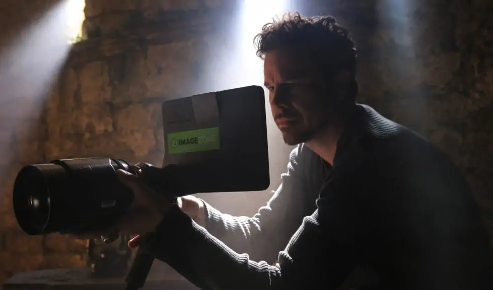
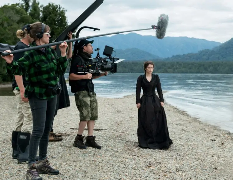
Long before working on The Luminaries, Denson Baker ACS NZCS and production designer Felicity Abbott went to film school together in Sydney. Abbott points out that no matter the project there are always discussions about colour, light, texture, and images. “Production design and cinematography are both visual disciplines so there is a lot of common language. We usually start talking about visuals whether it’s references of photography, artwork, paintings or particular works of other filmmakers. There is then a whole raft of technical conversations that have to follow that. In terms of set design, it’s about giving the maximum amount of coverage and performance potential to the director and cinematographer. We were lucky to find spaces for The Luminaries where we could almost get 270 degrees coverage.”
It is important to recognise the talent of others for Denson. “I find that more of my conversation is bouncing ideas rather than saying how I would want to do things. It’s about getting a bit of to and fro in the conversation as to ways that we could go and then start to hone it in and be more specific as we get further down the track. Felicity’s team brought to the table a whole array of gas and oil lamps, and candles. We looked at reference pictures and paintings and saw how they were being used in actuality in the period. All of our sets were wired and piped in with the practicals that we could control, dim, reposition, raise and lower.”
Subscribe to our mailing list to continue reading
Frequent collaborators with filmmaker Armando Iannucci (In the Loop) are Zac Nicholson BSC (The Death of Stalin) and production designer Cristina Casali (The Personal History of David Copperfield). “The script is the one thing in common that we’re referring to, and the director has already had a significant input into that and has presented his vision,” says Nicholson. “We find a way to continue to build it and it grows organically until you have created this world. My real contribution comes later when we’re trying to get it onto camera. You start to work on the LUTs, the colour palette of the camera with an eye to the grade in the future, your shooting and lighting style, and the contrast. You use all of those factors to shape and mould your basic approach when it comes to day one of filming.”
Each project is unique in its own way. “David Copperfield was so fast moving that to get from scene to scene we introduced transitions,” explains Casali. “Theatrically things were coming into the visual language of that film quite early on, so we started to build in transitions and work out early Victorian theatrical technology. There were quite a lot of early holograms that we started to investigate. We did a comprehensive camera test with all of those technical bits to see how they would work.”
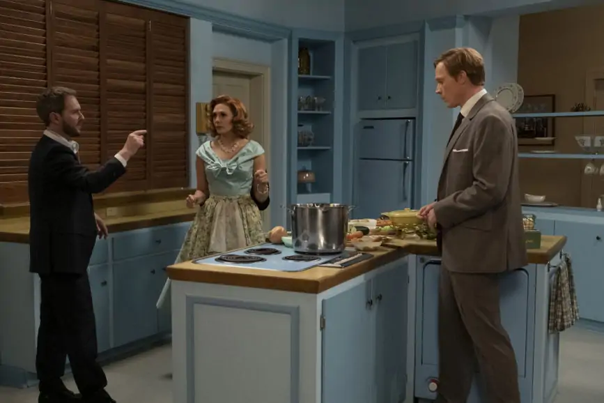
What also had to be taken into consideration is that the story takes place all over the country. “We needed a shipwreck, a beach, to be in Victorian London, and a theatre. We didn’t have a huge budget to build everything, so a lot of it was about landscape.”
The collaboration on Dare Me went so well that Zoë White ACS and production designer Michael Bricker became partners in life and subsequently worked together again on Hit & Run. “I started on a bunch of independent movies and was only thinking about the items on a set,” says Bricker. “But now it is thinking about more of an impression, character, what would people naturally do, and trying to think like a director regarding how the layout of a room can dictate and support blocking so when everyone arrives on set a little bit of that thinking has already been done. If you start a conversation with a DP about lighting, they’re going to be your best friend from the beginning. Lighting is the right place to start because you’re already talking about tone and mood, and it immediately takes you into colour and character.”
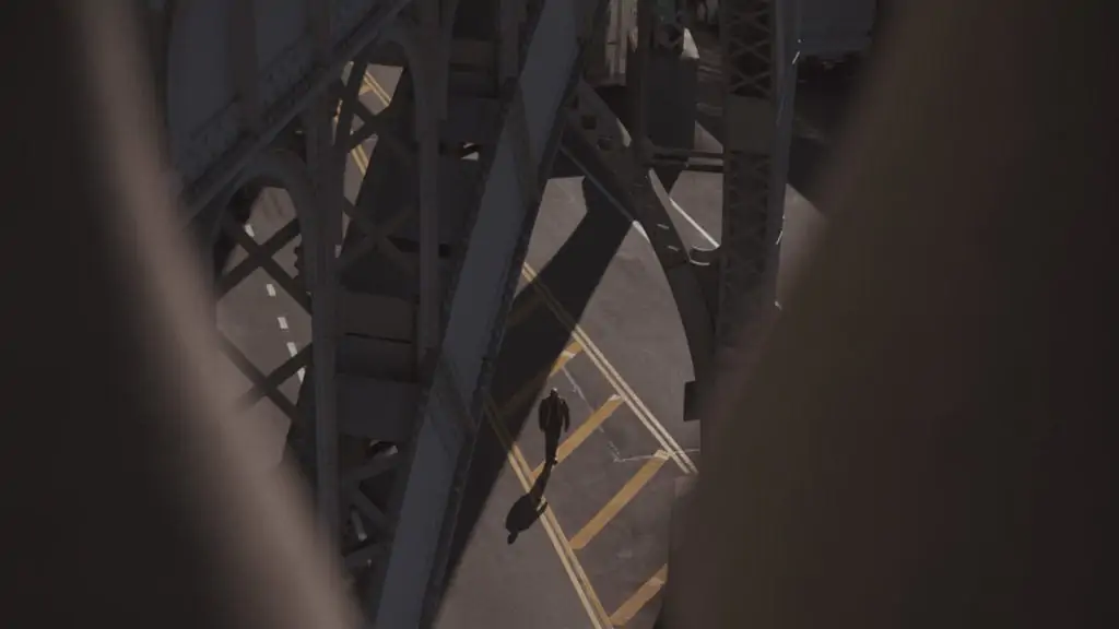
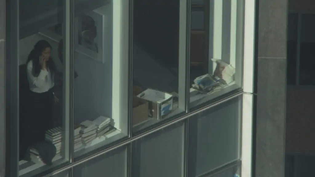
The visual language has an impact on the choice of locations and set designs. “Part of our approach on Hit & Run was this idea of surveillance and being watched from afar, so we did a lot of shooting from tops of buildings looking down at the ants of our characters walking across the street,” explains White. “We also did a lot shooting through things and foreground as if the camera was literally spying on our characters; that was a collaboration with Michael where I asked for a bunch of different materials to look through of varying thicknesses, and various types of glass and mesh. Those are the fun layers that you get to add because of a particular approach for the show.”
Larry Smith BSC (The Man Who Knew Infinity) has always tried to have a particularly good relationship with production designers because quite often they are his “eyes to the set.” “I use a lot of wide-angle lenses, so for me it’s important that the set is seen as much as possible. I hate being close-up all the time where you don’t see anything. The visual language for me starts when I walk onto the set. The top production designers understand light, where it should come from, and will try to build a set that is going to look the best from their point of view. If the major building blocks are in place, that is a good indication of how production is going to work from my side.”
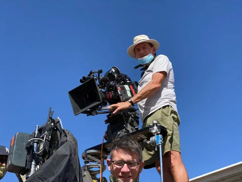
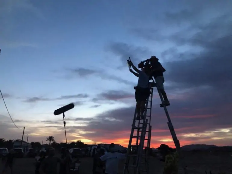
The Marvel Studios production team quickly learned that making a sitcom was not easy for WandaVision, especially when creating homages to I Love Lucy in the 1950s to current day. “Director Matt Shakman [It’s Always Sunny in Philadelphia], DP Jess Hall BSC ASC [Ghost in the Shell] and I spent literally days together looking at references, sitcoms, and lighting styles,” says production designer Mark Worthington (American Horror Story). “Jess rented period lighting instruments from Los Angeles and had them shipped out. We would have a specific still on a screen from The Dick Van Dyck Show and Jess would go through different lighting scenarios to get to a certain place, but we never copied it. Ultimately, it’s about Wanda’s memory of sitcoms when she was a kid watching them in the Eastern Bloc.”
Storyboards serve as a bible. If the director blocks a shot in a storyboard, production designer Alan Gilmore (Crawl) tries to match it as much as he can and then ask for the director’s opinion on it. “I’ll reinterpret the environment around the characters,” he says. “You gather all the architectural details and try to suggest interesting proportions and shapes to enhance the whole feeling of the space and give it a mood. I studied architecture in college before I worked in film, so I learned a lot about psychology of space and try to bring a lot of that into my production design where set has its own character and mood.”
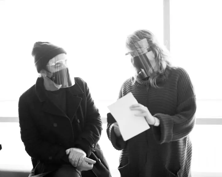
For cinematographer Brett Pawlak (Short Term 12), the pandemic has had a significant impact. “I’m trying to develop a relationship with the production designer and talk creatively about a project, but you have that one additional barrier to prohibit the conversation from being more informative than when it’s person to person. The other aspect is all the sets that were built for the show [Pawlak was working in Montreal] and we couldn’t have a ceiling because of COVID-19 protocols. When we were talking about a set, we had to be aware that the camera couldn’t be too far back and low where we would see off of the set because the ceiling wouldn’t exist. Also, for a while you weren’t able to use any atmosphere in the set. Those are a couple of things that have been difficult on the creative side.”
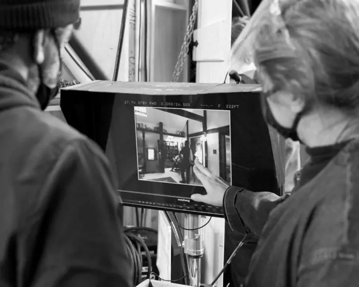
Paul Cameron ASC (Reminiscence) appreciates the consideration he receives from production designer Howard Cummings (Westworld). “Howard knows how important light is for me and how I light. He’s not recommending locations that don’t have great natural light or face the wrong way. Sometimes when I’m not available or haven’t even started the movie, Howard will send me some pictures and ask, ‘Does this work?’”
One of the first questions that production designer Amy Williams (Master of None) asks is about the aspect ratio. “It informs and shapes what you put into a set. It’s fun to work within the aspect ratio opposed to designing something one way or another. A good example is on the third season of Master of None which was shot on 16mm. We were going to use the Academy ratio so things were more squared off and the camera wasn’t going to move. With that in mind and to help with the framing, I worked in a lot of architectural elements to add some more depth and texture,” says Williams. “The best collaborations are when you do get really into the character and narrative, and you’re both eager to explore that.”
