Discover how Series Director Stewart Kyasimire used Blackmagic RAW to shape the powerful visual storytelling of Four Kings, an Amazon Prime documentary exploring Britain’s boxing icons and their untold stories.
Four Kings is an enticing new four part documentary series which provides unprecedented access into the lives of four of Britain’s best boxers in the golden age of boxing.
Produced by Workerbee for Amazon Prime, the series also explores topics such as racial prejudice and breaking down societal barriers in the world of sport and mainstream media. Series Director and DP Stewart Kyasimire, having previously worked on documentaries such as BBC Scotland’s Black and Scottish, joined the project with a drive to tell the raw and unfiltered story.
“The team was looking for a director who could relate to the boxers and bring a more organic flow to the interviews… or conversations as I’d prefer to call them. Many might assume that boxing is a grassroot story for lots of black ethnic people in the 1970s and 1980s with little depth to offer, but there is so much more to it, which is what I wanted to unpack,” Kyasimire reveals.
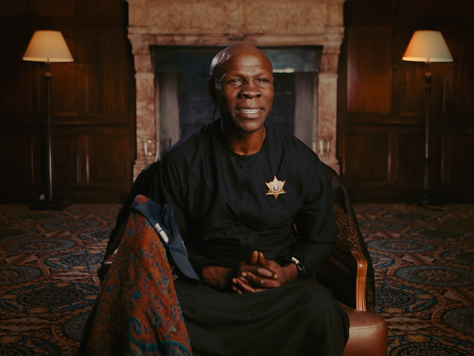
Ahead of the production, Kyasimire began developing the visual style that would carry the series look. “I was a set designer before becoming a filmmaker, so I helped to dress the sets ahead of time. We had a list of locations to shoot in, such as churches and grand mansions, so we wanted to make sure that we minimised any white walls and embraced the natural beauty of these locations with an added artistic flair.”
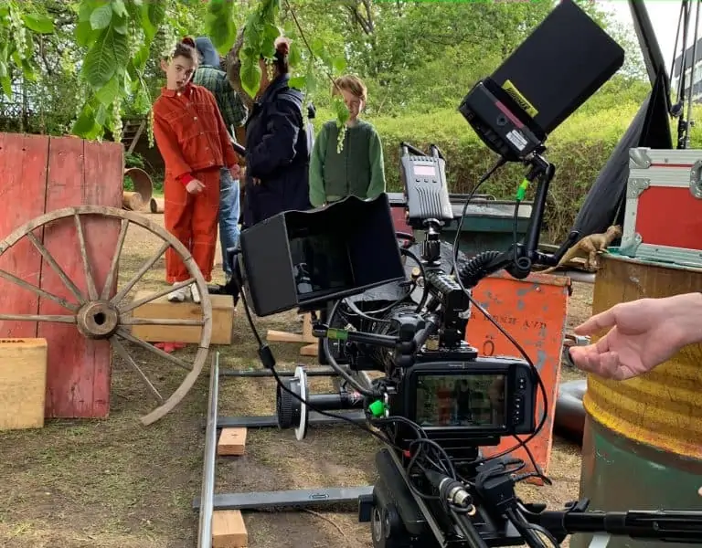
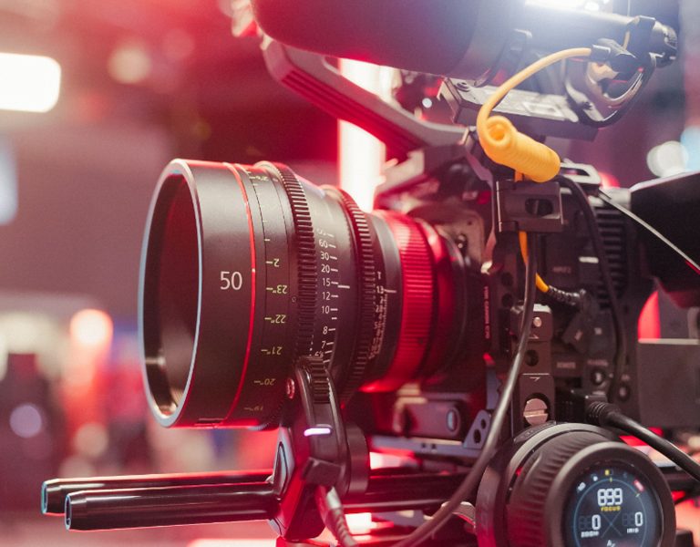
Acquiring in 4K using Blackmagic RAW, the principal camera choice was the Blackmagic URSA Mini Pro 4.6K G2, paired with Zeiss primes. Complementing those cameras was a gimbal rigged Blackmagic Pocket Cinema Camera 6K Pro, used for outdoor actuality shots.
“The URSA 4.6K is a great camera for me. The dynamic range and highlight roll off is impressive and really lends itself to the cinematic style that I wanted,” Kyasimire notes. “The aim was to embrace an American cinematic look, using a mix of contrast and catch light to enhance the image; distancing the final image from the digital look as much as possible. The shared colour science in both cameras meant matching everything in post was straightforward, and that was one less thing for us to worry about on set.”
Balancing the need for a specific look with practical considerations such as location shooting, Kyasimire carefully considered his lens choices. This decision was part of a broader effort to capture as much of the final look in-camera as possible, which also influenced his lighting choices.
“Our priority was to ensure we spent as much of our budget on screen as possible,” he reflects. “The Zeiss lenses offered the clean, high-quality image I was aiming for, and worked well with our camera choices, helping to achieve the desired cinematic look while also being practical for on-location shooting.”
With lenses and camera decisions made, Kyasimire also considered how lighting would play a crucial role in achieving the in-camera look. “My visual style also extends to lighting choices; I’ll usually set the main key light to 2200 or 2800 kelvin, which gives off a nice warmth, and that compliments darker skin tones on screen. In one case we weren’t able to turn off the house lights so we used Aputure light panels and shot through double diffusion to give us a good catch light while still creating a softer, more even image.”
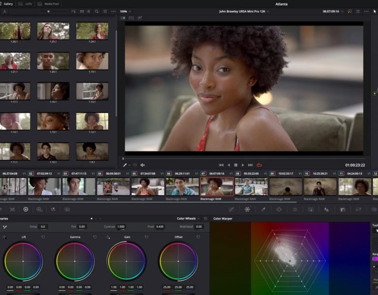
Workerbee post production manager and colorist Keren Aarons oversaw the grade and online in DaVinci Resolve Studio using the DaVinci Resolve Advanced Panel, to further fortify the vision. “The workflow moved from Avid into DaVinci Resolve, and I spent about two days with him to communicate the look I wanted. I provided images from ShotDeck and references from The Last Dance to guide the visual style,” Kyasimire notes.
He adds, “We used the gamma wheels to adjust individual elements of the image such as the mid tones, opting for more warmth and contrast in places, without off balancing the natural highlights and shadows. This was a seamless process which was made easier by the Workerbee post team.”
Sitting with Aarons to create that look was really important reflects Kyasimire. “I love the color grading process,” he enthuses. “We also used DaVinci Resolve for some of the graphics work, specifically with Fusion for the opening titles. For example, we had a style involving news articles, where part of it was created in Photoshop and then brought into Resolve to add movement and effects.”
The series also relied on archived material that captured the boxers in the earlier days of their careers. “Getting those tapes into a digital format and consistent with the footage we shot was fairly difficult. First, we put them in a 3:2 aspect ratio and then added some radius to make it compatible with today’s standard 16:9 delivery format for TV,” Kyasimire reveals. “To colour match that material, we used Resolve’s color chart to analyse the colours of one clip to match with another, which saved us considerable time, and we upscaled the archive footage using the DaVinci Neural Engine; increasing the resolution and lifting the image.”
The series is now available to watch on Amazon Prime.
