THINKING IN COLOUR
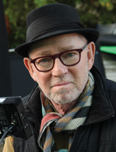
Many of you know that I’m a cinematographer. The first thing I do when I get a call to interview for a movie is read the script. As soon as I start to read, I start seeing images. Those images are in colour. And as I continue to read, the palette of the project becomes clearer in my head.
There is a clear connection between the colour of the images we use to the emotional qualities of the story. Early in preparation, along with the production designer and the director, a palette is determined. For instance, the connection between blue light and human emotion has been demonstrated in Japanese and British subways by placing blue LED panels at either end of stations. This has shown the correlation of significantly reducing suicides in these locations. There are many other examples of the colour of light effecting human emotion.
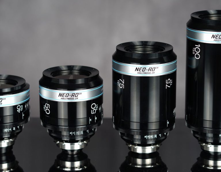
With our limited ability to reproduce specific colours and longer gradations of colours, I often find myself in post reaching for a specific tonal range for emotional effect on the audience and can’t quite get there. 6P will change all of that.
After hearing the nightmares about making the photochemical print on Stuart Little (lensed by Guillermo Jorge Navarro Solares ASC AMC) and trying to marry the live production material with the computer-generated digital footage of the white mouse, I knew while finishing Stuart Little 2 – which I photographed – we would have to develop a system of controlling the colour grading of our background plates (shot on film) before they were delivered to the animators to insert the white mouse.
I knew the colours of the movie were emotionally very important to the story’s psychological effect on the audience. When I was asked in my final interview with the producers, the director and the studio head at Sony what I thought the movie should look like I took a deep breath and said, “The first movie was when Stuart is just meeting the family and has a beautifully subdued and desaturated look. This story is three years later, and Stuart is a “real” member of the family now. Everybody is happy. I think this should be a very sunny movie.” They bought it and I got the job.
I had been in Paris and watched some of the process of making the very first digital intermediate on the beautifully coloured Amile and then had the opportunity of watching Sir Roger Deakins CBE BSC ASC working on the digital intermediate of O Brother, Where Art Thou? at Cinesite, a movie with very specific colour mandates. I knew that Stuart had to be done as a digital intermediate, only the third movie ever to use this revolutionary technique.
It took me a year in post-production trying to convince the studio to let us try this. In the meantime, I colour graded every single background plate before they were sent to the compositor so that we wouldn’t have to grade the shot to look the way we wanted. Because if colour was changed after the compositing, our white mouse Stuart would no longer be white. Sony Imageworks created the colour science and built a digital pipeline. And we were able to produce DI# 3. I was very proud of the work we had done. But when I was reaching for certain colour gradations for emotional effect we just couldn’t get there.
Now, over twenty years later, we are finally going to have a system that I describe as having more colours in-between the colours. We are finally reaching for what I called in the mid-nineties the Holy Grail of digital colour imaging: an end-to-end, device independent, colour management system. Along with the incredible work the Motion Picture Academy has done developing ACES and with the advent of 6P Colour, we have taken a giant leap toward the goal of total emotional control of what our audiences can experience while watching our movies and television shows.
Now, with the development of the ability to use additional multiple primary colours, we can really see the subtle roll-off of colours in many subjects such as skin tone. I first noticed this quality while doing experiments with various levels of colour depth on the movie Amityville: The Awakening. With a wider gamut we began to see many more subtleties in skin tone. Skies came alive with many more shades of colours. And last week, when I was driving through California’s Anza-Borrego Desert State Park, I noticed the thousands of colour variations in the desert mountains that I knew couldn’t be accurately reproduced on film or any digital system of imaging without the 6P Colour system.
6P couldn’t have been developed at a better time. This enhancement will bring us a level of tools that will allow storytellers to freely express ideas and feelings through colour. Colours we’ve never seen on a screen before. The 6P system is backwards compatible with all current colour systems and fits within ACES. And as displays become available with 6P Colour technology embedded in them, the actual viewing audience, in their homes or in a theatre, will be able to experience colour depth in images that until today, was not possible. Viewers can finally see the colour between the colours. And we will reduce metameric error in the process. This is a giant step toward the holy grail of end-to-end, device independent, colour management.
6P Colour was introduced on 3 June 2021 at the first SMPTE + event.
BY: STEVEN POSTER ASC