Explore the latest post-production and grading projects across the industry.
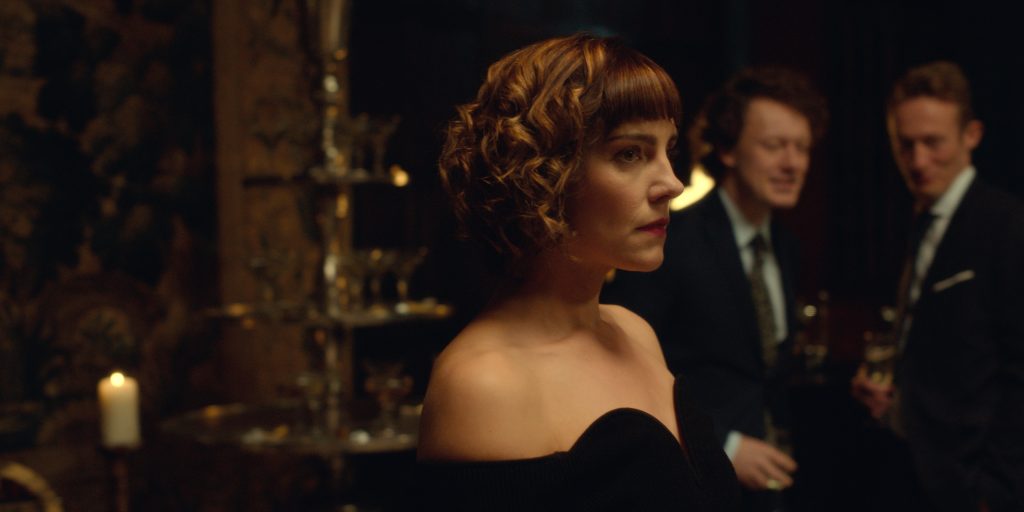
The Italian job
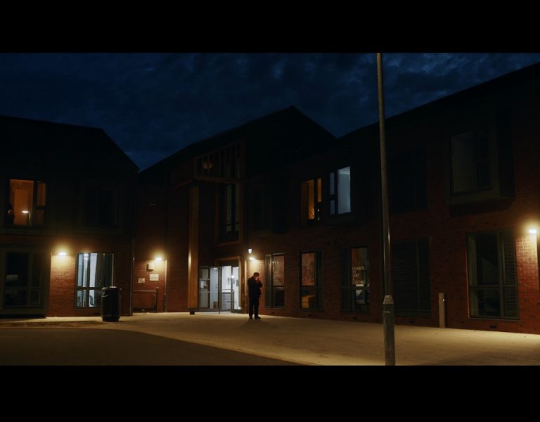
At Camerimage – that melting pot of the global cinematography community – British Cinematographer caught up with senior colourist Marco Valerio Caminiti of Frame by Frame to hear about the Italian post house’s latest project: The Serial Killer’s Wife (pictured above). The suspense-packed thriller, based on Alice Hunter’s bestselling novel of the same name, follows the lives of Beth Fairchild (Annabel Scholey and her husband Tom (Jack Farthing). One night, Beth’s idyllic life is thrown into disarray when her husband is suddenly arrested for murder.
Frame by Frame’s DI team worked on the series from the conforming phase, going through the colour grading and then managing the various deliverables requested by the production. “I personally developed a LUT that the DP used on set as a preview, but we did not follow the dailies process,” Caminiti notes.
The show involves collaborators from the UK, Italy and Ireland, lending it an unusual visual flavour. “There’s quite a unique combination of Italian taste coming from the art, costumes and production design departments and being set in a British environment, whereas director Laura Way and cinematographer Evan Barry are Irish,” says Caminiti. The colourist was joined on the project by Frame by Frame colleagues Alessandro Pozzi (post-production manager), Matteo Lepore (post-producer), Giorgia Petrazzini (conformer), and Paolo Viel (finisher).
The main challenge of the show, Caminiti explains, was achieving a crime drama look that would not override the vibrant colour palette chosen. “In fact, even though most of the series has a clean and cold look, we peculiarly worked on a nice level of contrast and colour separation to avoid a flat and monochromatic result. It is worth noticing that all this was accomplished while coordinating the whole process between three different countries. Luckily enough, I had the pleasure to sit in our grading suite for a week with Evan to find the right direction for the show, and some days later Laura also came to Rome to attend the grading sessions and review all the four episodes.”
For Caminiti, it’s a project he’s especially proud of. “After having studied in the UK at the NFTS (MA Digital Effects: Colour) and worked at Warner Bros. De Lane Lea, it now feels like I have managed to bring that experience back with me to Rome, working on an international production from my own city and combining my two different backgrounds,” he summarises.
Colour science
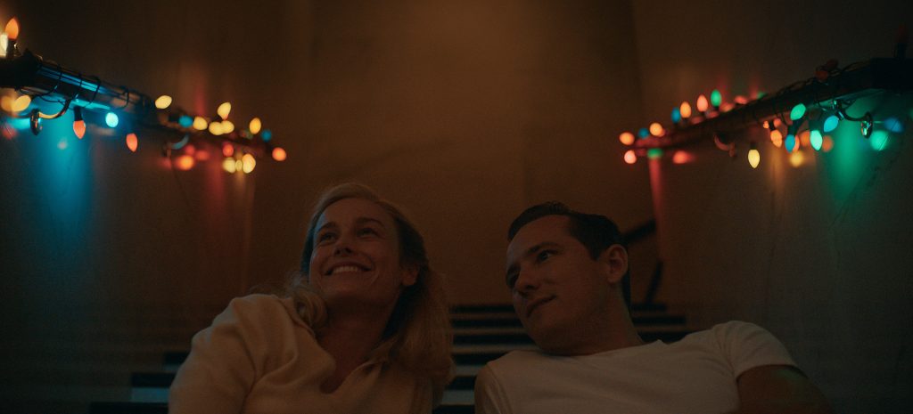
The Apple TV+ period miniseries Lessons in Chemistry adapts Bonnie Garmus’ acclaimed novel to the screen, telling the story of chemist-turned-cooking-show-host Elizabeth Zott (Brie Larson). Light Iron provided dailies and finishing services for the project, with supervising colourist and Light Iron co-founder Ian Vertovec performing the final colour grade.
“Cinematographers Zack Galler and Jason Oldak wanted to maintain a nostalgic yet immersive atmosphere to bring the story to life,” Vertovec shares. “With that, it was crucial that the colour reproduction of the food Elizabeth prepares – which is how she connects to people – matched our own sense of what those foods look like in real life.”
Vertovec used Baselight for the grade, and to realise that lifelike colour rendering. He explains: “I used the Truelight Colour Appearance Model with the ACES look profile to match human vision as much as possible, especially in the scenes where Elizabeth prepares food. We then softly blended in an Agfa film emulation to create a more nostalgic colour rendering and harmonise the warm tones. We also shifted the project’s white point warmer to communicate the mid-century aesthetic. Lastly, for the flashback scenes, we pushed the film emulation blend ever further.”
Squids in
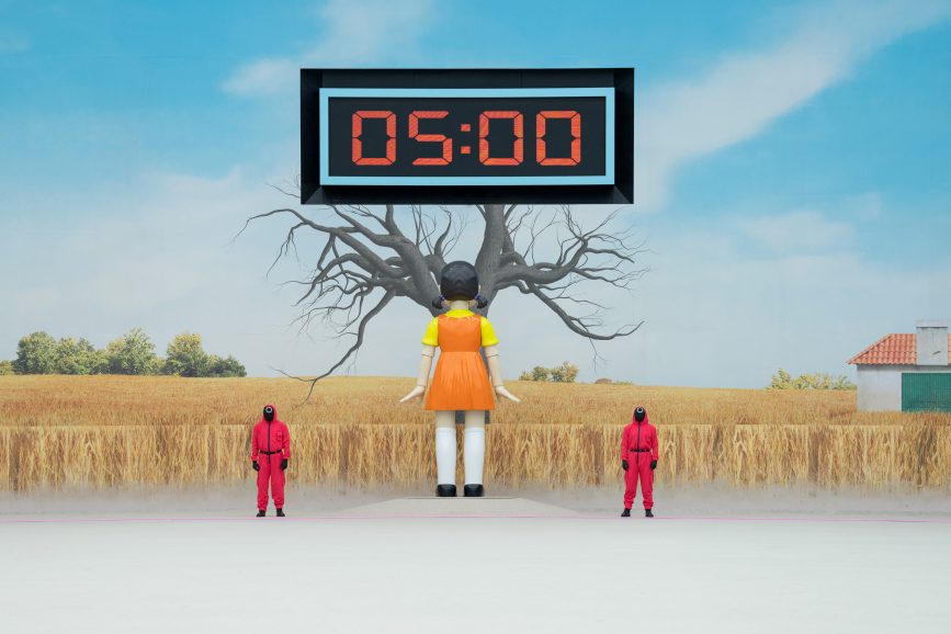
Creating a reality show of the magnitude of Squid Game: The Challenge brought forth unique and complex challenges for the production team. Unlike other reality shows, where camera setups often remain consistent, this show demanded a flexible approach – which is where ENVY CAPTURE came in.
Elliot Leigh, location supervisor at CAPTURE, sheds light on this aspect: “The multi-camera setup on Squid Game: The Challenge had to be changed and rigged for each individual game to maximise coverage and capture all the key action and drama.”
Each game presented its own set of demands, with up to 24 ‘rig’ cameras and dozens of PSC cameras tracking the 210 participants residing in the dormitory. Furthermore, the production team had the flexibility to add extra cameras when deemed necessary. For instance, in the case of the show’s opening challenge, ‘Red Light, Green Light,’ which featured all 456 contributors, the setup had to be shifted to a larger space to accurately replicate the original program.
Ricky Martin, head of technical operations, notes, “There were 32 streams of media and an additional 18 cameras recording, which is understandable when you see the size of the game and the number of contestants to keep track of.”
Throughout the reality portions of the production, 24 ISOs (isolated camera feeds) played a central role, with dedicated ISOs for interview rooms. Toby Weller, solutions architect, highlights their efficiency, revealing, “ISOs for interview rooms were also transcribed live, with reports delivered straight to production teams after each interview.” As the show progressed and contestants were eliminated, the ‘Dormitory’ record constantly evolved, adapting to the changing dynamics with varying bed arrangements, cameras, and microphones.
Leigh summarises the collaborative nature of the project, stating, “This is one of the shows where we had the most collaboration with production, and everyone was communicating on how certain parts were going to be shot. There is no guide out there to explain how a project like this gets made.”
Dark and stormy
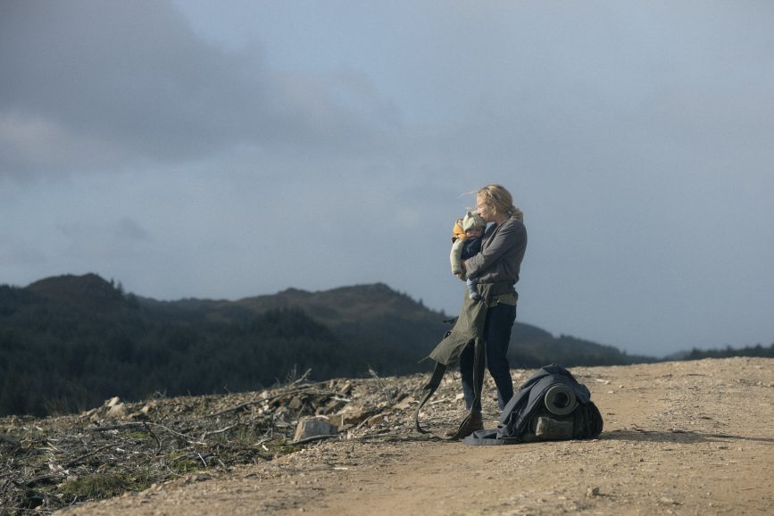
The End We Start From, based on the novel by Megan Hunter, follows a nameless woman called the Woman (Jodie Comer), who gives birth to her first child amid a catastrophic storm. As severe flooding ravages the streets of London, she is forced to flee northward with her baby and husband, played by Joel Fry. Picture Shop’s team in London provided colour grading using Baselight for online edit and grade for apocalyptic drama; the creative team included senior colourist Paul Ensby, assistant colourist Tom Alexander, grade edit assist Ross Brunton, and Picture Shop executive producer Begona Lopez.
The drama was shot on 2-perf 35mm by DP Susie Lavelle BSC ISC alongside director Mahalia Belo. Both attended the grade throughout, which was performed on Baselight in Picture Shop’s grading theatres in the Lexington Street, London.
Colourist Paul Ensby got involved during the pre-shoot camera testing stage where he set looks with Belo and Lavelle. During the shoot they intermittently looked at shots technically to check they were still on track and able to achieve the desired effect.
Once the grade was done, it was a clear, subtle, naturalistic, pastel that suited the feature. This was meticulously maintained throughout, but the flashback scenes were pushed into a highly saturated warmer hue to set them apart.
As it was shot on film, Ensby was keen to stick to the printer light toolset within Baselight to keep the organic look that film possesses. With this base he used several subtle power windows/vignettes where required to help problematic areas or help focus the eye towards the key area of the frame.
Both Lavelle and Belo were fully immersed in the grading process. “Thankfully we were all on the same page in terms of the look – extra care was taken regarding the overall saturation and hue of the foliage, for example. In fact, I’m not sure I have ever forensically examined the tone for every scene at this level before!” says Ensby.
The VFX was handled externally and once on-site they were assessed and enhanced in the grading suite – the biggest challenge was a scene almost entirely shot on blue screen of London being flooded which was tricky to keep it realistic and believable.
In good company
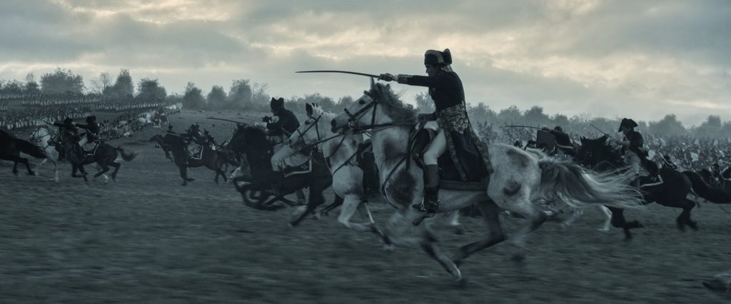
Ridley Scott’s latest box office behemoth is Napoleon, starring Joaquin Phoenix as the titular French emperor. Company 3 senior colourist Stephen Nakamura, who’s graded nearly all of Scott’s digitally coloured films and TV shows, handled the grade for the film.
“A lot of it is quite desaturated, which is something Ridley generally likes,” the colourist says, “but he wanted to make sure certain colours pop.” So, while a lot of the film has a very cool look, warm colours, such as the flag, skin tones and flames do declare themselves. “I use parallel nodes and layer mixers to come in underneath the grade and bring out just specific colours in particular places,” he says of his technique within Blackmagic Design’s DaVinci Resolve.
Cinematographer Dariusz Wolski ASC, another of Scott’s frequent collaborators, “knows exactly how to light and shoot everything so it can come out the way Ridley likes,” Nakamura says. “A lot of the film is designed have this low saturation, painterly kind of look. The night scenes, which Ridley likes to shoot day-for-night, are meant to have the exposure brought down pretty far in post. But there is always sufficient colour information and exposure in his images that there’s room for Ridley to experiment in the grade.”
Nakamura points out that this low-chroma look is established from the film’s earliest scenes. “Once viewers get used to that palette, it becomes ‘normal,'” he explains, “so that a little bit later, we can introduce just a touch more colour in some scenes and they feel like they’re full of colour, even though it’s still very much the desaturated look Ridley likes.
“People can talk about what kind of colour palette looks ‘real’,” Nakamura explains, but it’ all relative. It’s about interpretation and making the audience feel that what they’re watching is real. With Napoleon, once you get into this fascinating character and the sad love story, you don’t think about the look. It just helps transport you to another time.”
Film in focus
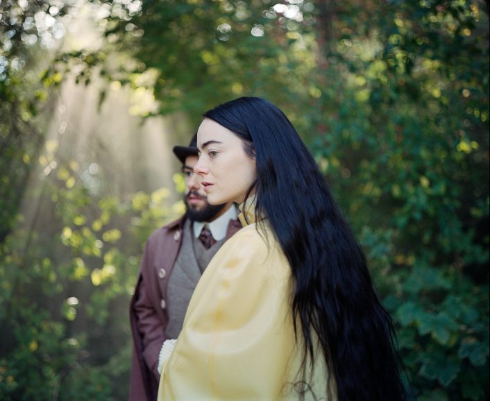
Poor Things, the latest feature from visionary director Yorgos Lanthimos, has earned a whopping 11 Oscar nominations, including Best Cinematography for Robbie Ryan BSC ISC. A Victorian tale of love, discovery and scientific daring, Poor Things tells the incredible story of Bella Baxter (Emma Stone), a young woman brought back to life by an eccentric but brilliant scientist. Lensed by Ryan on Kodak 500T, Ektachrome and Double-X 35mm film, Poor Things’ 4K film scanning was completed by Cinelab, as well as the creation film deliverables.
The BIFA Award-winning All of Us Strangers saw one of the first times that 35mm film has been shot on a virtual production stage. Processing, scanning and dailies colour for the feature, lensed by Jamie D. Ramsay SASC on 35mm 3-perf film, was by Cinelab colourist Darren Rae.
Society of the Snow, lensed by Pedro Luque SCU, recently benefitted from Cinelab’s DFD (Digital-Film-Digital) analogue intermediate process. This involved transferring digitally captured footage to 35mm Kodak VISION3 250D film stock and then processing and scanning back to digital, with the authentic film texture and grain applied.
Cinelab has also looked after digital dailies including dailies colour by colourist Joshua Callis-Smith on Argylle (cin. George Richmond BSC); digital dailies lab services on One Life (cin. Zac Nicholson BSC); digital dailies lab services and dailies colour by colourist Darren Rae on The Beekeeper (cin. Gabriel Beristain); and film processing, scanning and dailies on The End We Start From (cin. Suzie Lavelle BSC ISC).
Cités and spheres
The Mill Paris, and more specifically its Mill+ production team, took part in the production of 60 audio-visual and interactive devices for the Cité Internationale de la Langue Française, inaugurated by French President Emmanuel Macron.
As the inaugural cultural institution fully devoted to the French language, the Cité Internationale de la Langue Française is hosted within the historic Château de Villers-Cotterêts in Aisne, where in 1539 King François I declared French as the official language.
“Over a span of almost two years and a half, we successfully rallied and guided a diverse team to craft 60 ingenious and entertaining installations,” says producer Hugues Allart. “We trust that the public enjoys discovering this immersive journey into the essence of the French language as we derived from bringing it to life.”
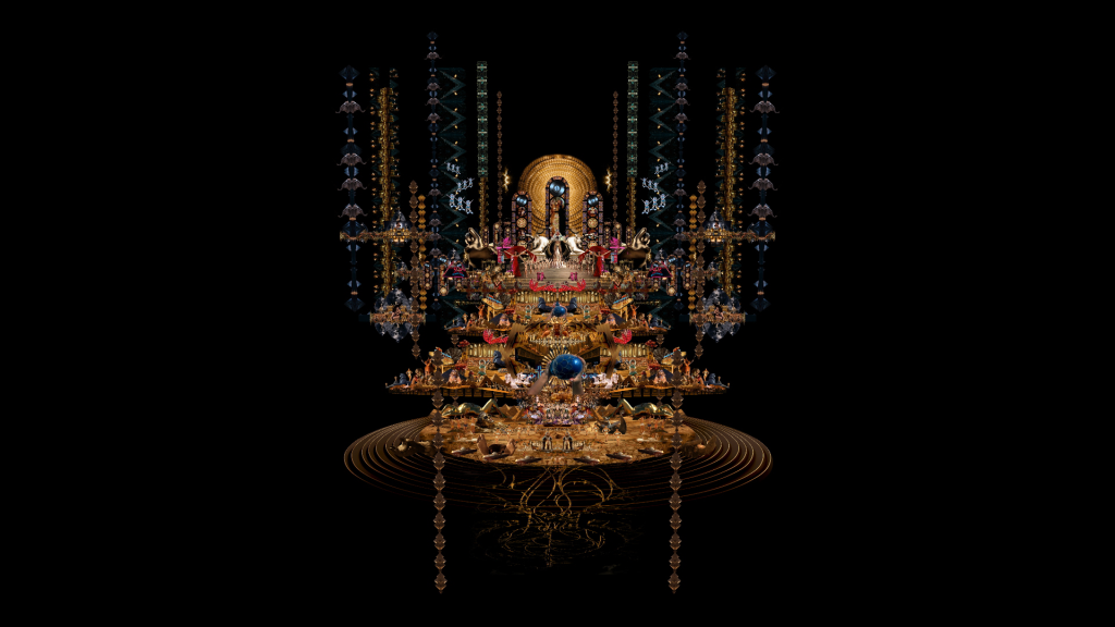
The Paris studio also collaborated with director and artist Marco Brambilla on a work broadcast during the inauguration of the MSG Sphere in Las Vegas, hosted by U2. From his vision emerged a gigantic and intricate work, accurately and passionately depicting Elvis’ life through 6 key stages: Birth, Music, Vegas, Performance, Metropolis, Vortex. Going far beyond a simple visual retrospective, this majestic work is the result of the meticulous assembly of over 800 video clips taken from the legendary icon’s films.
To ensure appropriate video excerpts for rotoscoping, a meticulous film reference search was conducted, leveraging AI techniques like Stable Diffusion. One of the most significant technical challenges was achieving a 16K x 16K resolution, necessitating the development of a specialized pipeline to optimize efficiency and fluidity in handling such immense data. Under Stéphane Pivron’s guidance and with support from Alexis Baillia, a technological engineering effort was orchestrated within The Mill’s agile in-house team. They delved into Marco Brambilla’s creative vision, meticulously organising with Flame & After Effect more than 800 video elements into six categories.
Despite the project’s vast scope and complexity, the team managed to successfully complete it in a little over two months.

Cheers to that
The feel-good comedy Arthur’s Whisky released on Sky Cinema on 1 January, starting off the new year with the wonderful trio of Diane Keaton, Patricia Hodge, and Lulu.
Arthur’s Whisky, directed by Stephen Cookson, with cinematography by David Mackie, and a screenplay by Alexis Zegerman, centres on a widow who discovers her recently deceased husband invented an elixir which makes the drinker look young again. Sharing it with her two friends, the three women paint the town red only to discover they are no longer equipped to be young in the modern world.
OnSight was pleased to complete full post-production for this film, with Andy Coles as re-recording mixer, Andy Lee as colourist, Adam Sample as senior on-line editor, Dan Bourne performing additional visual effects, overseen by lead post producer Jeff Halsey.
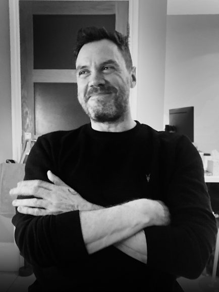
Daniel to The Look
In March, The Look will welcome senior colourist Andrew Daniel to their team. Daniel’s previous work includes All Quiet on the Western Front (recipient of the 2022 Academy Award for Cinematography and BAFTA Best Film) and Apple’s acclaimed drama series Hijack, directed by Jim Field Smith and lensed by Ed Moore BSC. Other drama credits include Patrick Melrose, Giri/Haji and just released Criminal Record. Feature documentaries include Bobi Wine: The People’s President, If These Walls Could Sing, Be Water, Tell Me Who I Am, the Oscar winning White Helmets and the Oscar Nominated Virunga.
Daniel joining the facility is anticipated to significantly broaden the scope of The Look’s creative services across high-budget feature films, documentaries, and television dramas. Andrew will collaborate with fellow colourists Thomas Urbye and Grace Weston, with support from Ollie Andersen and Sam Viner, alongside the growing team of 22 skilled professionals across The Look’s offices in London and Cardiff.
Daniel joins after a successful 2023 for the facility, projects included the series finale of Netflix’s Top Boy and Sex Education, BBC’s The Sixth Commandment and The Gold, and Channel 4’s Somewhere Boy and Truelove. The Look will deploy 12 new grading and online systems this year, hosted on a mix of physical and cloud based workstations, providing the ability to scale resources as needed.


