
Sense & Sensibility
Seamus McGarvey BSC ASC / Fifty Shades of Grey
Sense & Sensibility
Seamus McGarvey BSC ASC / Fifty Shades of Grey
BY: Chiara O'Scura
Fifty Shades Of Grey often gets raised eyebrows when mentioned, even among friends. Now, the steamy series, which spent more than a 100 weeks on the New York Times Fiction Best Seller list, with more than 100 million copies sold worldwide, will be shown on the big screen in all of its sensuous glory, writes Chiara O’Scura.
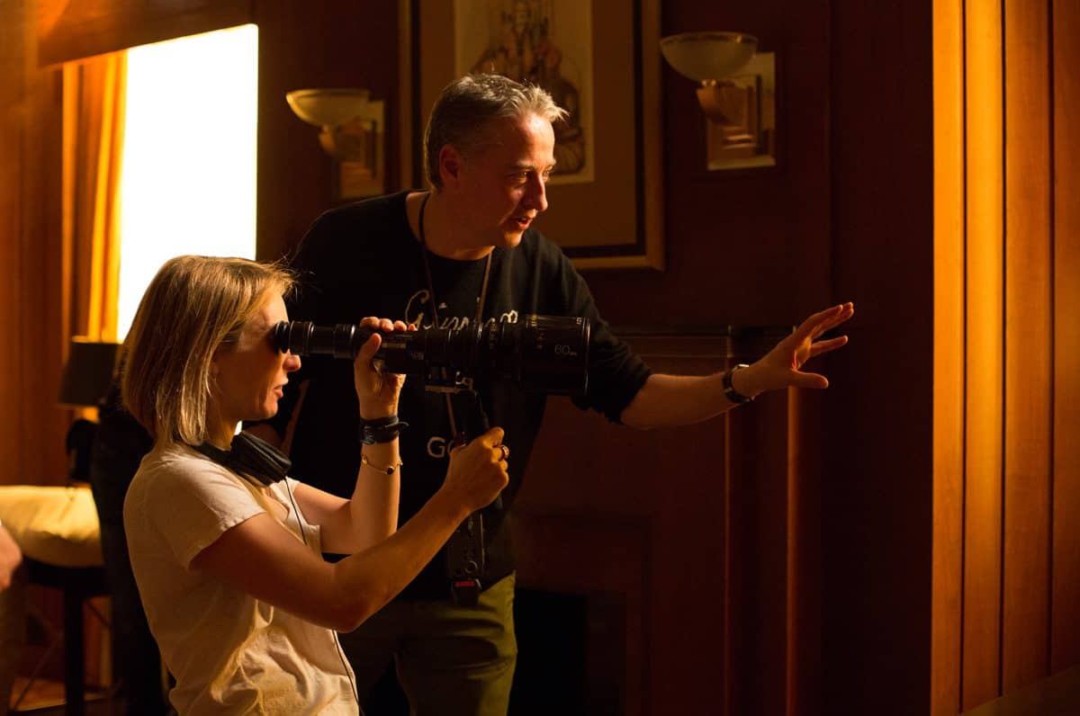
Cinematographer Seamus McGarvey BSC ASC wasn’t overly keen on signing on to the project at first, but his love of director Sam Taylor-Johnson and her reverence and sensitivity towards the controversial work, seemed to melt his fears away.
“I was worried about the sexual politics and how they would be portrayed in particular,” he said after his first full-length screening at Technicolor in Hollywood, “but it came out so well. Anastasia is given strength and direction, and Christian’s vulnerability matches the complexity of the film. I am so pleased with the final product.”
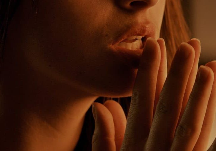
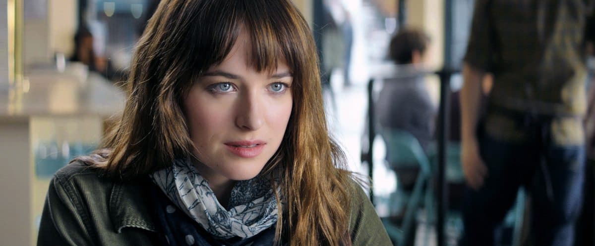
Fifty Shades Of Grey began as fan fiction by E.L. James – a story passed around in mommy groups online – but the fan fever caught fire and it rapidly became one of the top-selling series in publishing history. The story follows Anastasia Steele (Dakota Johnson), a somewhat naïve senior at Washington State University in Seattle, who’s asked to fill-in for her unwell friend to interview the mysterious world-class charmer Christian Grey (Jamie Dornan). Although BDSM (Bondage/Discipline, Sadism/Masochism) is a major part of the tale, it’s being hailed as a true love story at the core.
Here McGarvey discusses his visions for the movie, and how working with such sensitive content can be both unnerving and exciting.
When did you first meet Sam Taylor-Johnson?
SM: Back when she was Sam Taylor-Wood! Sam is one of my oldest friends and collaborators. We met about 25 years ago and have collaborated on short films, her art installations and photographic works, and our first feature together was Nowhere Boy in 2009.
What was prep like for this film?
SM: Sam and I talked minimally but effectively in prep. It’s not that we don't have that shorthand you get when you’ve worked with a director for so long, but we have known each other a long time and it’s not always necessary to get into the minute details in prep if you’ve got that rapport with someone already. We did talk in broad strokes about the feel of the film, gathering magazines and books and photographs that would inform our colour, texture and compositional balance.
In order to portray the BDSM world effectively, and even more beautifully than I actually found it in real life, we employed a BDSM advisor. There is a high-end and low-end world to this culture, and we were very much going for the high-end look – something you can’t just Google and find a picture of. A big part of my challenge was to make the scenes in the film beguiling, and perhaps relatable for an audience.
Did you use any visual references?
SM: We looked at some Bernardo Bertolucci films – not The Last Tango, but The Conformist and The Spider’s Stratagem (both made in 1970 and shot by Vittorio Storaro AIC ASC) in terms of colour and compositional references for the opening of our film. They’re both films we admire, and weren’t used directly, but just sort of a way of getting our mindset in the right place. At one point we did consider going a bit more experimental in the visual treatment of the sex scenes and looked at Francis Bacon and some of his more carnal images. His work did influence the colour of red we used, staying away from crimson and using a more blood red. Sam brought Ellen von Unwerth to the table as well, who is known for erotic femininity in her photos.
Central themes in this film are sex and control. How did you begin to see those two things visually?
SM: I think Sam was really trying restore a bit of control to the woman’s character. Anastasia does enter into a submissive relationship, but there’s damage in the Christian Grey character as well that is actually quite touching. Sam really wanted to play with that side of things, so that it wasn’t just ‘dominant male/submissive female’ all the time.
We looked at a bit of religious imagery as well, that Dolorosa tradition with artists like El Greco and Francisco Goya – they were obliquely influential. For the lighting we took some reference from a favourite painter of ours, Zurbaran. His paintings of monks in visions of ecstasy draped in exquisitely depicted fabrics are always a spur.
How did you begin to talk about the visuals surrounding those themes?
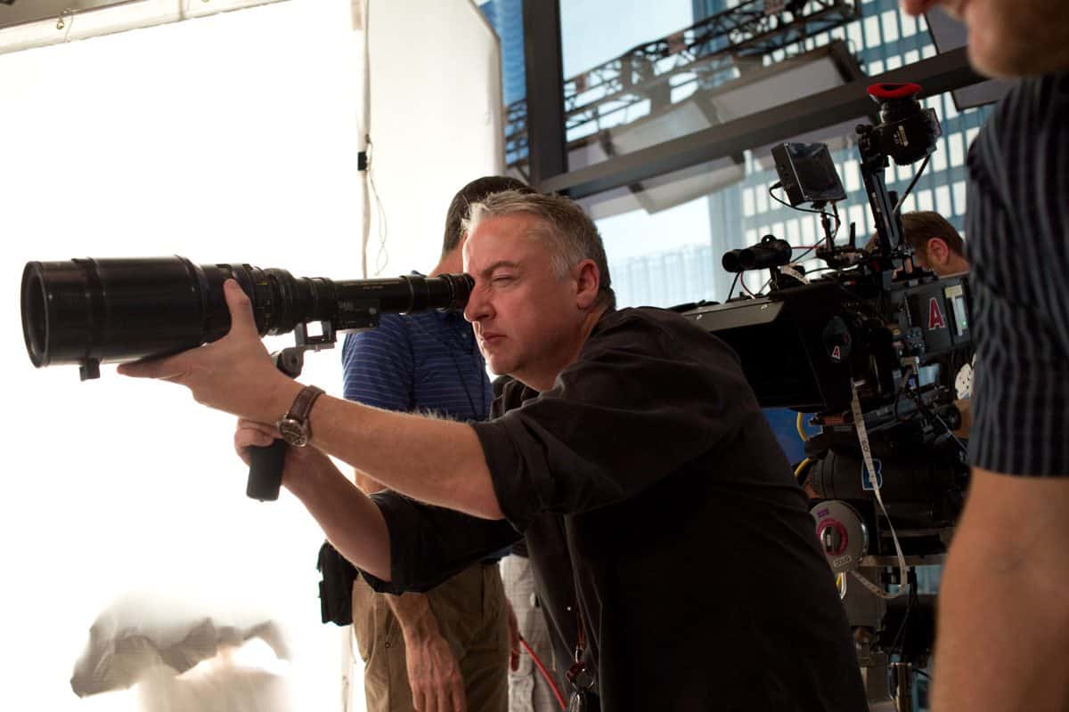
SM: I think the script brought more complexity to the story than I found with the books. My visual palette, so to speak, was quite a simple one for this film. In fact, it’s one of the simplest films I’ve ever shot, photographically speaking. I decided to shoot 2.35 Anamorphic so we could really stay in that negative space in the beginning – when Anastasia is a bit more naïve and Christian is still sort of an unknown, mysterious and unpredictable; we stayed quite wide there. We had the Panavision C-series – a great older glass made in the late 1960s – and I liked it wide on a 40mm or 50mm lens, pushing people to the edges of the frame. Compositionally, that space between the characters eventually closes up, and we’d often shoot on the 60mm. As we got into the Red Room, we used 75mm and 100mm, close in on their faces and bodies, still with a very shallow depth-of-field because of the Anamorphic frame.
Tell us more about the Red Room. How big a role does it play?
SM: The visual apex was always working toward the Red Room of Pain. We considered it a third main character really. I worked closely with production designer David Wasco to build the lighting into practicals. Sam wanted a lot of shots that were allowed to just develop and open up by following the actors, and the ambiance of the lighting was built into the room to help allow that. We had a grid above the room that we could move up and down, and we built softboxes with 150 and 300-watt practicals to create a soft ambiance. We enhanced that with hotspots of brighter light from some Lekos, and had spill light on the walls from ARRI 650 Fresnels, which had been designed with lots of cabinets and insets that were lit with MR16 Pars and Lekos to keep the background somewhat hot. David’s production design had a red theme going on with red silk fabric on the walls and red-painted panels, so we hardly used gels in there except for Cyan 60 every so often.
What were the thoughts surrounding shooting on digital?
SM: We were attracted to digital for this project because of the clinical aspect of the story. We had two ARRI Alexa XTs with Codex recording this time round, but Sam and I have only shot on film before this with our projects together, and she was a bit nervous of jumping into digital. We wanted the Red Room to have some obscurity and we didn’t want grain in the low lights, which is inherent for the Alexa. At the same time, we wanted to add a touch of organic character and the C-Series Anamorphics are a bit older and just beautiful glass for that effect.
Was there any gear or processes you used for the first time on this film?
SM: I’ve always loathed the challenges of a filming driving scenes with a process trailer. It’s just very cumbersome and time-consuming. I was worried about that, and recently I’d seen a few movies where they had successfully shot scenes with digital back projection. We worked with 24 Frames Digital Films in Vancouver, who then went to Seattle, shot plates and arrived back on set to film our driving scenes, which we did all of over two days. It was quite beautiful and painless – you can create reflections on the front windows, tune-up the effect, choose the angle and distort the angle of the screen to produce a different look, and the actors are all in a comfortable state. It’s just believable and controllable, and Sam was able to focus of the performance instead of worrying about anything else.
"We were attracted to digital for this project because of the clinical aspect of the story."
- Seamus McGarvey BSC ASC
What were some other important aspects of the storyline to capture visually?
SM: Christian’s world of richesse was high on my list. E.L. James was very fastidious about description in her novels, so it was always something I wanted to pay attention to as well. I know that blank space doesn’t sound visually enticing, but staying in that negative space we really wanted an austerity to show the control and order that’s in Christian’s life. Our colour palette was steely, and grey – if you will – definitely cooler. That first third of the movie is symmetrical and ordered, very mechanical with stiff dolly moves. To further play with those details, and because I had a conflict with Pan, Kramer Morgenthau ASC did a week of additional photography, where he also shot inserts of Christian’s tie, cufflinks, belts, and such, just to keep that attention to detail really present.
With art direction as well we had colliding elements. Like for instance, in Anastasia’s house, colour-wise it starts off with a lot of pastels and flowery imagery, still a bit cooler and softer. There’s gradually more contrast brought in to the frame, which also happens within her relationships. There is a girlishness and innocence that eventually gets tarnished as the relationship with Grey evolves.
How much effort do you put into creating capturing a shot in-camera versus depending on the colorist?
SM: Coming from the photochemical approach, I always try to do it in camera, both in terms of the gelling of the lights or even filtration on the camera itself. Having said that, there is a huge advantage to a Digital Intermediate, especially when you work with someone like Steve Scott [at Technicolor]. The fine-tuning only embellishes the image for the better. Another person’s eye can bring those little attenuations to the shape and feel of the light. That is not only shot-by-shot, but it really comes into its own during dynamic grading – i.e. changes within the shot as it moves. I’ve worked on quite a few films with Steve now – Love You More, Charlotte's Web, The Soloist, The Avengers, Godzilla – and he always brings an artist’s eye to it, but at the same time doesn’t overwork the image. I’ve noticed recently in some films that sometimes a DI can look overwrought. I hate when a film looks too messed around with or too interfered with. We went for enhanced naturalism on Fifty Shades Of Grey, hopefully with a bit of a psychological edge to it.