Temprimental VFX was responsible for all visual effects on Blonde led by Raoul Bolognini, owner, VFX producer/supervisor and Phillip Mosses, VFX supervisor.
British Cinematographer spoke to the pair about how to meander through several separate visual styles whilst keeping the VFX consistent and period accurate.
How did you collaborate with the cinematographer on this project?
As visual effects take centre stage in more films, it is customary for the DP and VFX supervisor to work together on shooting standards, lens selections and even camera setups. Many times, VFX can dictate a list of requirements to the camera department – to ensure usable material for all of the various departments downstream. Blonde, however, is not one of those shows. Rather, visual effects took a much more secondary and supportive role.
Personally, as a visual effects supervisor, this is the space that I prefer to work in. For a film like Blonde, there was a tremendous amount of forethought into the shots that director Andrew Dominik wanted, and yet I knew that the development of the image would be a process of experimentation and happenstance. Ana was giving Andrew such incredible performances, and DP Chayse Irvin ASC CSC was focused on delivering an iconic image with every shot. The last thing anyone needed was someone like me telling them what lens they can and can not use.
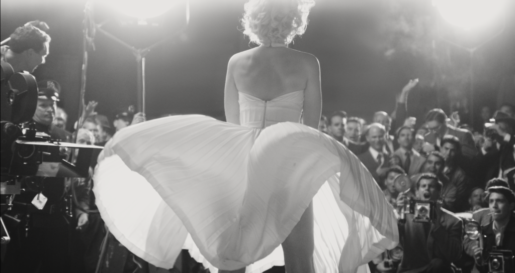
And in this case, with distortions and diopters in play, as well as Chayse’s beautiful work with the Cinefade, it was simply up to visual effects to make sure that all of our work would seamlessly flow into the final image. The result is that many steps in the visual effects process required a very custom and hand-crafted approach to match distortions, lens flares and defocus.
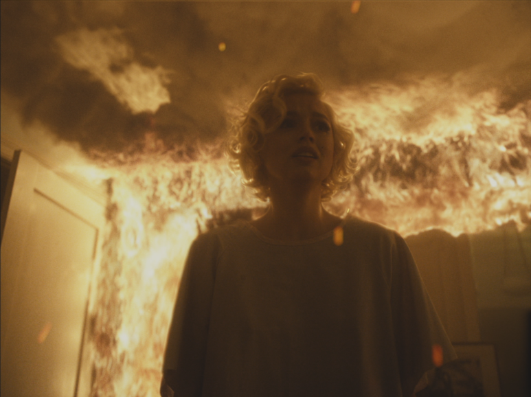
For shots where VFX took more of a prominent role, Chayse and Andrew would design the shots, and add interactive lighting for our effects. For the scene where Ana is in the burning house, they tried to give us an image that was as clean as possible (meaning requiring minimal roto where possible), but even then, they went in knowing that they had the freedom to shoot whatever Ana’s performance required. Watching the camera and Ana together was like watching jazz. Who am I to step in and say that they played a wrong note?
Were there any particular pieces of instruction from the Chayse Irvin ASC CSC that stood out to you when achieving the VFX style?
I don’t know if there was necessarily any instruction from the DP, but I will say that the most unique process for this film was the fact that there was never a plan for DI. With each sequence and every shot having a very unique look, as we switch from various frame formats, and from colour to black and white, Chayse designed the colour from his colour suite in the truck, and applied their colour, a grain pass, and a halation pass.
Normally, we will work with the raw footage, and then apply a daily grade (as a show lut and shot CDL), but then that would all get applied and/or changed in DI. In our case, we had a very specific CDL and LUT for each shot, yet we were not the keepers of the halation and grain pass. So many times, we would need to create an internal halation and grain (which would get applied on top of our work) later by EFilm.
This process added a lot to our overall process, but it was integral. So, as I mentioned before, it was an opportunity to be flexible and adapt.
For shots that were completely CG, as we would on any film, we worked with Andrew to achieve the camera motion that is in keeping with the film, as well as use of light and lenses. But even then, in this film, we are visually jumping from format and colour in such a dissociated way, that it ultimately gave us some freedom to establish our own, hyper-real take on some of our hallucinated visions.
Does your process vary depending on film type, colour and frame rate? What’s the most difficult format to impose VFX?
I think each format introduces its own unique challenges. For starters, just knowing what your final image format is going to be was sometimes like playing bingo, as shots and sequences would change formats throughout.
However, for this project, I would say that perhaps the black and white was the most tricky. Knowing that we were finishing in black and white was helpful, but we would need to make sure that our work would both integrate into the raw footage, but also translate into the final black and white colour choice that Chayse created.
Did the multiple visual styles in Blonde cause any difficulty?
I don’t think the multiple styles caused difficulty, but it was a challenge chasing the look – as opposed to having a cohesive visual language for the film. For Blonde, our visual language was a bit of a Tower of Babel, and it was up to the production team to keep all of the different formats and colours closely in-step with the finished shots.
What’s the key to achieving the appearance of large crowds using VFX?
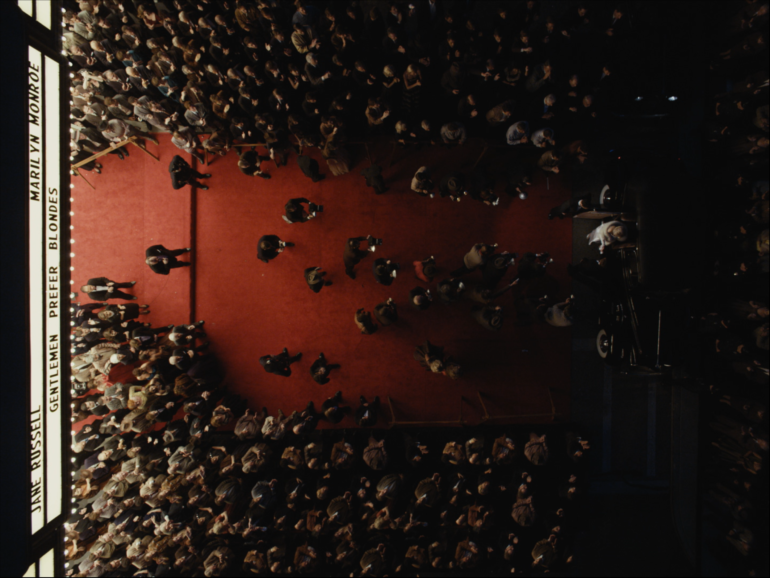
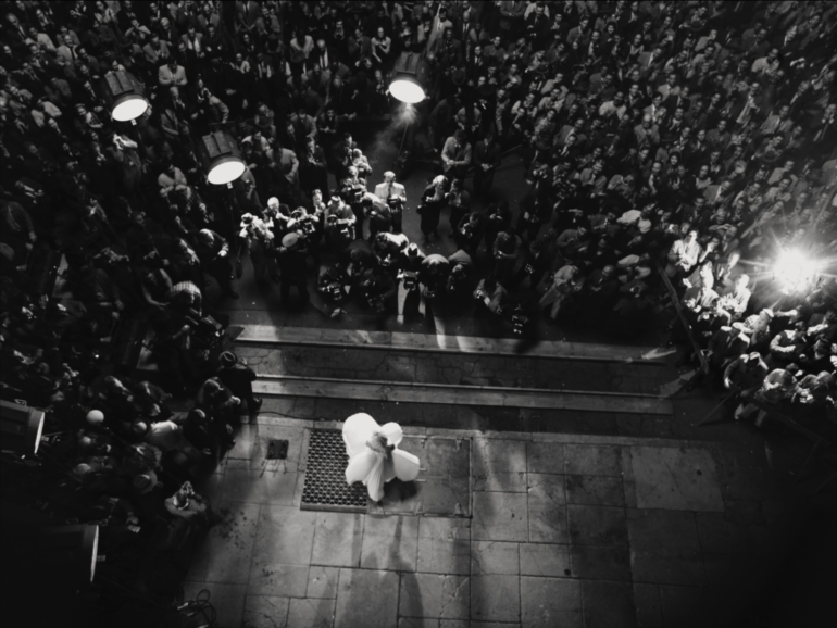
It really depends on what the requirements are for the shot. But in the case of Blonde, we worked really hard to create large crowds through multiple passes in VFX. In the top-down view of the iconic Seven Year Itch scene, we needed to move a crowd of about 150 people around the studio lot in a quick and efficient manner – and create a matching camera move. Our crowd needed to fire off flash bulbs (and be lit by them) as well, so it was a matter of devising a plan with the AD’s on set, and just running through all of the passes as quickly as possible. I think we managed to pull off all of those passes in less than 30 minutes or so, which was good, because like all good VFX shots – they are kept to the end of the day, and everyone was eager to wrap.
For our crowd duplications inside the movie theatre, the key to that working successfully was a consistent lighting cue from the screen. We pre-filmed many of the projected sequences (and added VFX to these sequences) mere days before they were due to play on set. Chayse then projected the images onto the screen so that the crowd would be lit with the actual footage (as opposed to cheating it in post). The result is that every crowd take needed to run through what would ultimately be over 5 minutes of cut footage. Then in the edit, Andrew could choose their moments and have all the pieces they need with matching lighting.
When applying subtle VFX to enhance a scene, or maintain period accuracy, how important is it to exercise restraint?
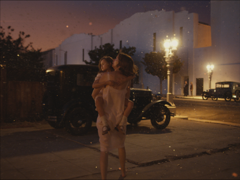
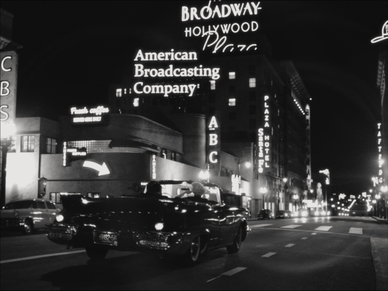
Having worked on many projects where period accuracy is important, the temptation is to go deep down the rabbit hole into recreation. There are projects where there is a time and a place for this, but the first question I like to ask about every shot is about the emotional context and purpose of the shot – and to design the environment accordingly. For example, our shots of Marilyn in the convertible – driving through downtown Hollywood – the purpose was not to showcase known and proven locations (although we did add original buildings from the time). Rather, the shot is an atmospheric memory, which allows us to play with layout and lighting, to create something that feels like downtown Hollywood. It’s a subtle difference to the approach, but it helps frame the process.
As for the question of restraint, this is many times a concern of budget. Therefore, it’s important to bracket the role of VFX by first achieving the emotional goal of the shot. And for the subtle work – light paint, or minor augmentation, restraint and realism really are the name of the game. The natural play of the light and the image is your bible. You never want to do anything that draws attention to itself. For that matter, there are scores of shots in this film that have visual effects that I’m pretty certain nobody knows about.
How difficult was the process of placing Ana de Armas into real scenes from Marilyn’s filmography? How do you approach these scenes?
I think these scenes were the most fun, as they were a bit of a dance between the production design and visual effects. For our All About Eve shot, where we see Ana onscreen with George Sanders, we basically recreated this shot with a set, background actors, and even a look-alike George Sanders. When the shot was originally conceived, we had no idea if we could use Sander’s likeness in the shot, so it was going to have to stand as a re-creation if necessary. But in Andrew’s mind, it simply HAD to have Sanders, and they were eventually able to clear his likeness. Therefore, to achieve this, it wasn’t a task of putting Ana in the scene with him, but rather putting George in the scene with her. He’s there as a head replacement only.
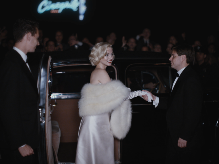
For our Some Like it Hot shots, these were carefully built sets that were framed up to play as split screens. We then needed to match the grain and film weave of the original footage, so she would fit right in.
What was the most difficult VFX sequence in this project?
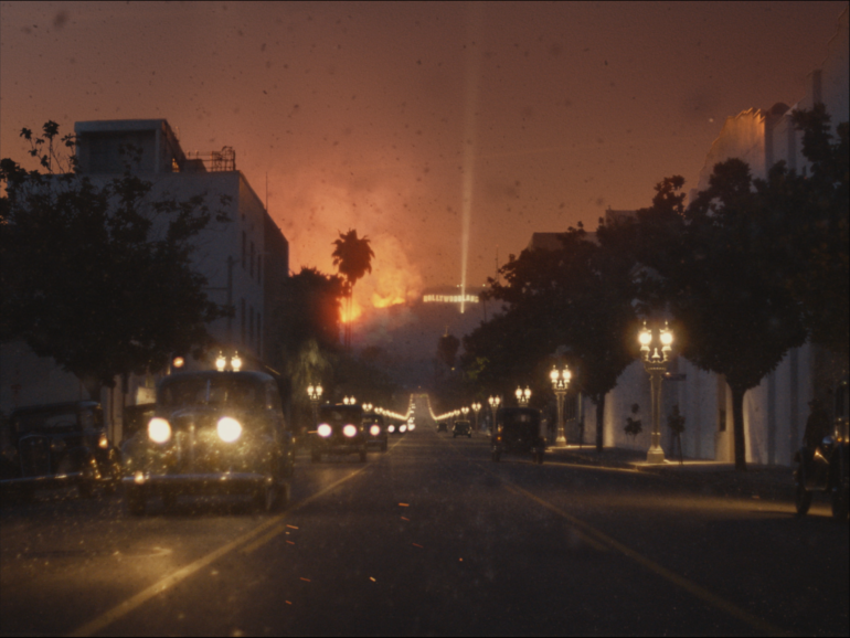
I think the most difficult were either our fire sequences (on the road, with little Norma Jean) or in the house. In all of these instances, we were prohibited from using any fire on set, so Chayse needed to create all of the lighting that we see in our practical smoke, and we needed to add the flames. It was a choreographed placement of practical lights, and then augmenting with CG smoke, flames, and embers.
What is your favourite piece of VFX in this project?
For some films, this is an easy answer, as there’s always the “meat and potatoes” shots, with a few crowning moments. However, in hindsight, there were so many unique visual moments that were all so distinct from each other and so technically bespoke that this question eventually becomes the equivalent of asking a mother which of her children is her favourite. I know that’s not the answer anyone wants, but the more I’ve been asked this question, this is ultimately where I land.
How did you go about reconstructing the scenes containing the NYC of the past?
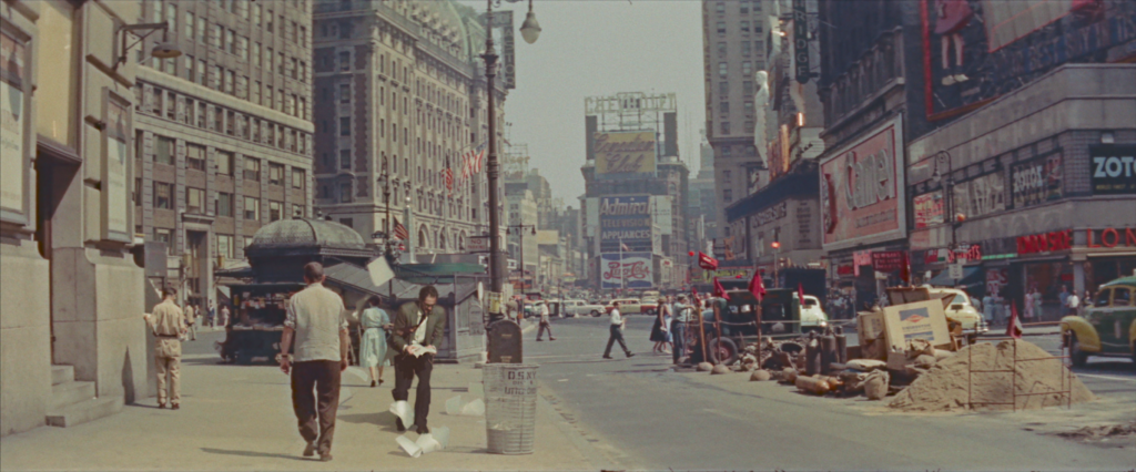
There’s really only a handful. When the Playwright (Adrian Brody) is walking down the NYC street, this was a case of finding a piece of stock footage, which we then matched camera angle and lens (to the best of our ability), and put him into the shot – complete with practical and CG flying papers. Because our film is shifting its look so much, this is an approach that we could take that saved a tremendous amount of money. Recreating period New York city is so much easier when you don’t actually have to recreate New York City.
For the shots where Adrian encounters the giant billboard of Marilyn, this was filmed in downtown Los Angeles, and we contained our shot to be in an alleyway that reveals a giant building. This marquee and sign is a over-sized recreation of some very specific imagery from that time period, so it became a matte painting with a few building replacements.
The VFX Marilyn Monroe billboards feel particularly textured and tangible. What was the process in achieving this?
Thanks! This was a particular goal for these billboards. The livegrain and halation that Chayse designed for these shots really did a number on that type of detail, so it was very important to get those shots to read that information.
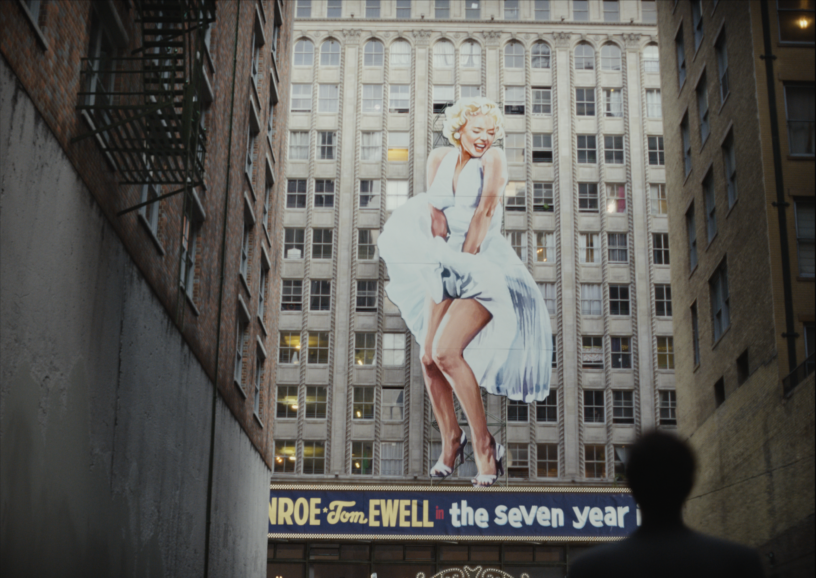
For Andrew, it was important that anything and everything – wherever possible – to be an actual element that was photographed. It would have been easy to simply take those billboards as a digital asset and treat them in the 3D or matte painting to look photo-real. But in the case of these, the art department printed out billboards on a smaller scale, which I then photographed on set in our lighting. In some cases, this was the asset that we used in the shot – and in other cases, this was used as key reference for us when lighting our 3D environments.
Finally, as I said, the halation pass would rob our image of a lot of these small details, so we had quite a few iterations of wedging an increased amount of contrast on those elements so that they would finally read once the final looks were applied to the shot.
Is there anything you learned from this project that you’ll take onto every project going forward?
Absolutely! A lot of productions approach giant movie screens the same way they would treat a giant television composite – where the interactive lighting of the projected image is cheated by the compositor. However, shooting these crowds with the actual images being projected – with multiple passes bracketed for exposure (both on the crowd and for the projected image and reflections) resulted in a far more realistic and grounded result. The preparation for this approach, and the time spent on set might not be realistic for every film, but I will certainly advocate for this approach moving forward.
Additionally, and I’m not sure it’s something I learned on this project, or if it’s something that this project reinforced – it’s the idea of knowing when and how to support the director and DP’s vision. On a visually experimental and stunning work like this, it’s important for VFX to know it’s place and to remain flexible. This is counter-intuitive to visual effects, as there’s rarely a department where “know the plan and shoot the plan” is more important. But we were able to work really well in this pipeline. This is not to say that our needs and concerns weren’t respected or heeded. When we were truly pinched, Andrew was accommodating and understanding. The result was a very healthy give an take in the process.
