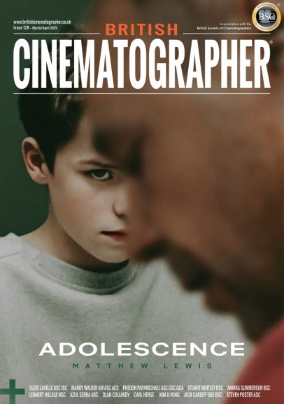
A SHOT IN THE DARK
Cinematographer Linda Wu reveals how OK/NOTOK used a single locked-off camera position to tell a near-future story of tolerance and human connection.
Please share an outline of the production?
OK/NOTOK is a dark comedy-drama set in the near-future that plays like “science fiction Mike Leigh” told from the perspective of a working-class British Asian woman. The film is stylistically bold in the simplicity of a single shot but is infused with detail inviting viewers to lean forward and engage.. At its core, the film is about tolerance – who we shut out and who we let into our weird little worlds.
How different was the productionfrom previous projects?
OK/NOTOK was unique. The very first line of the script dictated that the camera would be locked off throughout the whole film. Knowing that shaped the creative approach; our conversations weren’t about shots but about how we would show the passage of time and the changing dynamic between the characters all from this one perspective.
How did director Pardeep Sahota articulate what they were looking for?
Pardeep had made an incredibly detailed treatment – which had all the ideas he was trying to convey and all the references he had in mind — which became the starting point of our dialogue. While the film is sci-fi in genre, Pardeep didn’t want the film to look like an obvious sci-Fi film; he wanted the look of the film to give away nothing so that when the audience finally learns the truth about Zane it’s a surprise.
How did you decide upon the visual language?
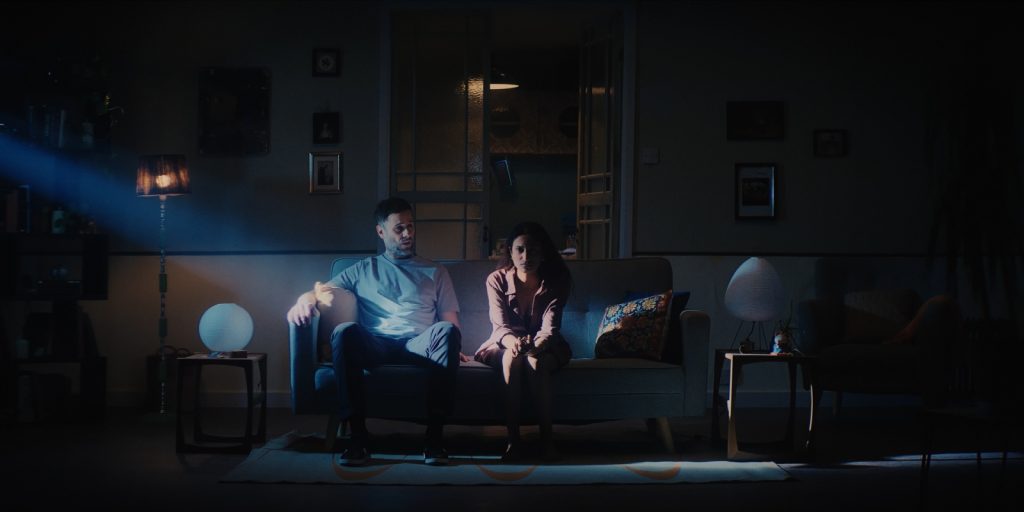
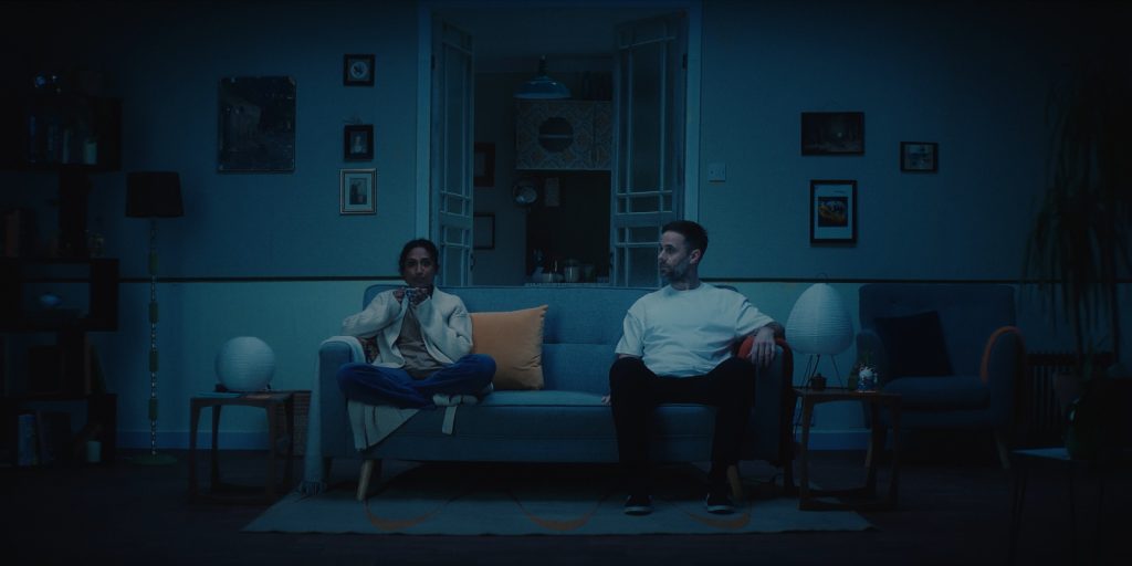
Pardeep had been sitting with this idea of a fully locked off camera since before I joined the project so a lot of what we talked about from the beginning was what else we could do to visually convey the story and atmosphere. Embracing this limitation, I realised that it would be all about lighting on this one. We started by talking about how Loretta and Zane’s relationship changes over time. I asked Pardeep what time of year their relationship starts and what the weather and light should be like at every scene in their relationship. This led to some interesting conversations about the kind of light that we associate with each season and we realised how simply lighting a scene to feel like a certain time of year or mood could convey so much about the relationship between the two characters. We developed our own shorthand for what each season looked like lighting wise and went through the script deciding what lighting suited the mood at that point.
How did you go about devising the shot list?
The very first line in the script read like this: “NOTE: THIS FILM IS SHOT ENTIRELY FROM A LOCKED OFF CAMERA. “EACH CUT COMES AT EVERY SCENE CHANGE,” so shotlist wise there wasn’t much to do. Pardeep had storyboarded every scene so as to better convey the physical blocking, but really, the film is all one shot from a single locked off position. With this restriction imposed on moving the camera and lens size, I enjoyed examining deeper the remaining tools of cinematography: learning how to convey this story through lighting and blocking alone.
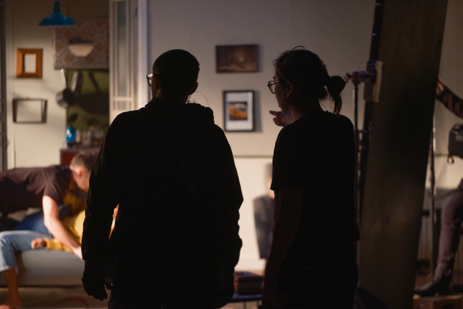
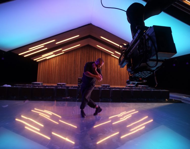
Wu learned how to convey the story through lighting and blocking alone (Credit: Marlon Nico Thomas)
What cameras and lenses did you use and why? Who supplied them?
I used a Sony Venice 2 and a beautiful C-Series Anamorphic 50-95 zoom from Panavision. I had done a lot of thinking about the lens, as I could only choose one, and in the end after a lot of testing opted for a 2x anamorphic lens. I wanted the photographic quality of a longer focal length that would compress the background a bit more and help our set feel a little more grounded in reality. I also needed the width that an anamorphic could offer so that our two actors had ample space to move around. I also wanted something that had a bit of character; that would react to the changing light in the room as I felt that would help give the image a liveliness that may otherwise be absent with a locked off camera. I had initially experimented with mounting the anamorphic vertically on the venice sensor, but that proved to be quite complicated and our post pipeline couldn’t really handle it. I then moved on to testing lenses that, when cropped for a 2:1 aspect, would still retain their character. The C-Series 50-95 with the resolution of the Sony Venice 2 proved to be the winning combination. The lens being a zoom also gave me a little bit of flexibility on the day framing wise.
How did you go about devising the lighting schemes and what fixtures did you use and why?
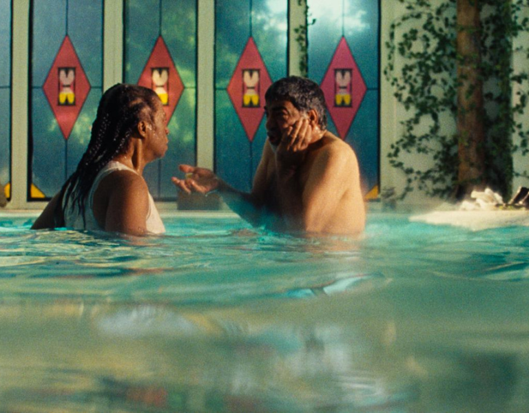
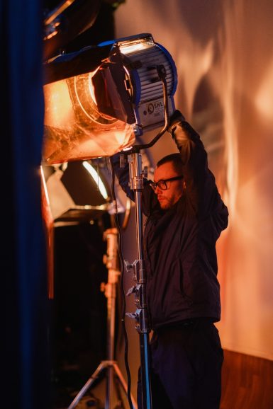
I worked with my gaffer Mark Laneto devise the lighting on this one. Mark and I had a long conversation about how to translate everything Pardeep and I had talked about in terms of lighting and seasons and what that actually looked like. Working from there Mark put together a package that consisted of a Litemat Auroris as well as 12Ks and 5Ks which would allow us the flexibility to create the different lighting scenarios desired so that each scene could convey the sense of passing time. We used the Auroris as an overall ambient and then brought in the 12k and 5ks through the “windows” to create a sense of the world outside.
What challenges did you encounter when shooting the project and how did you overcome those?
My challenge was creating so many different lighting looks whilst making sure that each still felt individual in such a short span of time. We had two days to shoot over 20 scenes, each set at different times in the year. I think it was a combination of planning and teamwork — across production design, the AD team, and lighting — that we were able to pull it off.
How did you decide upon the colour palette and LUTs?
The colour palette was fairly evident from Pardeep’s treatment. I had suggested the idea of a green wallpaper. I love green and think it’s such a versatile colour; it can be both sickly but also suggest growth and tranquility. We worked together with Elle Mikola, our production designer, to work everything into a cohesive colour palette that felt timeless so as to not place the film specifically into one time period. This felt important with Pardeep’s brief of a unique domestic sci-fi.
Was there much in way of changes in the DI and which colourist were you working with?
Nathaniel Skeels was our colourist on this one. Nate and I have worked together on a fair few projects so have a great shorthand and he understood the approach to this one from the get go. The look of the film was largely set on set — with the strong lighting and colours being present from the get go. Nate refined the look and also brought in some shaping — something I was looking forward to developing in the DI throughout the whole project.
Is there particular shot or sequence you are most proud of?
I am really proud of the scene where we imitate a police helicopter light coming in through the windows. Pardeep had always storyboarded that scene as such — with harsh dramatic lighting coming in through the windows. I mentioned to Mark that it would be great if it could move and feel as if it was coming from above — like a real helicopter searchlight; suggestive of the dystopian world outside Mark managed to get a mover and the team rigged the whole setup onto a dolly and some apple boxes and the result speaks for itself.
