Light Iron colourists Ian Vertovec and Ethan Schwartz detail the big-screen look of the FX series The Old Man.
The FX original series The Old Man stars Jeff Bridges as the eponymous lead, former CIA operative Dan Chase, whose off-the-grid existence is rudely interrupted when an intruder breaks into his home. The confrontation sets off an epic game of cat and mouse, forcing Chase to go on the run as multiple parties seek to either bring him in or take him down.
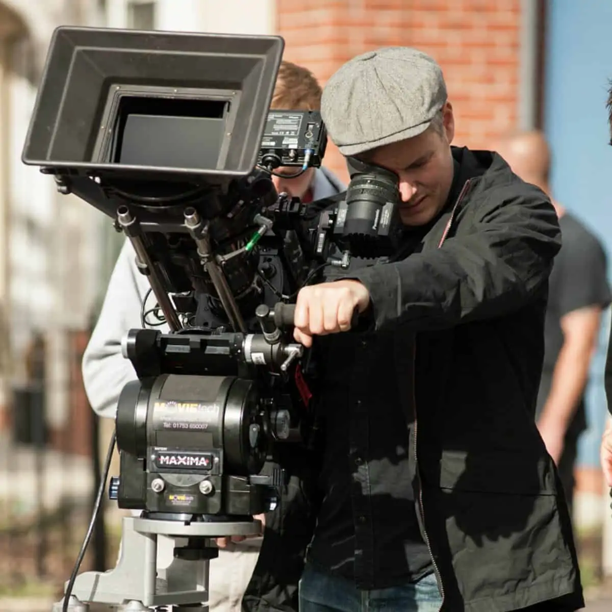
Sean Porter served as lead cinematographer for the series’ first season and shot four of the seven episodes, with Jules O’Loughlin, ACS, ASC and Armando Salas, ASC handling the remainder. Production on the series began in 2019 but was then delayed first by the pandemic and then when Bridges had to undergo cancer treatment. With the star’s cancer in remission, production resumed and was completed earlier this year, in 2022.
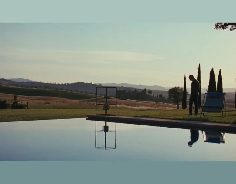
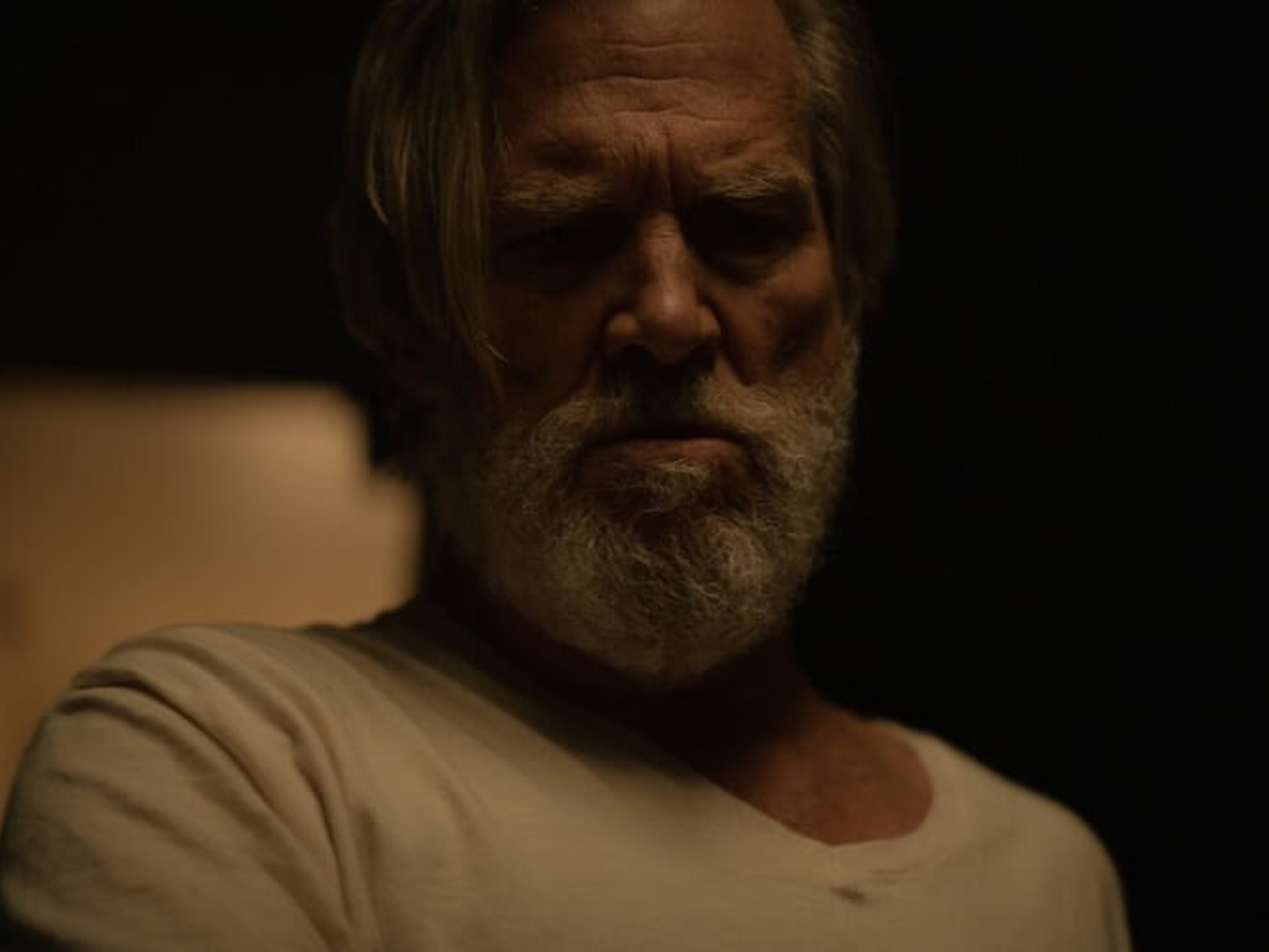
Back in 2019, in advance of the original start of principal photography, Porter and series producer Allen Marshall Palmer met with Light Iron supervising colorist Ian Vertovec to establish the look for the show. “Sean knew the look he wanted,” Vertovec recalls. “It was this rich, colorful, natural look, with more contrast than I expected. A lot of our conversation was about finding this dark level of contrast where there’s a real richness to this world. We set the look with some camera tests, and then after a week or two of production, Sean came back and we worked on some scenes they’d assembled. Then Sean had to finish shooting, so we stole time together where we could find it. I took Sean’s concepts and worked with that through the first four episodes, and then we had our first pause.”
When production eventually resumed, Light Iron senior colorist Ethan Schwartz picked up the baton, grading the final three episodes and seeing the series across the finish line. “Ethan and I have collaborated on a number of shows,” Vertovec shares. “He colors What We Do in the Shadows now, and I did Season 1. We both colored on the show Utopia. So we’ve handed off a bunch of times.”
Schwartz adds that when he took the reins on The Old Man, “I watched all four episodes Ian had colored, which helped me get a feel for the show and understand the story and its emotional impacts. I was able to see how bright or dark Ian was making certain scenes and how he was achieving those luminance levels.
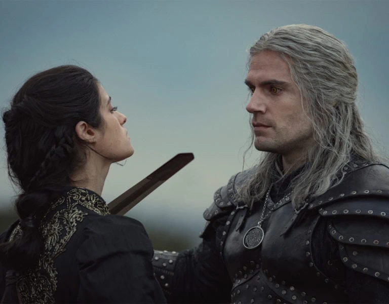
“I was using the same show LUT that Ian built in Baselight, where it was broken out into its raw form, which makes it really beneficial when grading,” Schwartz continues. “It meant that I could turn off specific aspects of the LUT depending on what the scene called for instead of having to find a new LUT. We wanted to keep the skin tones nice and even but also filmic, with a bit more richness and warmth, and the black level at a dark enough place without crushing anything out, so you get really nice shadows and roll-off. The Old Man lives in this cinematic, dark world, but we didn’t want it to be muddy. We wanted it rich, with really strong colors, but without it being poppy. We didn’t want it to feel like a TV show.”
“The colors are more natural and less ‘film muddy,’” Vertovec agrees. “You really notice it when police lights go off. It feels very true and very real, like there’s not so much of a ‘look’ on it.”
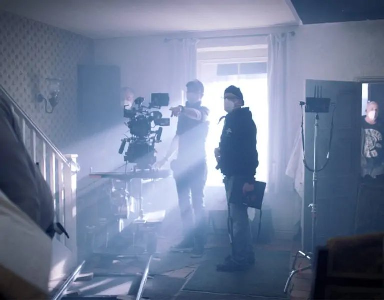
One of the series’ distinguishing characteristics is its pacing, highlighted by the regular use of long, single takes. “I was always blown away by the tone and the pacing of the show,” Vertovec offers. “One of the big challenges of the grade were these long takes that go through the scene and wrap around the action. It can get a bit more complex when you’re juggling all these layers and trying to hide transitions of color, tracking windows for minutes at a time with no cuts.”
When it came time to begin grading the first episodes back in 2019, the studio wasn’t asking for an HDR deliverable. Nevertheless, Vertovec suggested a Dolby Vision workflow, working natively in HDR while simultaneously reviewing the SDR trim. “That way we would have both versions, and I actually find it’s easier [to grade natively in HDR],” Vertovec explains. “Now it’s more common, but three years ago it wasn’t as normal. We were lucky we did it, though, because now they do want the HDR deliverable.”
During the grade for the final three episodes, Porter has collaborated remotely with Schwartz, helping “to make sure everything’s falling in line with the established look,” Schwartz notes. “The biggest thing is that it needs to feel like you’re watching a film, not a TV show. Maintaining the audience’s attention and keeping them really focused on the story is the primary goal. That’s the goal for almost every project, but particularly this one because of the action. You want to make sure everyone is engrossed when you get to those points, because they’re really intense.”
