VOYAGE TO NEW LANDS
Interpreting Frank Herbert’s epic sci-fi novel Dune for the screen saw a team with imagination and tenacity unify to present a shared vision of an otherworldly adventure. Some of the many involved included cinematographer Greig Fraser ASC ACS, director Denis Villeneuve, visual effects supervisor Paul Lambert, production designer Patrice Vermette, colourist David Cole, and gaffer Jamie Mills. They reveal how they transported the audience to the mysterious Dune universe Villeneuve has dreamt of exploring in cinematic form since he was a teenager.
“The appeal of a production is almost always the story and the people you work with, and Dune was no exception,” says cinematographer Greig Fraser ASC ACS, recalling the exhilarating voyage of world-building he embarked on with director Denis Villeneuve to tell the first part of the epic story that unfolds in Frank Herbert’s 1965 science-fiction novel.
Set in a distant future, when humans have colonised planets throughout the universe, Dune focuses on the Atreides family – the rulers of the ocean planet Caladan – who take on the stewardship of Arrakis, a hostile desert planet with valuable resources of the spice drug melange.
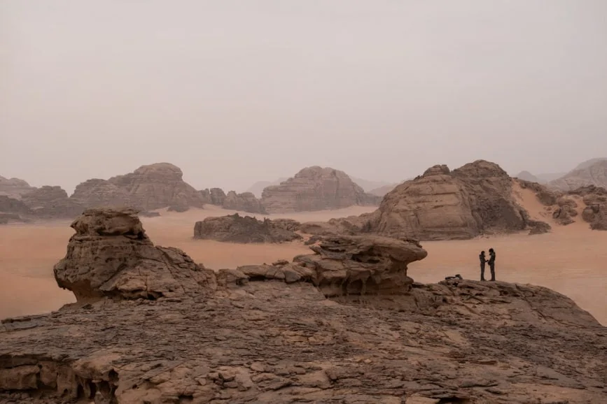
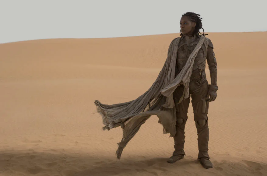
When Paul Atreides (Timothée Chalamet) and his parents Duke Leto Atreides (Oscar Isaac) and Lady Jessica (Rebecca Ferguson) arrive on the planet, Leto attempts to safeguard it from an attack by their rivals the Harkonnens – led by Baron Harkonnen (Stellan Skarsgård) – by enlisting the help of Arakeen desert natives, the Fremen.
Villeneuve wanted Herbert’s book, which had captivated him as a teenager, to be the primary source material. “The film had to stand alone as its own piece, but I was very much using the book, script, and Denis’ vision of the world to shape my opinion of how the story could be told visually,” says Fraser.
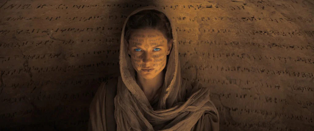
It was also important to highlight the role of the Bene Gesserit – a powerful and sacred sisterhood with supernatural powers. “The first steps were to focus on the female aspects of the novel,” says Villeneuve. “Women are at the epicenter of the story but under-represented in the novel. Herbert’s feminism is one of the great qualities of Dune and I wanted to make sure it was at the forefront of the film. This is the key with which I have chosen to open the door to this adaptation. The Bene Gesserit Sisterhood feels like one of the most fresh and powerful ideas from the novel.”
Subscribe to our mailing list to continue reading
Keen to approach every production anew, Fraser submerges himself in the visual language and story, casting off ideas or techniques used to create previous worlds. “Denis is one of the most amazing contemporary directors and it was a joy to help build this world with him and the team,” he says. “He has a strong vision but is also very open to collaboration, enjoying the relationships that develop from that.”
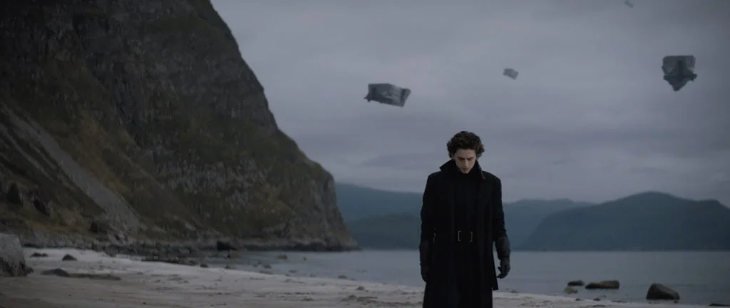
When deciding how cinematography would support the intricate narrative and help build environments, Villeneuve and Fraser began by examining the two worlds they needed to craft. “They are as distinct as you could find,” says Fraser. “Caladan is a rainy, lush planet whereas Arrakis is an extreme, hot, desolate place with a magical mystery to it.”
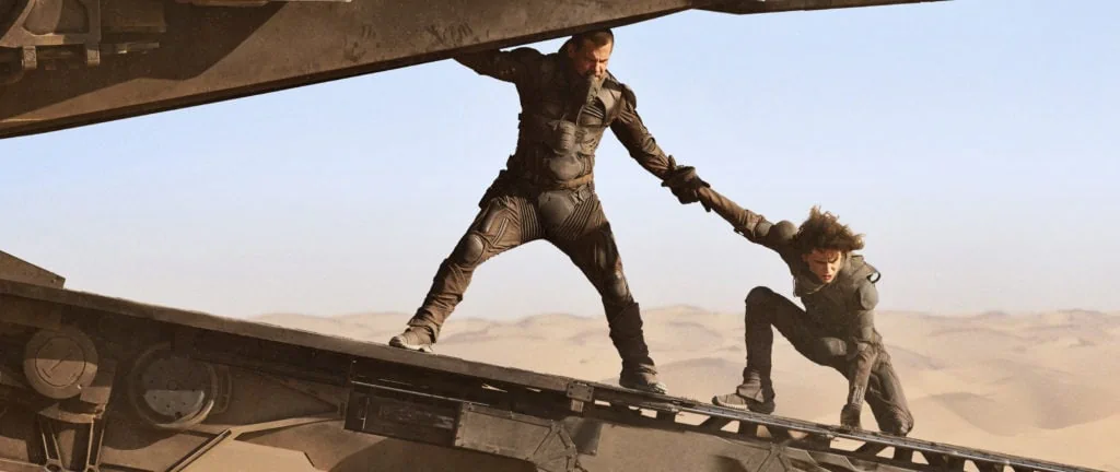
The relationship between humanity and nature also needed to be conveyed. “I tried to rediscover that feeling of melancholic isolation that I experienced while reading the novel. Greig and I also sought to capture the harshness of nature, moving away from its beauty, and aiming for its spiritual power. In Dune, God is nature. Biology is religion. We aimed to embrace nature as it is, and we tried to avoid embellishing it,” says Villeneuve.
“We tried to bring humanity back into the ecosystem. Humans take comfort in thinking that they dominate the elements, but Herbert suggests that we are part of the whole. Greig and I tried to bring humanity and its relationship to nature towards more humility.”
Supporting the story
Having marvelled at Patrice Vermette’s previous collaborations with Villeneuve on films such as Arrival (2016), Sicario (2015), and Prisoners (2013), Fraser was elated to immerse himself in the creative process alongside the “master production designer”, drawing valuable lighting and mood inspiration from his team’s “extraordinary work”.
Vermette approaches every movie in a similar way, believing the design should primarily support the storytelling in an atmospheric and subliminal way. “I try to find the meaning of a scene and the feeling the audience should get when watching it before drawing anything,” he says.
For this project, he reread Herbert’s book before reading the script to “revisit the roots and rediscover those worlds” that were “so rich with ideas and details”. He felt the visual language should be grounded in realistic settings to make the audience believe in the more extraordinary elements. “We found the right balance within a less is more, crude and basic approach,” he says. “Architecture and design should be a response to the nature of the landscapes.”
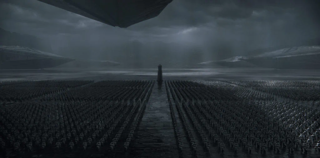
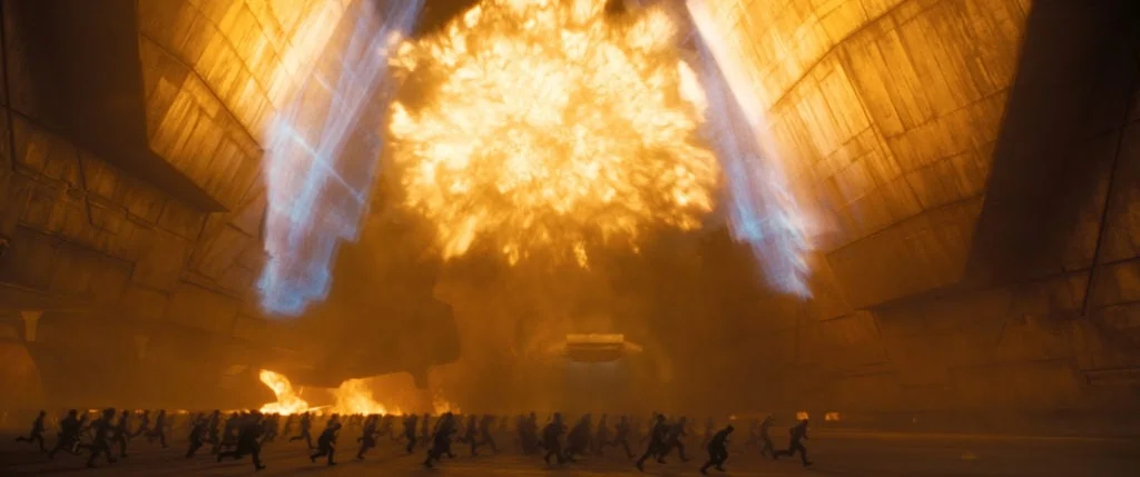
The planet Caladan needed to “convey the idea of melancholia” as well as “a harmony between nature and the architecture”. In contrast, Arrakis should be extreme and look as harsh a place to live as the book had described. Conveying Paul’s drive and desire to explore this otherworldly place was also a priority. “Paul has that adventurous, wandering spirit and we needed to cinematographically combine those ideas of this young man with a wanderlust and this harsh, magical land,” adds Fraser.
In the book, colonial entities try to show their power through the architecture. “Frank Herbert refers to the Arrakeen palace as the largest residence ever built by humans,” says Vermette. “Thick walls would help keep the interiors cool and light wells would be integrated with the structures to avoid direct sunlight.”
Vermette began designing the worlds of Dune seven months before official prep began. Initial sketches were transformed into 3D models which key frames were taken from. Photoshop paint overs were then executed to create multiple views of each setting.
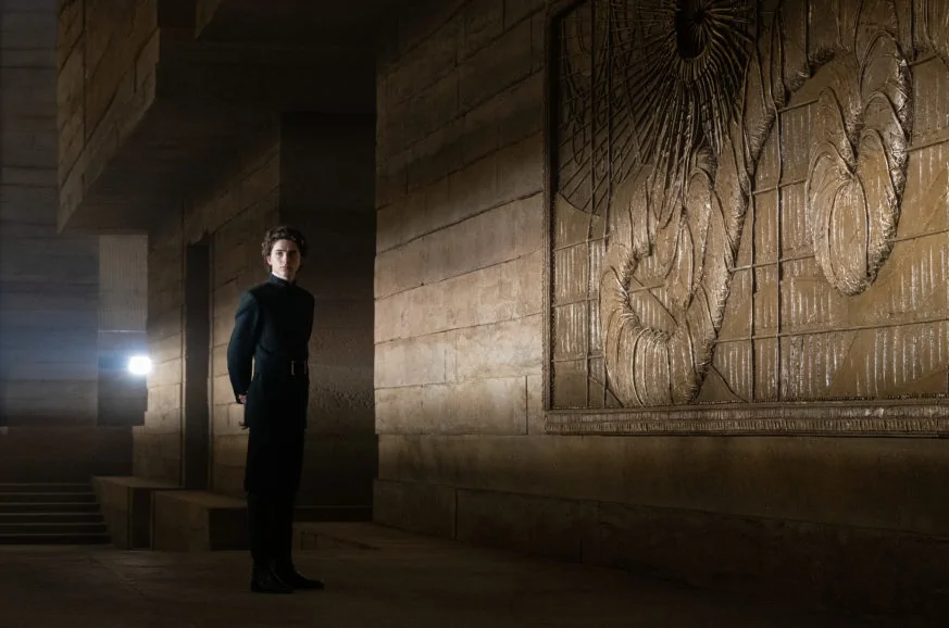
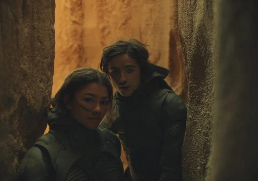
“Denis wanted a distinctive look and encouraged everybody to dig deep in their imagination to create this world,” says Vermette. “We worked on the lighting and atmosphere in those concept illustrations. Once we had the thumbs up from Denis, we assembled an illustration bible containing over 150 images of sets, ships and props by the time pre-production started. Denis used this to inform all departments of the journey we would embark on.”
At the beginning of that period, Vermette worked with concept artists including Deak Ferrand; Sam Hudecki; Aaron Morrison; and Georges Hull, who were later joined by Greg Tozer; Jeremy Hannah; Collie Wertz; Peter Popken; and Kamen Anev. Vermette and Villeneuve wanted the illustrations to be as precise as possible as they would be key to informing everybody in the crew and ensuring the designs followed through to make it onto the screen.
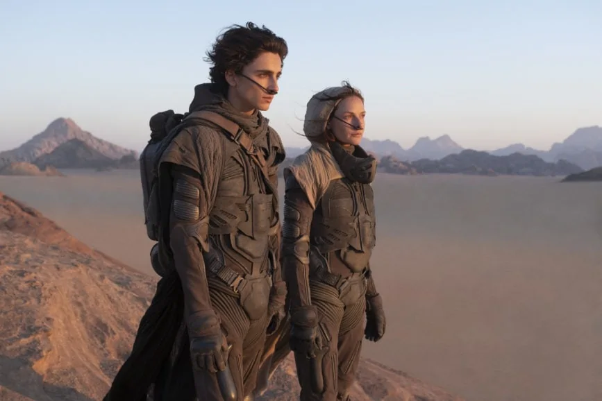
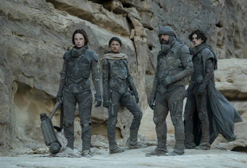
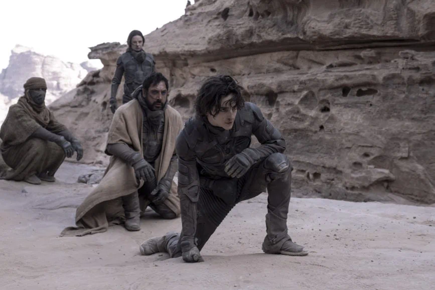
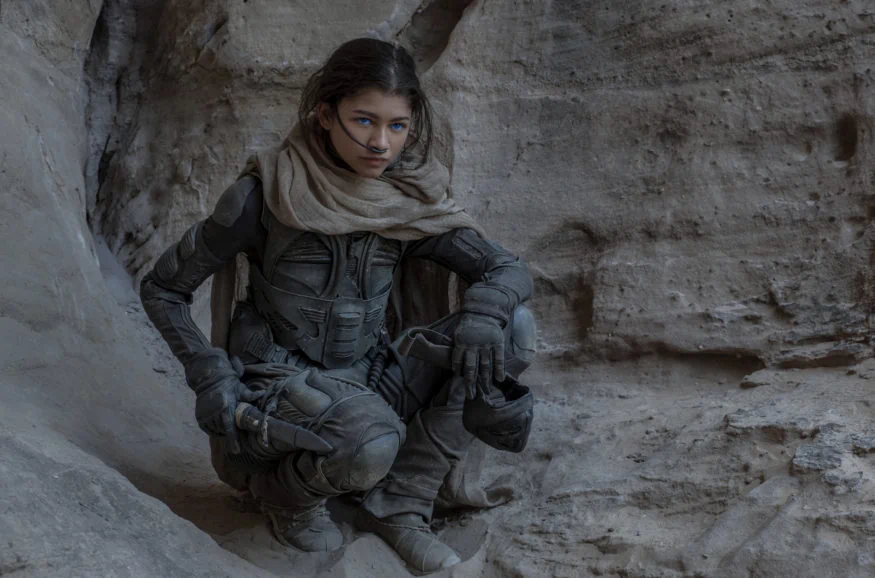
“The models made in the process became assets used by the art department to make building plans, allowing those in the previz, VFX, and cinematography departments to better understand where the light was coming from,” says Vermette. “For Denis and I, this became a new way of streamlining our ideas and I have been carrying on with this methodology ever since.”
An extensive period of storyboarding in line with Villeneuve’s love of experimenting with sequences was also integral to the evolution of the distinct planets. “Realising the film through creative discussion was fun and the resources available allowed us to storyboard in detail and previz entire worlds in 3D,” says Fraser.
With the visual plans in place, scouting commenced in Jordan and Abu Dhabi – where all exteriors were captured on location – and in Hungary where all the interior set builds took place. The overriding aim was to maximise the resources available at each location to create the greatest impact with every frame.
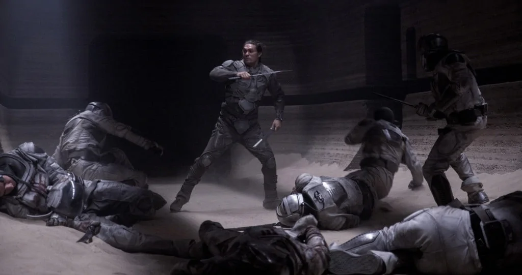
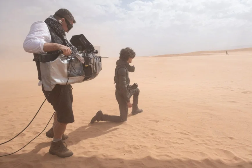
The filmmakers viewed Arrakis and its sand dunes almost like oceans, playing with the creation of that land in broad brushstrokes. “It came down to how much of each desert sequence could be achieved in each location,” says Fraser. “Some exterior scenes could not be captured in Abu Dhabi due to us choosing not to take the people or infrastructure required. Our Jordan unit, on the other hand, had more infrastructure brought along in terms of lighting and wind effects needed for some larger elements of the story. Some sequences could only be shot in the backlot we built in Hungary where our mechanical and construction infrastructures were.”
While one of Fraser’s previous sci-fi productions, The Mandalorian, employed virtual sets and production techniques in the world building, a practical approach was adopted for Dune. The cast and crew often ventured out to the middle of the desert at 3am to wait for the sun to rise so they could capture the perfect shot. “If we get the opportunity to continue telling the story of Dune in subsequent films, we may incorporate more virtual shooting,” adds Fraser.
The complete experience
Format helped accomplish the filmmakers’ visual goals for Paul’s journey, utilising IMAX at points when he sees this new world and mysterious place he has dreamt of. IMAX allowed Fraser to open up that world and is why he would encourage audiences to see it in IMAX, if possible. “This film is fundamentally made to experience in the dark expanse of a cinema,” he says. “We had the scope and scale but also needed to pick up on the nuances of the characterisations – the big screen is the best way to appreciate that.”
When crafting the Dune universe, ensuring audiences could enjoy the full IMAX experience was essential. “Denis told me early on that he’d dreamt the movie in 4:3,” says Fraser. “It was an unusual comment and I never expected him to say that based on the source material as 4:3 doesn’t instantly stand out to me as being big. But when you start to move into the IMAX world, 4:3 is epic in scale.”
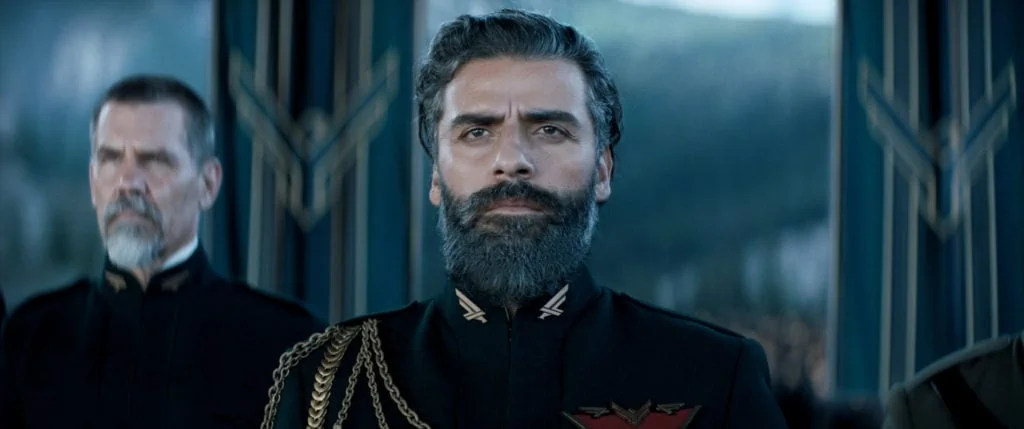
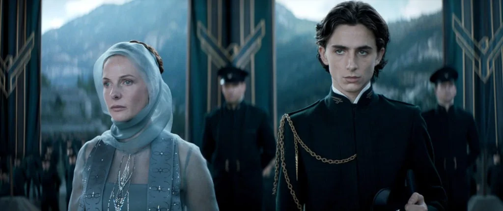
Fraser realised that much like Paul’s visions of Arrakis in Dune, Villeneuve’s imagining of the world being at its most immersive in 4:3 was accurate. “It’s tricky to shoot an entire movie in 4:3 because it’s not always most conducive for the big screen experience in places that don’t have IMAX, so we needed to make sure we made the film for as many people as possible,” adds Fraser. “We were mindful that 2.39:1 was a format most people would experience the film in, and we needed to guarantee those who only have access to local theatres could still experience it in all its glory.”
Assuring this was accomplished required some additional work in post from visual effects supervisor Paul Lambert (Blade Runner 2049, First Man) and the team at DNEG. “Dune was filmed with the Alexa LF as the main camera – shooting the full frame IMAX 1.43:1 aspect ratio, but then also 1.65:1 anamorphic using the same sensor, just expanded out,” says Lambert. “We were quite gung-ho about using the IMAX frame at first and it was great until we got to the edit and had to make a 2.39 version of it.”
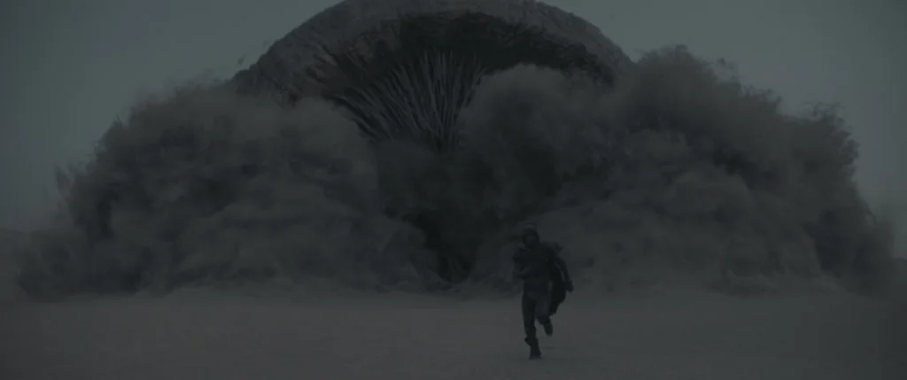
One shot in particular – when Paul is at the bottom of the frame as the sandworm rises – required complete reimagining in post to fit into an IMAX and 2.39:1 aspect ratio. Lambert and the team could not create a 2.39 cut from the IMAX frame of 29 shots, so they extended the IMAX frame out either side and shrunk it back down to 2.39. “Those shots – we call mega frames – were at 7K because of having to extend out and then put them back into 2.39,” he says.
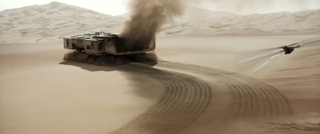
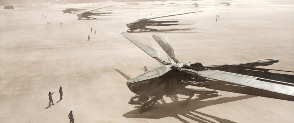
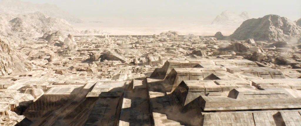
Shooting for IMAX also requires “a different mindset”, highlights Fraser. Close-ups don’t necessarily need to be as close “because you know the screen will be so large”. Conscious the film would be cropped to 2.39:1, Fraser made framing decisions that would allow for this. “It was well worth having in-depth discussions about whether there was too much or not enough headroom, if we needed to tilt up, and what that might look like in IMAX.”
Villeneuve elaborates on the advantages working in the format offers filmmakers and ultimately audiences: “IMAX is a very intimate format. It increases our proximity with the characters. Like if we were able to get into their very own personal bubbles. Of course, IMAX brings an insane power with verticals and can create a sensation that the audience is falling into the landscape. I’m in love with that vertigo feeling. That contrast between increased intimacy and dominant landscape is what this adaptation is about: we are following the introspective journey of a boy being transformed by a new landscape.”
An organic journey
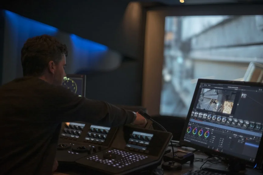
Fraser shot tests in various formats including 15 perf 65mm, 35mm, Alexa 65, and Alexa LF. For the digital formats, senior colourist David Kole and the team at FotoKem ran the test footage out to film and carried out a scan-back process to determine the most flexible choice. Ultimately, the decision was determined by aesthetics. “Once Greig and Denis saw the test on the huge screen at IMAX, they realised the Alexa LF footage worked best with the scan-back process, keeping all the great optical photochemical responses of film – halation, interlayer dye interactions, nonlinear responses of density across the frame, weave, and fluctuations,” says Cole.
It was felt this offered the audience a more organic transportation into the sci-fi world of Dune. “We wanted viewers to believe there are flying ships and giant worms, and today’s savvy audiences are critical about images looking real. Having the characteristics of film helped with that suspension of disbelief. By putting the fantastic images captured by Greig back to film, the entire aesthetic of the project is grounded in realism,” adds Cole. “Dune is a character-driven movie and using the film process brings an uncontrollable randomness to the character of the worlds and people who inhabit them. Everything you see is even more believable.”
VFX supervisor Lambert also supported using film in the process. “The tests delivered a look I hadn’t seen before – it had a sense of grandeur,” he says. “It wasn’t overly grainy, but it gave anything bright the characteristic of halation you see on film. Anything which gives an overall patina always helps the visual effects process.”
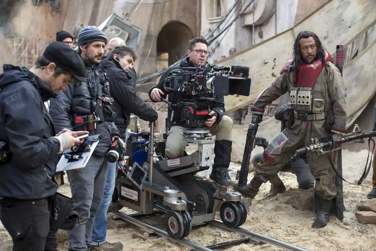
Once the ARRI Alexa LF was selected as the camera “that created the look of the desert that had been envisaged”, Fraser chose the Panavision H Series and Ultra Vista lenses, supplied with the camera, by Panavision, Woodland Hills. “Panavision’s Dan Sasaki tuned our lenses – they were just perfect,” says Fraser. “I’d worked with the Ultra Vistas on The Mandalorian and was impressed by the results and had used the H Series a lot on commercials, so I knew they offered a humanity and softness whilst delivering a high level of quality.”
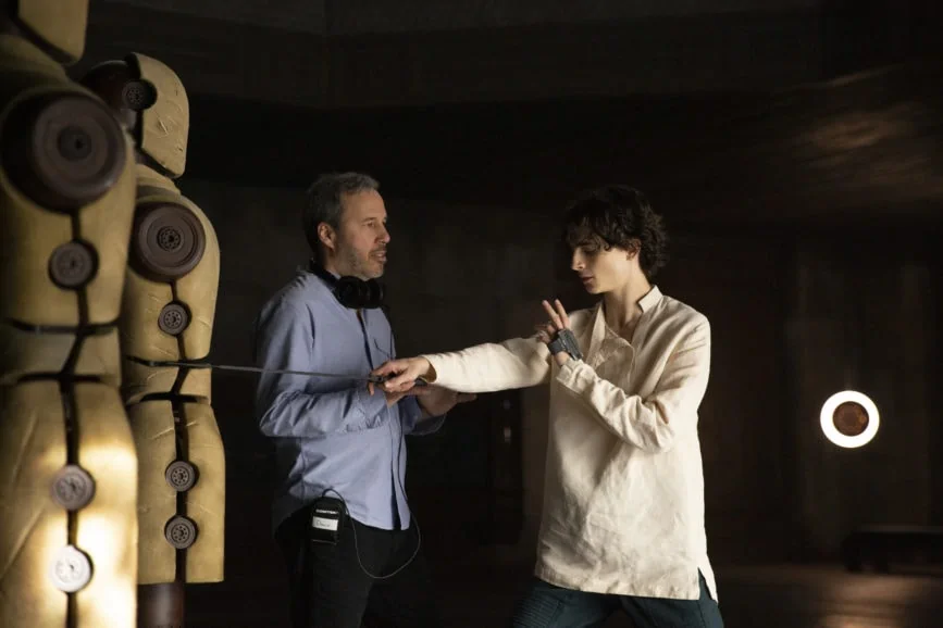
Working in unison with Fraser to help realise Villeneuve’s vision of the story were second unit DP Kate Arizmendi, 1st AC A camera Jake Marcuson, 1st AC B camera Phil Smith, and key grip Guy Micheletti. The best approach to capture each type of sequence was instantly apparent to the crew, including the variety of fight sequences. “We deliberately avoided handheld for the initial fight between Gurney [Josh Brolin] and Paul in Caladan,” says Fraser. “We wanted it to be more of a dance. If the camera moved, it was slow, and we used minimal cuts so we could showcase the choreography.”
A human story at its heart
While conveying a feeling of scale was crucial, it was important that the imagining of Dune was a human tale. Decisions were made on a shot-by-shot basis, storyboarded in advance. “It’s a complex story, so we wanted to keep it visually simple to avoid adding any complication into the process,” says Fraser.
The landscapes of epic proportion were captured by aerial director of photography Dylan Goss (Blade Runner 2049, Sicario). “Aerials are like a third eye or God-like eye on the world in Denis’ work,” says Fraser. “In contrast to the ornithopter chases which could be more frenetic, the introduction of the world from above needed to be gentler and more considered.”
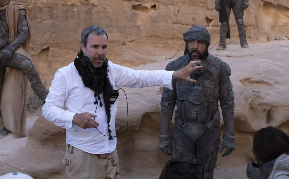
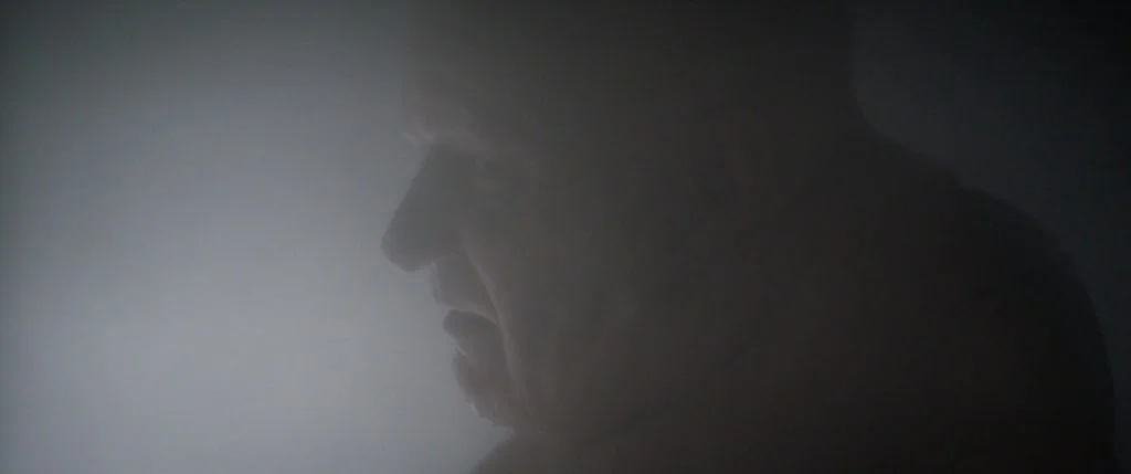
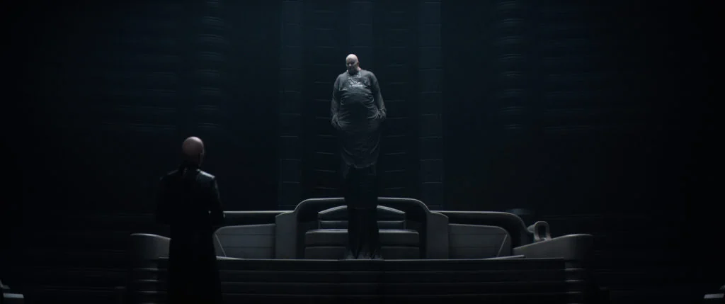
A similar approach was taken when presenting characters such as the Baron in the human-focused story. “We wanted to introduce him slowly and be a little more elusive. You always want that mystery and mystique surrounding the villain,” says Fraser.
When creating the environments the characters would inhabit, gaffer Jamie Mills assisted Fraser in tackling the challenge of lighting some enormous spaces. Fraser wanted to respect the concept art which accurately depicted the lighting. “We used it as our guide. After studying the set drawings, I looked into the best ways to achieve this – creating the right amount of light in the right places, recreating the correct shadow lines and whether the light would be hard or soft,” says Mills. “Greig has a very naturalistic feel to his lighting, so that was also always in the back of my mind.”
Fraser has been “a firm believer in right LED technology” since shooting Rogue One: A Star Wars Story (2016). “This demonstrated that if you use the right LEDs, the colour depth delivered is significant,” says Fraser. “When shooting Dune, we were lighting really large sets, but were limited by the availability of the right lights. I needed fixtures with a quality of light that had an edge and wasn’t just pretty, soft light.”
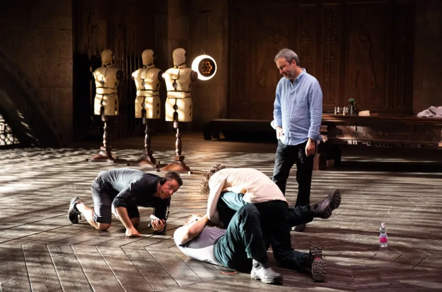
The solution was to use a mixture of Digital Sputnik and Creamsource Sky fixtures, rigged into soft boxes whilst still retaining their sharpness. “We used the Digital Sputnik LED fixtures mostly – DS6 frames and DS3 kits,” says Mills. “We sourced most of the available heads in the world. We also worked out a system to break the DS6 lamps into single fixtures to allow us to cover bigger areas with the one lamp.
“Greig loves the colour depth of the lamp, as did Denis Villeneuve when Greig showed him the ability to dial colour at the touch of an iPad, to add real depth to the sets and bring them to life. They’re also great for skin tones, another reason they are a favourite of Greig’s.”
Production design, lighting, and colour were intertwined throughout. Fraser and Mills tried to limit the complexity of the lighting set-ups, making choices based on the lights that offered most colour depth. “Patrice created stone walls in a sand colour and if we used LEDs that didn’t offer the best colour depth, it produced a monotone, flat image. Denis noticed the colour depth wasn’t right if the lighting set-up was compromised,” says Fraser. “A couple of times, as on some previous productions, dailies colourist Chris Rodkin, who has a great eye for colour, came on the pre-light with Denis and I to grade the light to get the most colour depth out of the sets.”
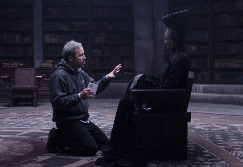
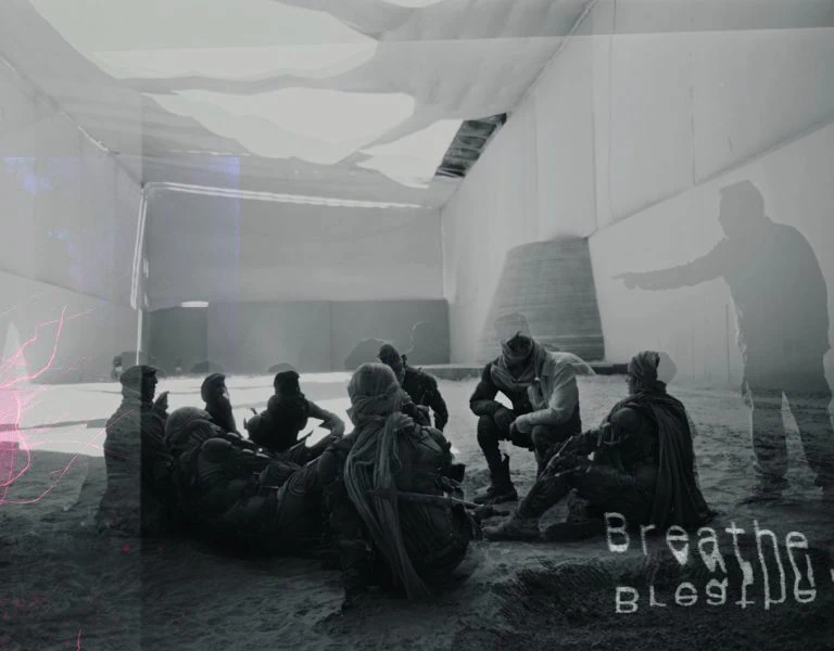
Scenes shot on stage still needed a feeling of natural daylight. One sizeable open space – the main room of the Imperial Nexus Laboratory – required natural-looking light to be created in a controlled environment. “From the concept artwork, it was clear it wouldn’t be possible to shoot it on a regular stage because we didn’t have lights that would behave in the way the sun would at that location,” says Fraser.
Vermette and Fraser searched for somewhere that would give them a large enough cavernous area and natural light. “The size of the room and importance of the light and shadow cast from the circular opening in its ceiling gave everybody some headaches,” says Vermette. “After several variations, a solution was found, boldly and courageously suggested by art director Gergely Rieger – using the area between four stages at Origo Studios in Budapest.”
To recreate the light volume of the environment within budget, the set was paired with the Arrakeen Residency Aircraft Bay set. “We started by cladding the bottom 20 feet of the stage’s side walls with solid stone sand-painted panels,” says Vermette.
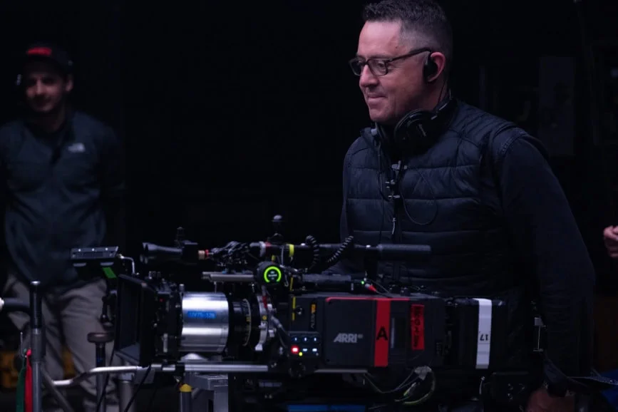
Above that line, Vermette’s team used tight fabric of the same colour. The riggers then installed cable lines over the open area on which two sliding fabric roofs were used to cover the area between to contain the light, as it would in the real set. The roof needed to mimic the circular opening and spokes in the set design. The floor of the set was covered in sand the same colour as the one at the exterior location in Jordan.
A sun path was charted, and a giant gobo was cut out of the top piece of fabric. “With our accomplice 1st AD Chris Carreras, we needed to allow ourselves shooting flexibility to find the perfect day and time to shoot this sequence,” says Vermette. “This meant no wind due to the fabric and shadows, clear skies, and a specific time at the end of the morning so the sun would cast the perfectly defined shadow on the ground of the set.”
When the sun was in the optimum position, the light also hit the Sardaukar military force. “That gave us a perfect base for visual effects because we had daylit foreground characters and I could then extend the frame out into darkness to create a much bigger area,” adds Lambert.
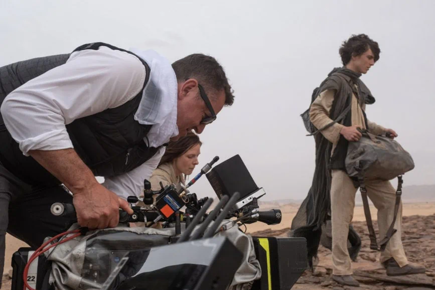
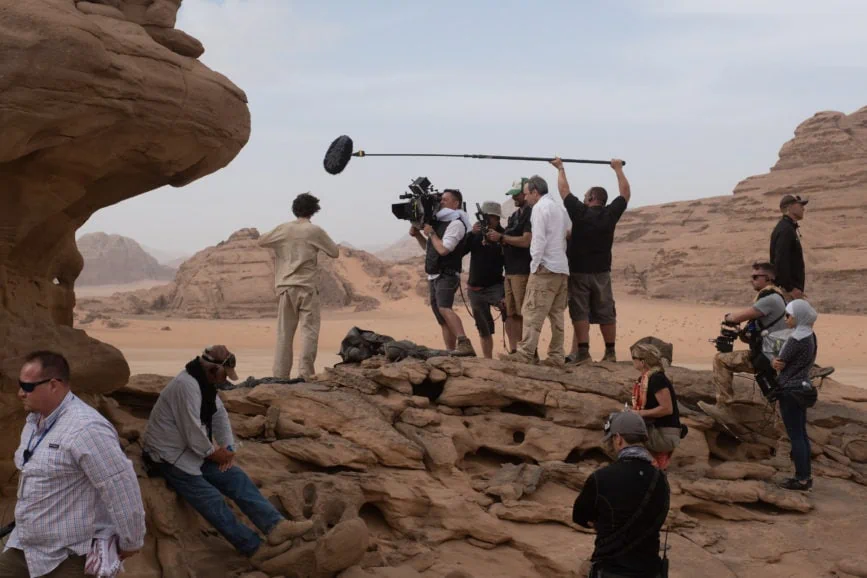
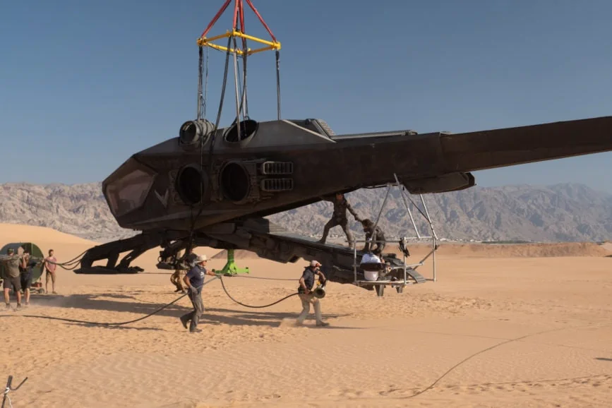
Believing “the more you touch a frame in visual effects, the less believable it becomes”, Lambert also highlighted that a different lighting approach may be needed for sequences inside the ornithopter aircraft to guarantee their success from a visual effects perspective. “I could see that shooting inside the cockpit would result in reflections upon reflection because it was essentially a glass bowl,” he says.
Traditionally, such scenes would be shot in a studio in front of a green or blue screen, but the team was adamant that if a sequence was meant to be outside, it would be shot outside. “So, for the interior ornithopter scene we found the highest hill outside of Budapest that gave a nice, clean horizon,” explains Lambert. “We built a gimbal and surrounded it with a 25-foot-high sand-coloured ramp which we called The Dog Collar.”
When the sun hit the screen and bounced into the cockpit, it created the illusion of the ornithopter flying over the desert. “It looked really realistic because we had an orange base with a bright sky. We also captured hours of photography using a six-camera rig on a helicopter flying over the dunes in the UAE. This massive resolution imagery could be combined with the Dog Collar footage rather than doing a full extraction of the Dog Collar photography. The compositors at DNEG blended the two, keeping the reflections and nuances of the set photography, making for a far more believable composite.”
Playing with colour
The LUT development process, led by FotoKem’s David Cole, was also key in creating a depth of colour and golden mystical feeling in certain scenes. The company’s end-to-end workflow also encompassed pre-production camera tests, nextLAB dailies, look development with Fraser and Villeneuve, and all final VFX reviews with creative and film laboratory services.
“It’s a muted world, but not desaturated,” highlights Cole. Each planet has its own colour palette and density, and texture played a huge part in the storytelling. “For example, Caladan is cool – there are oceans, clouds, rain, and fog,” he says. “On Arrakis, we wanted the audience to experience its harshness and brutality. It’s dry, hot, and unrelenting, but interiors are very dark and built of stone. We played with that juxtaposition – burning hot and dark. We also played with colour for Paul’s visions – to snap the audience into another place and time.”
Ninety percent of the exterior on Arrakis used a LUT that simulated a skip bleach process. “We didn’t want the super-strong blacks in those scenes that skip bleach can bring, so this LUT softened things yet retained the silver tones of film negative,” explains Cole. “We matched this LUT to real film footage and then modified the toe end to give it the characteristics Greig wanted. We also made sure that skies really minimised blue to accentuate the lack of water on this planet.”
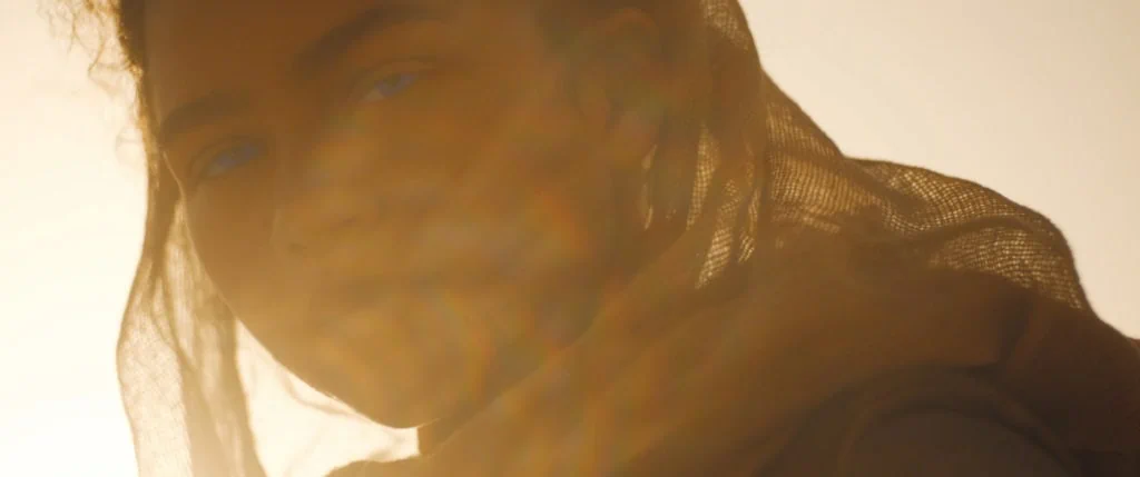
The rest of the movie used a filmic-style LUT that Cole tweaked for shadows. A third creative LUT was also produced which emphasised yellows, reds, oranges, and browns. “We used it when we wanted to enhance the dreamy golden-yellow look,” says Cole. “It can be quite confronting, and along with the flares, it tells the audience they are seeing a vision.”
After the primary creative colour pass was approved, FotoKem shot to 35mm negative and scanned it back to digital on a Scanity film scanner. FotoKem’s colour science group, led by Joseph Slomka, performed the match-back analysis before final colour tweaks and finessing were performed to complete the film. Fellow FotoKem colourist Phil Beckner also helped on the feature, including handling the 3D versions. FotoKem then oversaw all deliverables: full IMAX 1.43 aspect ratio, IMAX 1.9 aspect ratio, Dolby Vision theatrical, standard theatrical, Home Entertainment Dolby Vision HDR, and discreet SDR r709.
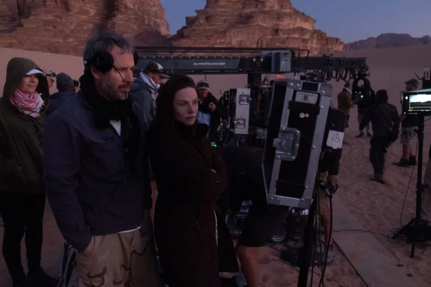
Early in post, Fraser and Cole created a colour bible/look book which they presented to Villeneuve. Spanning all scenes and about 40 minutes of footage, it gave everyone in post an idea of the direction they planned to take the movie. The final reel of the film was especially challenging – a journey at night across the desert and into the canyons which was all naturally lit. “When you’re in the desert and the moon is out, you can see for miles,” says Cole. “We really wanted to create that feeling of being out at night in the dark but still able to see.”
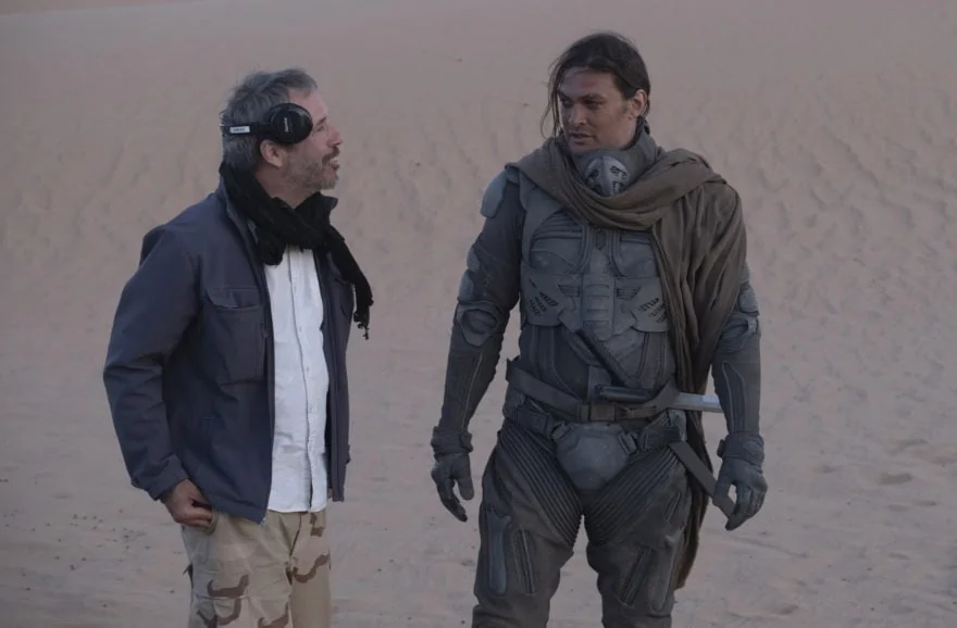
The scene progresses to become pre-dawn before the sun breaks as the sequence moves into early morning. From the moon going down to the sunrise, the creative grade emphasised the transition. “This scene was a massive undertaking,” says Cole. “Very precise rotoscoping and windowing were needed to keep the mood and tone, and make the audience look where they needed to. There was a very slow but large tonal shift throughout the 18-minute scene, and it had to be imperceivable and realistic.”
For Fraser, the joy of working with FotoKem is their “capacity to work in analogue in a digital world” – a mixture of the two environments he found incredibly exciting. “They’re a traditional lab that’s also technologically advanced, meaning they offer the best of both worlds,” he says.
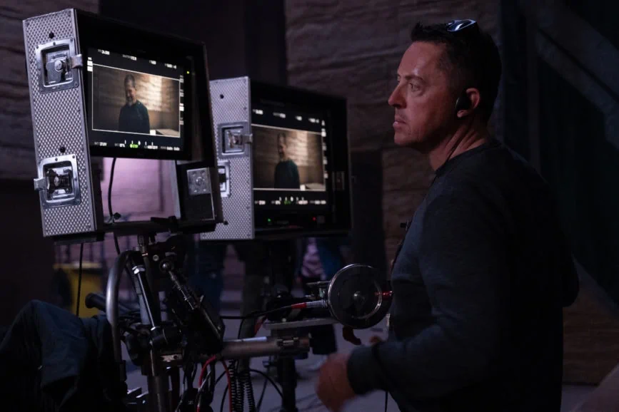
Grounded in realism
Villeneuve and visual effects supervisor Paul Lambert have a similar sensibility when it comes to visual effects. “We don’t want to use flashy virtual cameras and try to keep things as grounded and as photo real as possible,” says Lambert. “Visual effects shouldn’t take you out of the story.”
Much of the work between Lambert, Fraser, Villeneuve, and Vermette focused on how to give visual effects the best base to then extend from or replace a background, especially from a lighting perspective. “Visual effects are at a point where you can shoot footage and we can replace any background, but only if the lighting intent is the same as what we’re planning for the background,” adds Lambert. “We can grade it, but it will always look like two separate elements. That’s why we spent so much time during pre-production discussing the ideal techniques for the different setups.”
Alongside the vast team of visual effects specialists, DNEG supervisors for Vancouver and Montreal Tristan Myles and Brian Connor, who oversaw the splinter unit, were also integral. “The collaboration worked so well on Dune – everyone had the same goal, which doesn’t always happen,” says Lambert. “If I had a concern, it was listened to, and we adapted how we would shoot. For example, we tried to avoid blue and green screen whenever we could, using real sets as much as possible.”
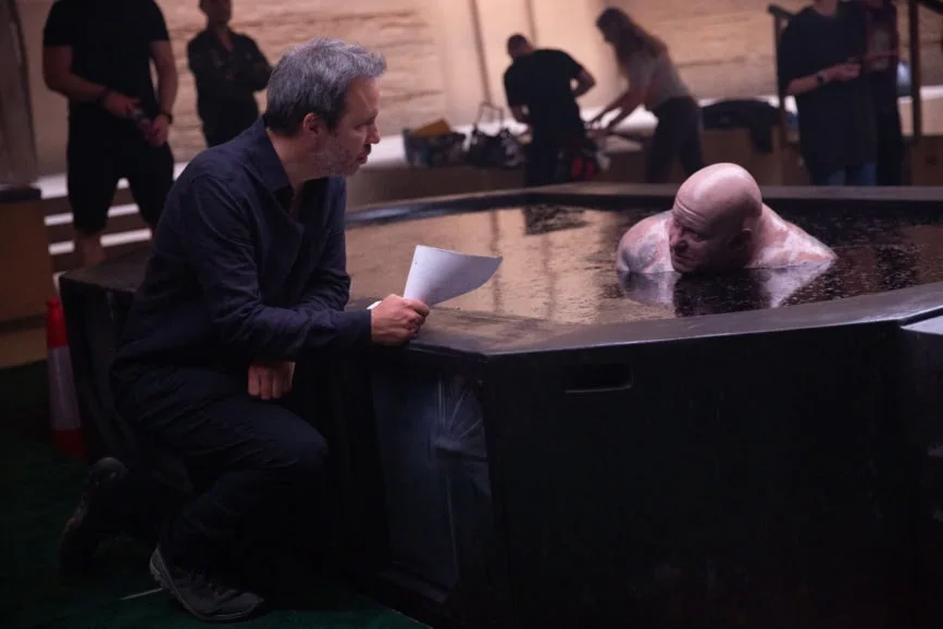
Giving the director, actors, and crew physical immersive environments to work in was part of the discussions from early on, respecting the vison represented in the concept art, and avoiding green screens whilst taking stage space and budgetary limitations into consideration. “Dune would feel like a destination we would all be exploring together. Every set had to be well-planned, and scenes storyboarded to carry on with the plan,” says Vermette.
“Recreating the light volumes to stay true to the concept art was a big part of it,” says Vermette. “We needed to find the methodology to match our philosophy and apply accordingly when needed.”
Along with senior art director Tibor Lázár, the team’s theories were put into practice in the main corridor of the Arrakeen residency which was built on stage 6 at Origo Studios in Budapest. Everything above the first 25 feet of the set would be created in fabric painted the same colour as the set, as would all the integral physical volumes. “VFX used these as spatial references to later be clad with the real textures,” says Vermette. “Greig would use these physical elements and obstacles to sculpt the light as it would normally fall into the room. Light bounce would not be contaminated by green or blue as the environment would be the right colour tone.”
This technique was used when and where they needed to, allowing physical sets to be pushed to their limits within the boundaries of the sound stages and backlots.
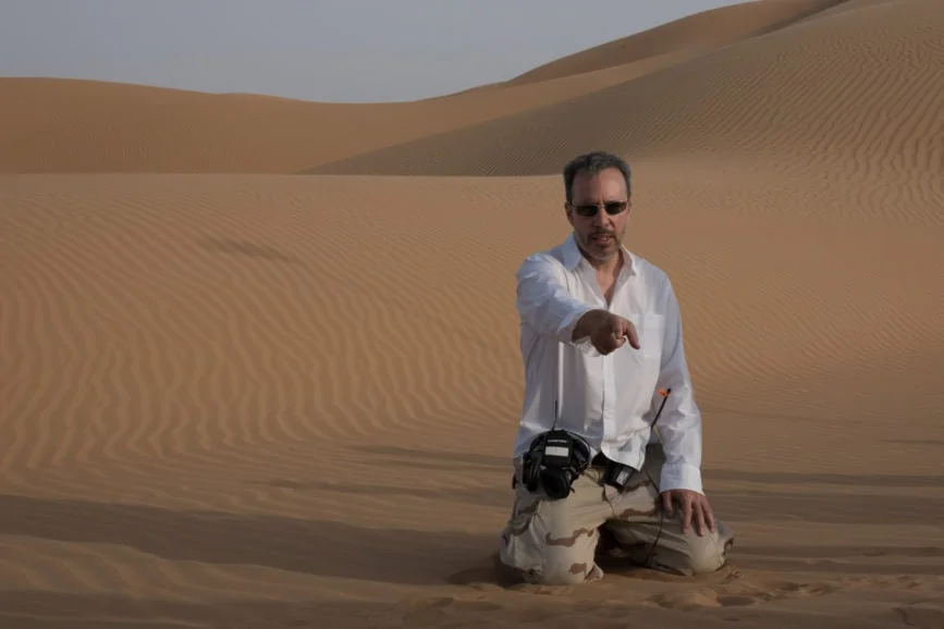
Lambert and the visual effects team built all their virtual worlds, the giant sandworm, the defensive shields, and all physical builds based on the initial designs Vermette’s team created in collaboration with Villeneuve. “Usually, concepts are a springboard to then build something which resembles the concept in visual effects, but Denis was adamant that everything would be like the concepts,” says Lambert. “When I first saw the concept for the sandworm – based on rigid plates with soft flesh in between which then allows it to create a slight accordion effect – I knew that it shouldn’t be too tricky to build. It was the sand around the worm which would be more problematic,” he says.
“The key to any visual effect,” says Lambert, “is to have reference or as much in-camera as possible which can then be augmented. We were never going to build a worm that big, and we couldn’t find reference of something that large moving around in the sand. I knew this process was going to be hard from a computational point of view for visual effects, so during our six months of pre-production, I instigated some simulations at DNEG.”
During this process, the artists went through many iterations to create a sandworm that looked as if it was flowing through the desert. “You get a feeling of water as it collapses into the dunes, sifting through the sand,” he says. “Working on Dune was a fantastic experience all round and just having the time in pre-production to come up with these ideas and collaborate was amazing. If I could replicate this process every single time, it would be phenomenal.”
–
Stills credit: Chiabella James / Courtesy of Warner Bros. Pictures and Legendary Pictures
