Novel Period
Giles Nuttgens BSC / Colette
Novel Period
Giles Nuttgens BSC / Colette
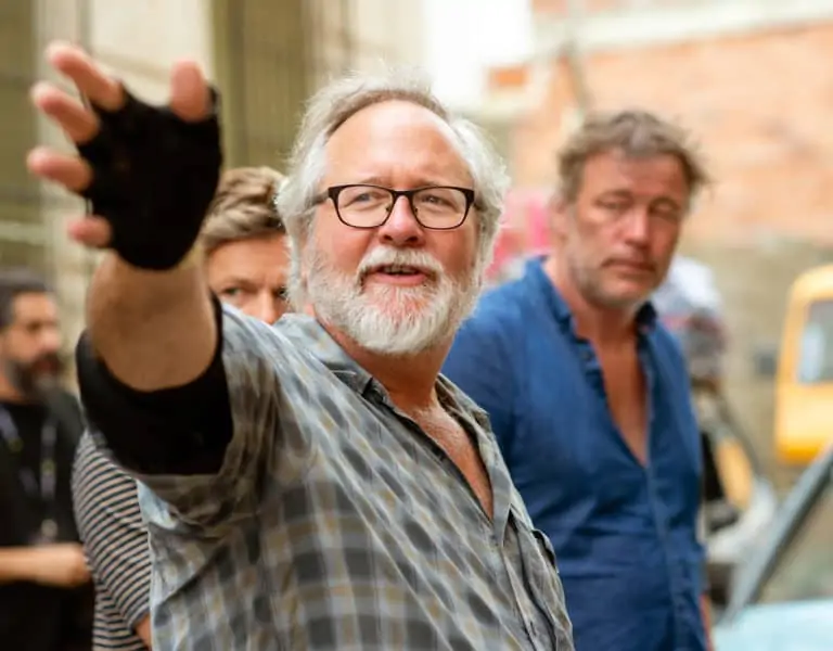
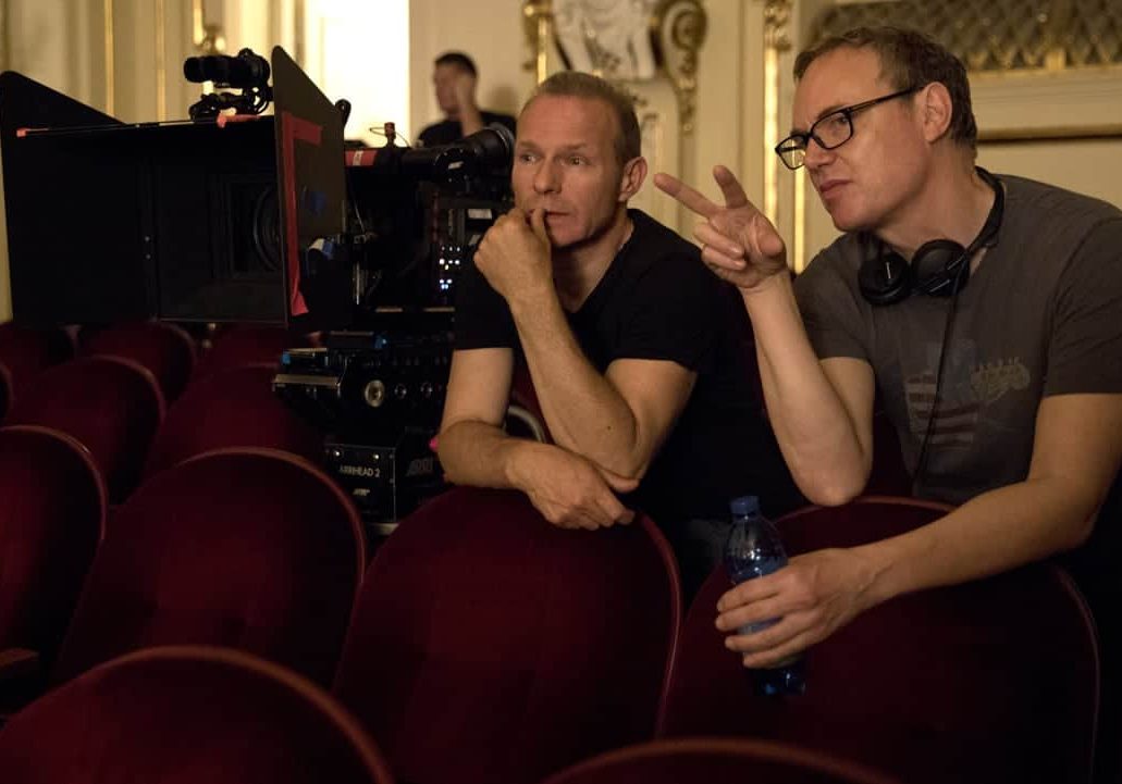
Top Image: Director of Photography Giles Nuttgens (l) and director Wash Westmoreland (r) on the set. Credit: Robert Viglasky / Bleecker Street
BY: Trevor Hogg
Whether it be children born on the day when India gained independence in Midnight’s Children, or brothers resorting to crime to save the family farm in Hell or High Water, Giles Nuttgens BSC has been drawn to stories about individuals rising above societal restrains to make their own destiny. The BAFTA Film Award nominated cinematographer partnered with filmmaker Wash Westmoreland (Still Alice ) for the late 19th century biopic Colette , featuring Keira Knightley as French novelist Sidonie-Gabrielle Colette whose husband Henry ‘Willy’ Gauthier-Villars (Dominic West) takes credit for her work.
“Wash had distinct references for the type of film he wanted to make,” explains Nuttgens. “I flew to London and sat down for a couple of days with him and Michael Carlin [production designer] and looked at some recent period films that Wash liked the look of but mainly ones made many years ago that covered a similar period, the Belle Epoque. His particular reference was the work of Max Ophüls, such as The Earrings of Madame De... (1954), both in terms of understanding the prevalent morals of that time and in terms of fluid camera movement. What was surprising was that the complexity of the mise en scène in those pictures and that even now it seems modern. Likewise, the framing was audacious, not to the level of Carl Dreyer's La Passion de Jeanne d'Arc (1928), but edgy and unrefined in a dramatic way.”
A number of visual effects shots needed significant planning to find the most practical and cost-effective way of producing them. “Michael put together composites of photos and sketches so we could visualise the desired image and see the best way of going about it,” reveals Nuttgens. “The budget was limited, so many of the original intentions had to be scaled back, but we knew that some pivotal locations, such as the exterior of the Moulin Rouge, would have to be an almost totally CG, based on hand-tinted reference photographs from the period. Others were extensions of existing streets using 2D real plates worked around a 3D wire frame. In the end, we tried to find the locations that were almost 100 percent useable but with CG additions, such as at their house in the countryside, shot in England but needing wooden shutters to make it look like France.”
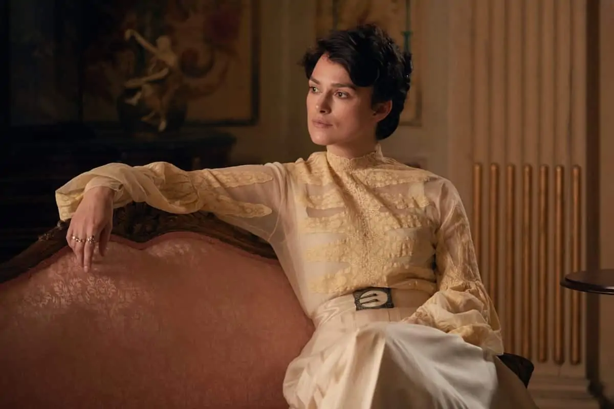
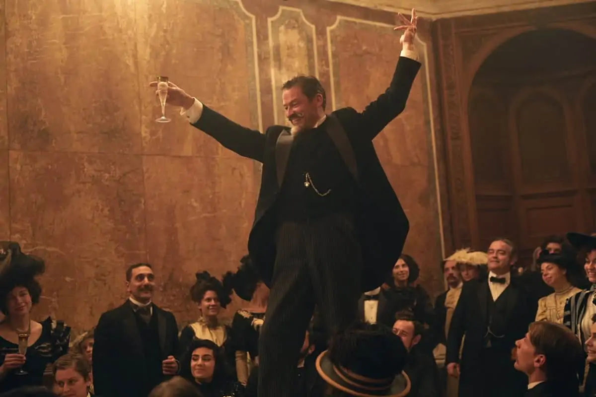
A long time was spent breaking down each scene to achieve what was needed within the short production schedule. “Wash wanted to keep the camera fluid and in motion as much as possible, as if we were waltzing our way both through the different stages in Colette’s life and the multiple technological changes that were happening around the turn of the century,” remarks Nuttgens. “Willy's requirement to keep up with the rest of the elite Parisian society and his desire to electrify his house gave us the opportunity to make distinctive differences in the look of the film which starts with candlelight and moves to electric light; combined with changing the colours and furniture within their Parisian apartment, it helped to contrast their financially solvent times with potential penury moments. After the bailiffs take away half the furniture, including Willy's large desk, we see them starting to write together on a small table. A single candle illuminates the scene as if they have to cut back on everything, including candlewax. The shot is a simple symmetrically framed track in to the two of them, in some ways they are reunited by their financial complications. This is in contrast to the early part of the film, where we used a long developing complex Steadicam shot to sweep her through the luxury and opulence of the salon parties they attended when things were going financially better.”
Preproduction lasted around five weeks, with 10 days of shooting taking place in England before heading off to Budapest for five weeks of principal photography. “Our preparation involved several short scouts in Hungary as the locations were found and approved,” remarks Nuttgens. “Michael Carlin, the production designer, and myself had an office together in London which helped us talk things over casually, although he was spending much of his time in Budapest. Finding locations wasn't easy for Michael. Budapest has had a lot of period productions throughout the years and Eastern European architecture is perceptibly different from that of Paris, which meant we were limited on exterior locations. The Express building in the centre of the city, is awaiting conversion into a hotel, and has beautiful and elaborate wood and marble work on the walls and floors that haven’t been changed for a hundred years; this became our mainstay ‘studio’ within a real building. It covered the fashionable restaurant where they used to hang out [a location also used in Blade Runner 2049], one of the theatres backstage, the courtyard where Willy visits his paid mistress, the ballet classroom, hotel bedroom and multiple other small sets.”
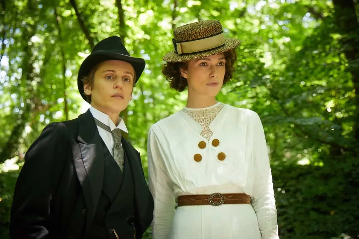
The interior Salon was a wood cladded series of rooms in a building protected as part of the patrimony of Hungary, which meant that nothing could be rigged into the ceilings. “Colette’s introduction to Parisian society was going to happen here and it was imperative for Wash that we feel both the wealth and the trepidation of her coming into the glamourous party for the first time,” explains Nuttgens. “It meant coming through the anteroom and into the main room where we did a 360º Steadicam shot for several pages of dialogue. This didn’t allow any possibility of having floor mounted lamps and dictated the way the film would be lit in a great part. We used many candelabras with real candles and the sconces were fake electric candles [that move like a real candle flicker] as no flames could be near the wooden walls. The rapid drop off on focus and the vertical stretch in front of and behind the focal plane caused by the anamorphic lenses helped us enormously in disguising the fact that they weren't real candles in the background.”
Practical lighting could only go so far with the Alexa Studio camera, as a certain level of fill light was needed to soften the light on the actors, control the colour of the light source, and to produce strong shadows so that the imagery would not look flat. “Until we have real blacks on HDR screens in cinemas, this will remain an ongoing struggle,” observes Nuttgens. “To make areas of the image look subjectively dark you have to have strong highlights in the frame. However, we didn't want the candles to burn white so it became a delicate balance. On the wooden roof of the Salon rooms there was detailing that looked like wooden doorknobs hanging down. On this we strung ropes on which, at each corner of the room, we hung rows on Chinese lanterns. In the centre of the room we made a cluster of Chinese lanterns above the chandelier. The weight the wood could support was extremely limited [and even the smallest damage would have made us lose the location] so we could only put four on each corner. Unfortunately, we couldn't source enough 500W bulbs and ended up using 250W photofloods. This meant that I was working with a stop less light than I had wanted, to correct the redness that tends to occur in the lower mid tones on the Alexa when you use warm light, such as candlelight.”
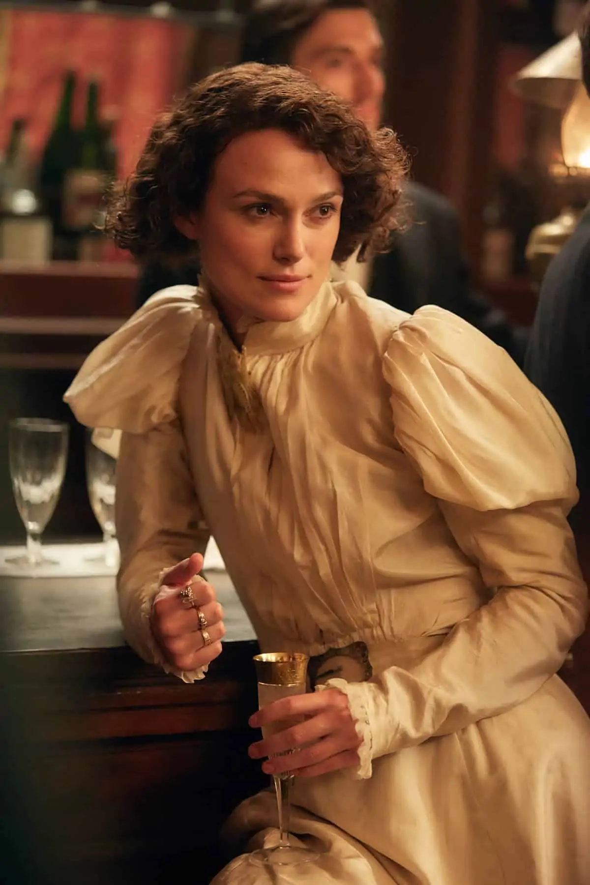
"It was the first time I had lit from the top of a set, but in some ways it fitted in not just with what we had to establish as a style in the early scenes of the film in the salon, but also there was a throwback to films shot between the ‘30s and ‘50s in studios.
It was a paradox, we wanted a modern looking film with our present day ‘practical’ driven aesthetic but mixed with a little bit of historical memory to films like that of Max Ophüls, and particularly to French cinema that had come before."
- Giles Nuttgens BSC
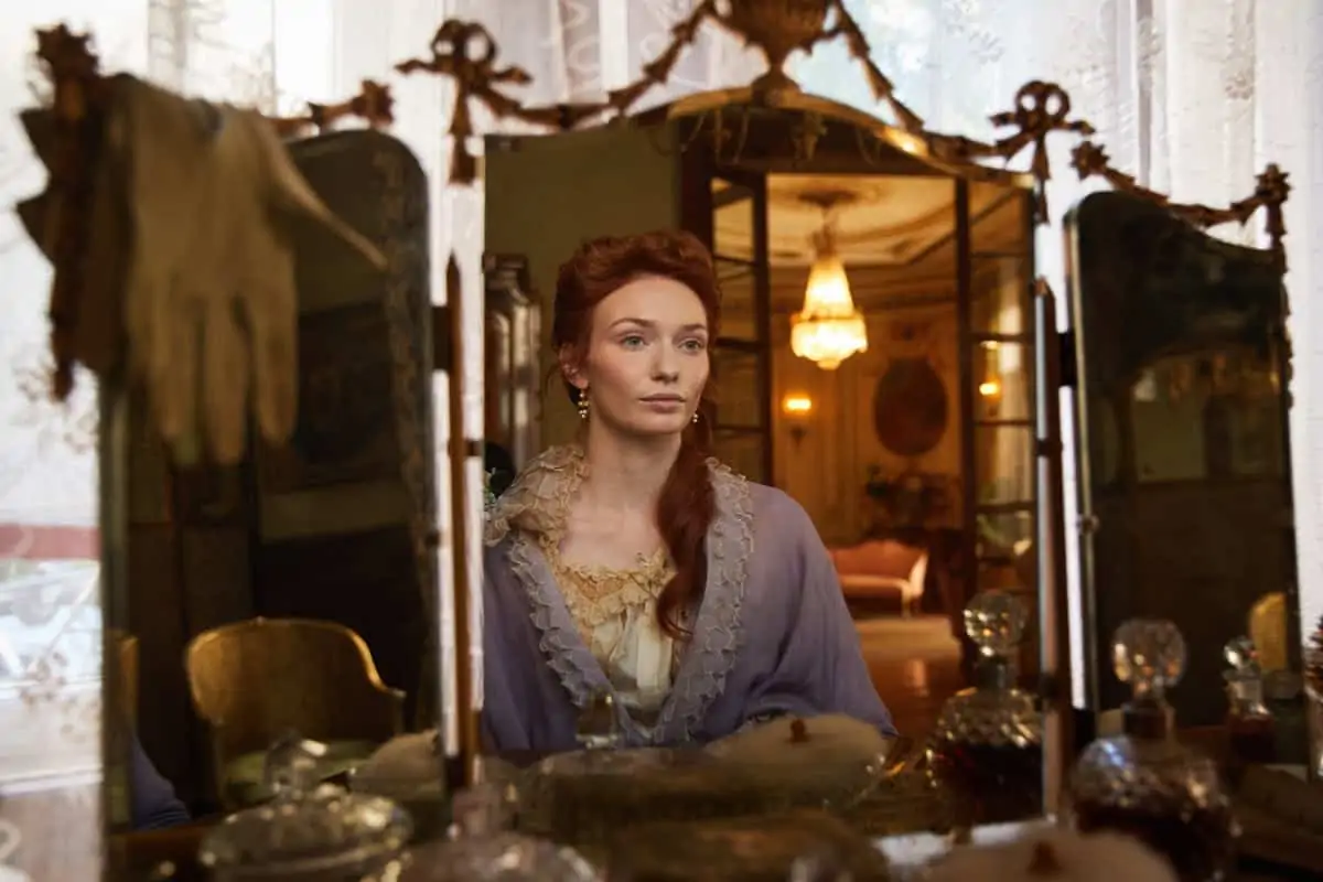
Collette’s apartment was built on a soundstage located just outside of Budapest. “We talked a lot about how we needed to facilitate the camera movement and introduce a lot of glass in the interior so we could see through or sense the room beyond,” reveals Nuttgens. “Michael sourced a company that could print onto linoleum and they produced a floor that even to the eye at close range you would have sworn it was real parquet. We constructed the set directly onto the studio floor to make sure it was totally level and didn't squeak for sound when we moved the dolly. This created some visual complications outside the windows - since it was a top floor apartment we had to avoid seeing the ground at level outside. However, the set liberated us with the camera. Very few rails ever went down except on the longest of our lenses. We had a great dolly grip, Attila Szucs, and so having total freedom on the floor meant he could adjust for any changes in the actor’s position. The greater complication was keeping us all out of the reflections on the many glass surfaces we had built in.”
A significant effort was made not to close the sheers or curtains even on the night scenes in the apartment so that the Paris backdrop situated outside was always present in each scene. “Wash and I had decided at the beginning that we wanted that gloomy Parisian filtered light that hardly penetrates into a room, which meant that lighting through windows didn't give us much to model the actors,” reveals Nuttgens. “There was no easy option of blowing the windows to provide us with large real soft sources around the room. The actors needed to look good and that required a lot of control, but we still tried to keep as much lighting hardware off the floor as possible. It was the first time I had lit from the top of a set [normally I put on a full roof and only use windows or practicals as sources], but in some ways it fitted in not just with what we had to establish as a style in the early scenes of the film in the salon, but also there was a throwback to films shot between the ‘30s and ‘50s in studios in the days before people moved to shooting on real locations. It was a paradox, we wanted a modern looking film with our present day ‘practical’ driven aesthetic but mixed with a little bit of historical memory to films like that of Max Ophüls, and particularly to French cinema that had come before.”
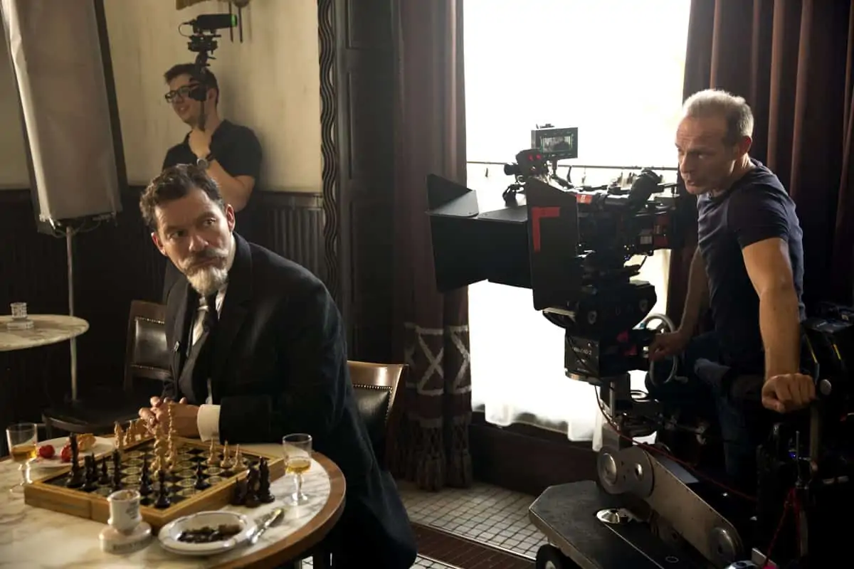
“We basically ‘boxed’ the main rooms with rows of Chinese lanterns sitting back from the walls and tied them back to a dimmer board so we could shift the key direction onto one side or another depending on the camera position,” continues Nuttgens. “We concentrated our power above the windows on the set so that the real sources would be, to some extent respected. The backdrops were lit by SkyPanels; this is not something I would have normally done as I prefer incandescent sources, but it allowed us to change colour and intensity rapidly off a dimmer board for bright and dark days, dusk and night. The requirement to keep the studio floor clear but not being able to source from the windows drove me in a direction that was different for me but overall was successful in its execution, at least in the creation of the period we were looking for. It’s not an overly glamourous film, it has a real edge and looks natural, but still satisfies the canons of acceptable aesthetics and beauty that we adhere to in period cinema.”
ARRI Rental in London and Budapest supplied the primarily single ALEXA Studio with optical viewfinder production, with the exception being the fight sequence in the Moulin Rouge, which made use of three cameras. “The complication was getting hold of a sure set of ARRI/Zeiss Master Prime Anamorphic lenses which were relatively new at the time and in great demand,” remarks Nuttgens. “The film was shot ARRIRAW, 2.39 anamorphic at 2.8K. The ALEXA is limited on resolution, and sometimes frustrating for that reason but shooting on the Anamorphic Master Primes meant that it was as sharp as it could be. We only used light diffusion filters to slightly blow the highlights around the candles but without great overall effect on the faces.” Key crew members included gaffers Mark Taylor and Balázs Vákár, key grips Warwick Drucker and Attila Szûcs, Steadicam operators Paul Edwards and Marci Ragályi, first assistant camera operators Ian Coffey and György Horvá (looked after focus which was complicated by the anamorphic format and having candlelight with lenses being wide open), and DIT Luke Williams.
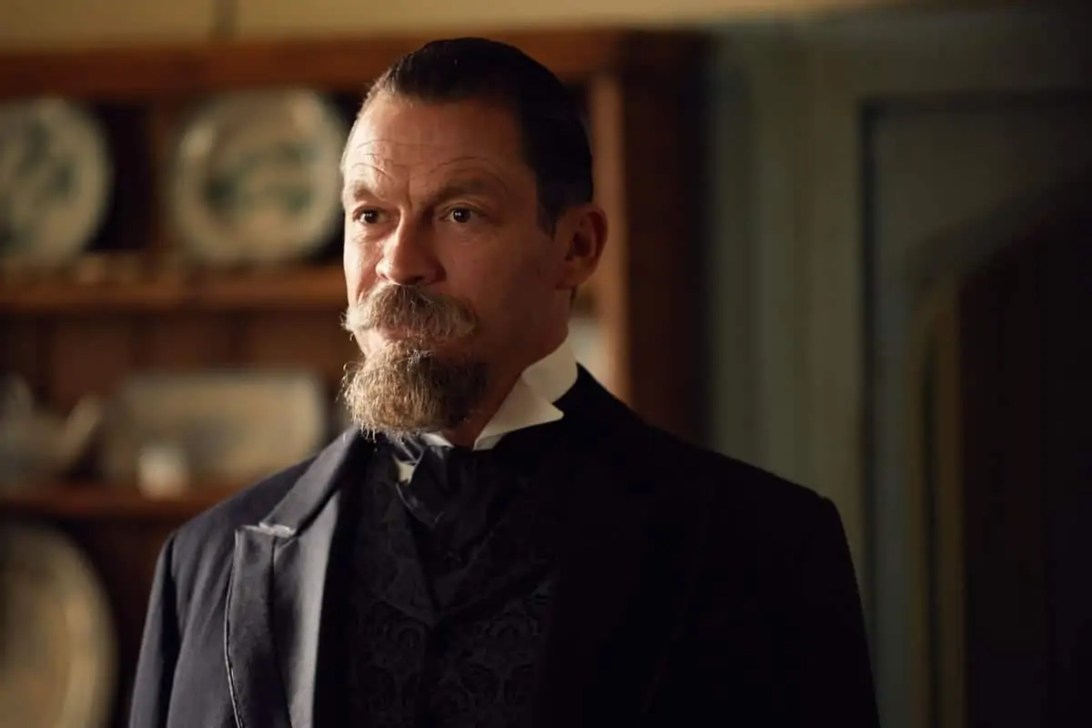
Colette was graded at LipSync Post by colourist Tom Russell using Baselight. “The overall look hardly changed from the shooting, we already had clear narrative progression assisted by the advent of electricity and the design changes we made for each period as the film progresses,” states Nuttgens. “I have never been strong on changing looks in a DI. You should light it that way in the first place. However, we did work on bringing out the highlights on faces, compensating for the overall flatness in the black of digital projection and added a little more diffusion on both Keira and Dominic to make them glow. We also need a certain amount of softening and wrinkle removal for the early years of the film when Dominic had to look younger.” The entire cast and crew were professional. “Because we were a mixed language crew, there wasn't much communication with the cast on the set. For my part, as a DP, I try to maintain a respectful distance always with actors, not to make technical demands on them nor enter into a communication that could distract them from their performances. We can all to get to know each other after work if we want to - on the set a certain concentration helps!”


