
Poetry in motion
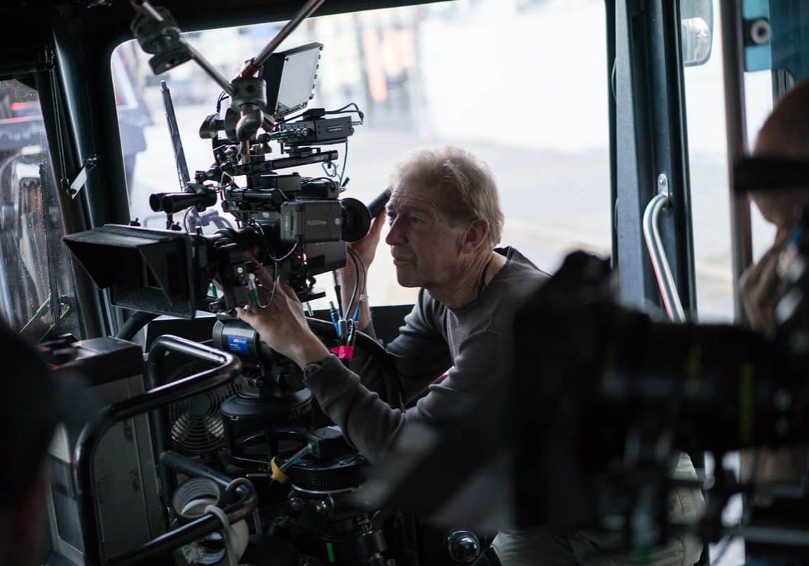
Fred Elmes ASC / Paterson
Poetry in motion
Fred Elmes ASC / Paterson
At the merest mention of his name, in casual conversations with other cinematographers prior to this interview, covetous sighs of “lucky you”, plus positive gasps of “ooh” and “ah”, were readily forthcoming. So it came with a heightened sense of expectation to speak with Fred Elmes ASC about his work on director Jim Jarmusch’s charmingly tender tale of Paterson. The outcome is that anyone with an interest in the cinematographic artform could do far worse than to imbibe the measured words of insight from a master herein, and then go enjoy the indie movie. Or vice versa, of course.
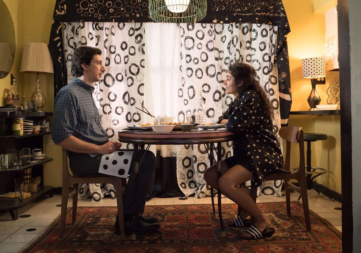
Paterson (Adam Driver) is a bus driver and poet, who happens to live in the city of Paterson, New Jersey. Each day in his life follows the same routine. He rises at the same time everyday, and walks past the town’s old warehouses and factories to the bus depot. After driving the same bus route, he returns home, has supper with his wife Laura (Golshifteh Farahani), and walks his dog to the same bar, for the same regular glass of beer. Paterson is quietly fascinated by humankind, eavesdropping on his passengers’ chatter, which send him into lyrical reveries. Laura urges him to note down the lovely observational verse playing in his head, but he never seems to get around to doing it properly. Eventually, though, a small disaster threatens to shatter their idyll.
The feature was shot in the autumn months of 2015, with the bus driving sections and the Passaic River’s Great Falls captured in the city of Paterson itself for authenticity, whilst the remainder was shot in and around the city Yonkers, due to tax incentives offered by New York State. It was Elmes’ fourth collaboration with Jarmusch, the pair having worked together previously on Night On Earth (1991), Coffee And Cigarettes (2003) and Broken Flowers (2005).
“I saw Jim’s Stranger Than Paradise many years ago. It was an interesting movie that really made an impression on me, and I thought, ‘Wow there’s a guy to watch’. Fortunately for me, he called a couple of years later out-of-the-blue and we’ve gotten along really well ever since,” recalls Elmes.
“We talked about Paterson for quite a while before the production began in earnest. I grew up around those parts, and know the town’s industrial heritage (in textiles, firearms and railroad locomotives), its great, working class history and more recent immigrant culture, and ultimately its ties to the wide East Coast of the US. I was hooked about the idea of a bus driver being a poet there, although initially I did not know much about the production apart from Jim had secured the involvement of Adam Driver.”
Recounting his early discussions with the director about how to visualise the story, Elmes says, “Jim described Paterson as a simple story about a man whose life is run by routine, who lives by the clock, does the same thing, at the same time every day, wears the same clothes, and so on. This allows his mind to wander and be creative in other ways. Poetry is his way of expressing himself, without having to worry about anything else.
“I expressed to Jim that rather than having the exact same shot for each scenario, that we capture a very subtle variety of shots around Paterson to slowly develop and build an engaging picture of his poetic character. This would also have the effect that when the story changed, we could then significantly change the camera angles, making the big moment a really big deal.”
However there was another challenge, which called on Elmes inner muse. “We had to establish Paterson as a poet from the very start of the movie. So working things through with Jim, we developed the idea of also shooting a montage of forms and fragments, a sort of abstract visual festival, that would overlap the live action and build around the poetry he narrates. These montages were later supplemented by Jim in post production, with beautiful animated calligraphy, without my direct involvement, but I loved it when I saw the final result.”
Elmes framed the production as 1.85:1, as he felt this would provide greater intimacy and engagement with the characters and locations, as opposed to Anamorphic, which can contain visual distractions at the edges of the wide image.
He selected Zeiss VariPrime glass, enabling subtle changes of focal length to reframe and push into the image during the different takes of the emerging character. Using the VariPrimes also came with the practical advantage of not needing to interrupt the production flow with frequent lens changes. Furthermore, these lenses offered a level of innate distortion and softness to mollify the sharpness of the cameras’ digital sensors, although Elmes further diffused the image with the application of fine netting over the lens front.
Elmes elected to shoot using Alexa Studio for the bulk of the live action, with the Alexa Mini deployed on-board the bus, due to its convenient size. Although Paterson appears to drive the vehicle, it was actually towed on a lengthy trailer arrangement, and Elmes knew a diminutive camera package would be a great help in the tight spaces available. Rather than go for straight live action, Elmes had a transparent Plexiglass sheet wrapped discreetly around the bus driver’s cabin, to add a visual overlay of reflections.
"I expressed to Jim (Jarmusch) that rather than having the exact same shot for each scenario, that we capture a very subtle variety of shots around Paterson to slowly develop and build an engaging picture of his poetic character."
- Fred Elmes ASC
Bearing in mind the modest budget, and the lack of visual effects, the production shot ProRes 4444 Log C, rather than ARRIRAW and the expense it brings in data handling. A film-emulation display LUT was applied on-set, which had been developed in pre-production by Elmes and his regular colourist, Joe Gawler at Harbor Picture Company in New York, who also completed the final DI grade.
Elmes says it was to the production’s advantage that the prep period, amounting to four weeks in total, was spread over the course of several months.
“We found the locations we wanted early-on and started living with those in terms of the sense of spaces, the colours and the framing. Jim cares very much about how his movies look – from the costume and set design to the photography, and he goes out of his way to get every element to his liking. But he’s very respectful to suggestions and the rapport he engenders makes for a stimulating and happy family atmosphere.”
Elmes says the lighting was mainly natural light, or inspired by it when required. The extended prep period allowed the production crew to take over a house in Yonkers and customise it with lighting in advance. Windows and doorways were boxed out, affording Elmes complete control over the lighting set-up there irrespective of the time of day. He illuminated interiors using bounced light from HMI lampheads, supplemented by a subtle, soft source from SkyPanels, Kino Flo Celeb LEDs and practicals, resulting in an naturalistic atmosphere overall.
Another part of Elmes’ lighting challenge was to handle the daylight on exterior scenes and prevent the highlights from blowing out. “We kept the actors out of the sun, and were ultra careful about the times of day we shot each scene, making sure to keep the colour and contrast the same,” he explains.
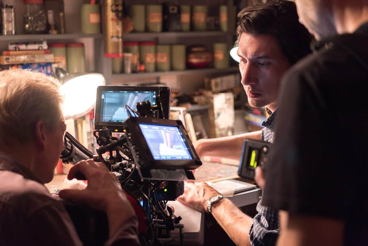
One senses that along with the considered framing of the live action, lensed by A-camera operator, Peter Agliata, Elmes particularly relished visualising the abstract images for the montage overlays.
“During pre-production I took a bus ride through Paterson and shot footage of everyday elements – an empty seat, reflections, the glint of sunlight on an opening door, passing vehicles, telegraph wires, industrial brick work, the silvery edges of clouds – and edited this into a short reel for Jim to consider. It met his thinking head-on. Paterson is not a treatise on existentialism, it’s really not as highfaluting as that. Just a simple poetic story. For Jim it’s often more about the bits in between the dramatic moments.”
As for the final DI, Elmes says he held back on bold colouring, preferring to keep the look naturalistic. “Slightly desaturating the image and lowering the contrast presented a subtle visual support to the repetition of Paterson’s life. A life that’s worth living,” he concludes.