Set in 1970s-’80s Miami, the Netflix limited series Griselda is a fictionalised dramatisation inspired by the life Griselda Blanco (Sofía Vergara), who created one of the most powerful cartels in history with a lethal blend of unsuspected savagery and charm. Cocreated by Narcos and Narcos: Mexico executive producer Eric Newman, Griselda was directed by Narcos veteran Andrés Baiz, who partnered with cinematographer Armando Salas, ASC for all six episodes.
Panavision provided Salas’ camera and lens package for the production, and Light Iron supported the show with an innovative colour workflow from dailies through the final grade, which was performed by supervising colourist Ian Vertovec and senior colourist Ethan Schwartz. Here, Salas and Vertovec detail that workflow and the foundation they built in preproduction through their early collaboration on the project’s look development.

Panavision: Armando, how would you describe the look of Griselda?
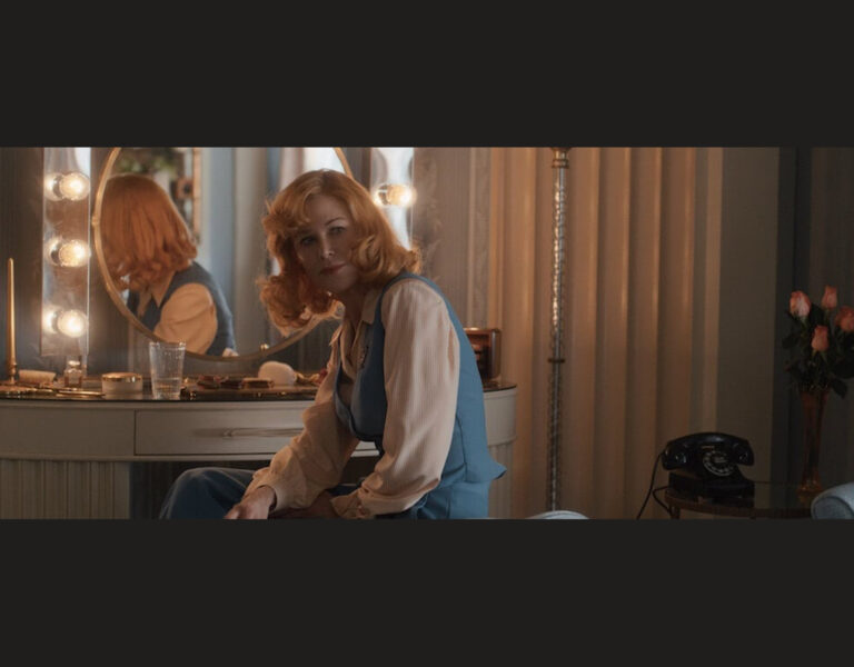
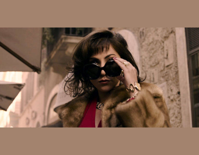
Armando Salas, ASC: The look is inspired by the late ’70s and early ’80s in Miami. We had tons of research that every department was compiling during prep. My task was to unify all those elements on camera in a unique way. The idea was to distill down to the essence in camera movement, coverage and color. I landed on a combination of grit and glamour using specific splashes of color in an otherwise desaturated and monotone environment, and soft light and halation combined with high contrast and heavy texture.
Were there any particular visual references you looked at for inspiration?
Salas: We referenced many films that we thought achieved something great in terms of blocking or camera movement, but never any gangster or crime movies. We referenced the work of photographers like Andy Sweet, William Eggleston and Larry Sultan. But among the hundreds of other images on the office wall of director Andrés Baiz, there were a couple paintings that were particularly important: Truth Coming Out of Her Well by French artist Jean-Léon Gérôme and Salome Dancing by German artist Franz von Stuck. Not only were they thematically important, but they inspired a slightly more painterly and allegorical approach to visuals. Another important source of inspiration for the color and contrast attributes were Polaroids that Andrés and I were taking during our early location scouts.

What brought you to Panavision for this project?
Salas: I’ve used Panavision many times before, and I always feel they are invested in the success of the crew and the project. Early on in preproduction, I decided to arrange a blind camera shoot-out. [Panavision marketing executive] Mike Carter went above and beyond in supporting that and encouraging experimentation. I spent an hour with [senior vice president of optical engineering and lens strategy] Dan Sasaki discussing the look of the show, and he helped pair lens sets with camera bodies for our test. In the end I chose a camera and lens set I had never used before. We shot Griselda on the Red V-Raptor and Panavision DXL2 with Panaspeed lenses.
And what brought you to Light Iron?
Salas: Seeing how Griselda was destined for a Dolby Vision finish, I needed a collaborator who was well versed in color-managed workflows. Also, I knew grain and halation would be part of the look of the show, and I was adamant about a workflow that would allow for those elements to not only exist in the final output, but to be embedded in the fabric of the image from live monitoring on set, to dailies, to VFX review, etc. Light Iron was very supportive in finding a solution and was dedicated to a successful implementation.
Ian Vertovec: This is one of the first projects where we used a BLG [Baselight Grade] workflow using FilmLight’s Daylight for dailies. Using BLG instead of LUTs and CDLs allowed us to have our defocus, halation and grain applied to dailies and fully supported through VFX.

How did the two of you communicate about the desired look to ensure you were visualising it in the same way?
Salas: I was looking for a partner in the look development since I knew my approach was going to be very aggressive; Ian was that partner. I wanted the image characteristics to be audacious and yet feel organic so that I could lens and light for it with complete confidence that the image would not fall apart. Ian and I did several rounds of look development for both color and texture, ending with the final hair, makeup and wardrobe test to put our finishing touches on what essentially were two ‘film stocks,’ one for 1979-’80 and one for 1983.
Vertovec: Armando brought in actual Polaroids he and director Andrés Baiz shot on their location scouts, and we built the show LUT based on those references. This process really pushed us to be bolder with the amount of green we added to the shadows as well as the pronounced halation and grain.
The look of Griselda is a ’70s Polaroid color rendering with an emphasis on texture. Green-gold, cyan and a burnt red were key elements of the pallet to emphasize this rich and opulent crime thriller.
Salas: All of our look development was monitored in both PQ P3 and Rec 709. The field monitors on my DIT cart were 1,000-nit SmallHD Vision 17s, and all downstream monitors were SDR. It’s incredibly important that the creative intent is maintained across display formats and that dailies track to the HDR image I’m seeing on set. Fortunately it all went smoothly, and the tech was never a hurdle for the creative process.

What were some of the main areas of focus when you were finalising that look in the color grade?
Salas: Because we had put in the time and energy early on, final colour mainly focused on finesse. Of course there’s always a couple of tricky scenes that get away from you in production, but for the most part we were dealing with subtleties like guiding the eye from shot to shot and removing distractions.
Although much care went into the design of the look, the feeling is far more carefree and loose. Griselda is on a wild ride, and the image reflects that every step of the way, from the mundane to the opulent.

–
Unit photography by Elizabeth A. Morris. All images courtesy of Netflix.
