Could you share how you became involved in The Brutalist and your collaboration with Brady Corbet and Lol Crawley?
I was initially brought on board the film as a dailies colourist. However, from my first session with Lol and Brady, working through their camera test footage in preproduction, there was a mutual feeling that we all spoke the same language and shared a sense of aesthetics. On day three of production, they asked me to stay on as colourist for the whole project and finish the film.
After seeing the first few days’ rushes, it was immediately apparent that this film would be something very special. Adrian Brody was an irresistible presence on the screen, and there was a sense of scale and grandeur about every shot unlike anything seen in movies these days.
As a cinematographer, Lol is very focused on the story, and from our first interaction, it was clear that he and Brady had been working on this project for some time. Both shared a profound understanding of the story and its characters and had already formed visual ideas to compliment and accentuate it.
Lol and Brady often came into the studio after wrapping to screen and grade the previous day’s rushes. After they had asked me to stay on to do the final DI, these sessions became even more involved, and we did a lot of great work even during the shoot, finding looks and solutions that, in many cases, made it into the final grade of the film.
This is distinctly different from how many projects get graded, where the footage is shot and edited, and only then does the colourist truly get involved. In those instances, many decisions might have already been taken that may have been different if the colourist had been involved earlier.
In our case, it meant that Brady and Lol could go to set on day 6, knowing that what they did on day 4 worked out exactly as they hoped, or perhaps with an idea from me about how to change a subtle thing to achieve even better results. This was instrumental in affording them a sense of reassurance and confidence, allowing them to make bold and strong choices on set.
Brady Corbet has spoken about the importance of texture and atmosphere. How closely did you work with him and Lol to achieve the final look, and were there any specific references or inspirations that guided the grade?
Brady and Lol referred to movies, photographs and paintings when discussing how they wanted me to approach the grade. This film is their third collaboration, so they also pointed to scenes and shots in their previous movies that worked well as potential references.
As the film is a celebration of art, architecture and the act of creation in general, having references from across a range of media was essential in finding the right visual cues.
Once we started working together and we had our first few sessions in the suite, we developed a great dynamic where they initially gave me quite a lot of freedom to explore what the footage wanted, so to speak. They were quick and consistent with their feedback, immediately letting me know if I was moving in the right direction or if something didn’t feel quite right.
As we spent more and more hours in the suite, this process became shorter and more efficient. They were very generous with their confidence, letting me try anything I wanted, and if they liked it, we incorporated it into the look.
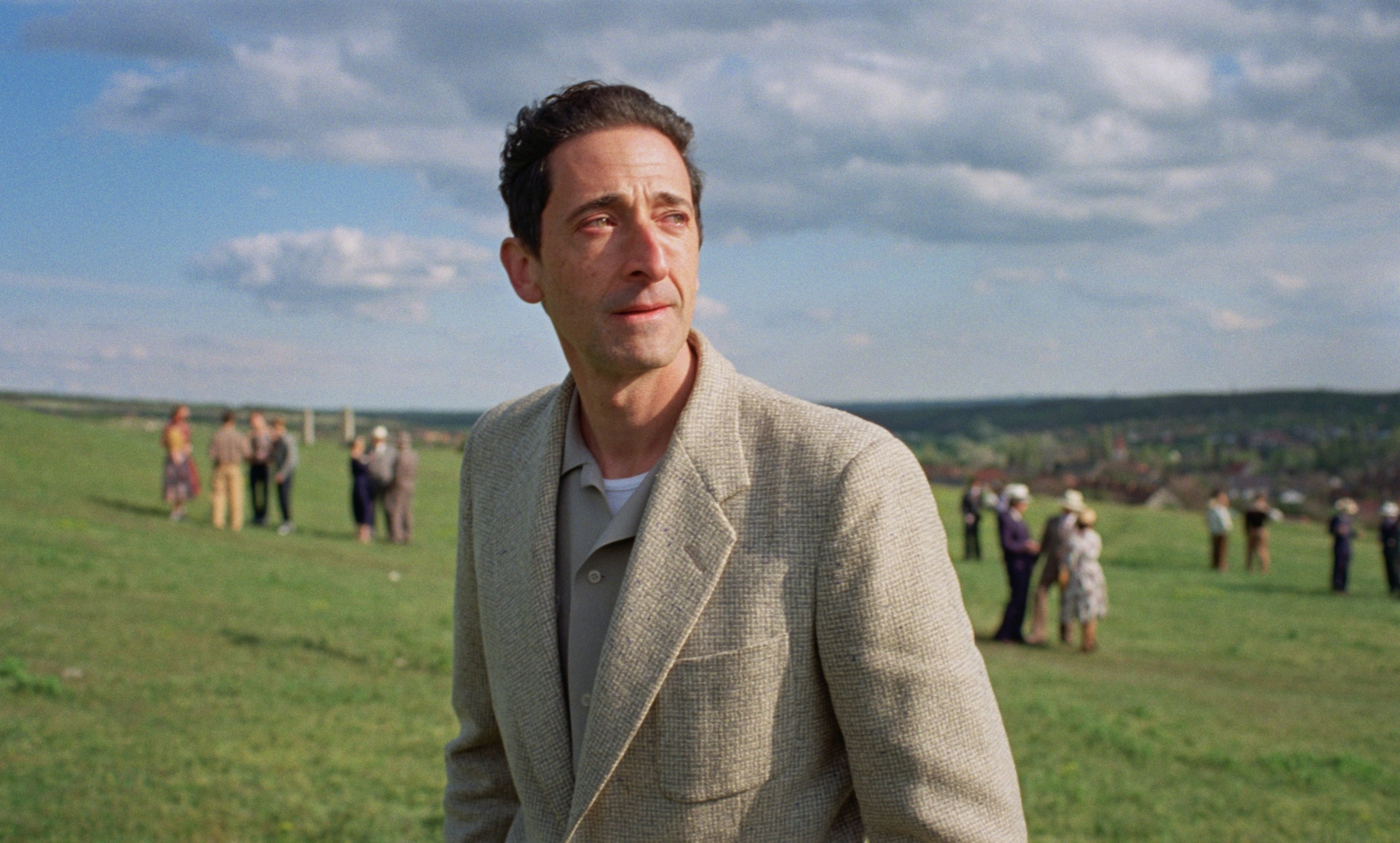
An excellent example is the dusk scene where Guy Pearce’s character brings his dinner party to the top of a hill to announce his plans to build the building the film primarily revolves around. The scene’s grade was largely informed by the sequence’s opening shot, where the party is seen walking through a park with their lanterns in the twilight and filmed as the last light faded. After some experimentation, I found an approach for that dim shot that created a fantastic, ethereal look. We loved it instantly and carried it through the rest of the scene.
This created a look very close to what’s in the film now. But one day, while working alone, I experimented further and found a way to redistribute low-end values from the blue channel where most of the exposure was into the other two. It recovered far more shadow detail than before. When Brady and Lol saw it the next day, they loved it, and that’s how it made it into the film. This back and forth became our rhythm. I experiment alone, and then the three of us collaborate closely, observe, react and refine together.
Texture and atmosphere were also central elements for the visual language of the film; a lot of the focus during the camera tests was on getting the right balance of exposure, lighting, negative processing and grade to get just the right amount and type of grain and texture that they needed for the movie. Lol and Brady made it clear that they wanted the film to have prominent grain in general, and they responded to the ‘beat-up’ quality that grain brought to the images.
The lens choice was another significant part of getting the film’s atmosphere right. Lol experimented with a great range of lenses before ultimately landing on the Cooke S4/i series.
Lol Crawley has discussed the use of VistaVision and the 70mm aesthetic. How did these choices influence your approach to the colour grading process?
Shooting in VistaVision and presenting in 70mm – among other screening formats – lends the film a unique sense of scale, visual and metaphorical. When approaching the grade, our goal was to maintain and accentuate this scale, gently shaping the light on landscapes and leading the eye to the right places on the impressive frames of VistaVision. As a colorist, it was an exciting challenge to gently and fluidly guide the eye across details most important to the visual narrative while protecting the integrity of some truly grand frames without letting them become too fragmented. In the end, we were pleased with how this worked out, especially considering the architecture and architectural details appearing both in the story and in its visual interpretation throughout the film.
On a more technical note, with the VistaVision cameras being rare and somewhat old pieces of technology, they flicker slightly in their exposure frame to frame. One of our specific challenges was eliminating this flicker, where it was distracting. Sometimes, we had to add flicker to the one 3perf 35mm shot intercut with the rest of the VistaVision footage in a scene to make the visual experience consistent.

Crawley mentioned creating a rich yet understated palette to reflect the story’s themes. How did you balance subtlety with visual impact in the grade?
Finding a balance between subtlety and visual impact was achieved mainly through experimentation and good communication to align our visual sensibilities. We talked a lot about the delicacy of skin tones and the subtle uses of green and blue to contrast them. We experimented with the richness of contrast, the levels of black and the film texture in the shadows.
The film prominently features elements of architecture, concrete, marble, stone, mud, and various other materials surrounding the characters. Getting the contrast and texture of these materials was crucial in order to achieve the intended emotional relation to the environment.
It also evolves through various moods and atmospheres, from the most delicate and intimate to grand vistas of brutalist architecture. We aimed to tune the range of colours to diverge and converge in a way that was appropriate for each scene, creating strong contrasts in light and shade, as well as colours where appropriate, while keeping other scenes much more muted and almost monochrome. Lol and Brady’s clear vision was our primary compass to finding what was appropriate where.
What challenges did you encounter in maintaining consistency across the varied locations and timelines of the film?
From the very beginning, one of Brady’s aesthetic guidelines was that he wanted the film to feel like a bit of an artifact, something discovered and not quite intentionally created. In some ways, this meant that we were tolerant of subtle shifts in the grading approach in the different scenes of the film.
Of course, Lol’s cinematography, the lenses, the lighting, film stock and many other factors still create a cohesive experience, with just the amount of variability to escape the feeling of it being too glossy and precise. The varied locations, periods and lighting constructions add to the movie’s epic and extensive feeling. My role was to ensure these variations feel intriguing and exciting and not jarring or distracting.
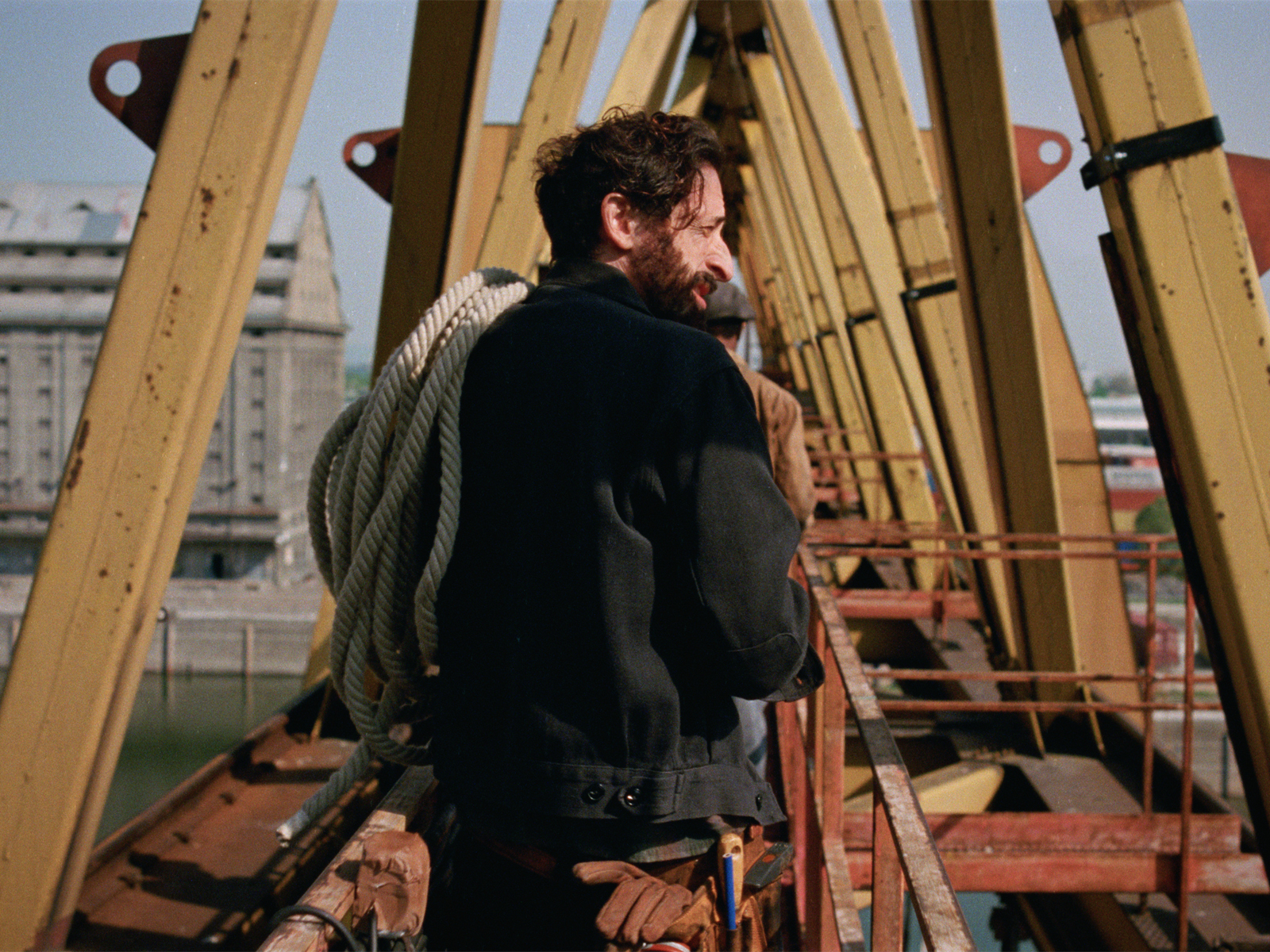
One example of a challenge arising from the varied filming locations was the colour of the concrete used in the building’s construction. Most of the building was a CG element, but for certain scenes where characters roam the halls of the semi-finished building, they shot on location at an actual brutalist building in Hungary. However, the concrete the building was made of was tinted red for some reason. So, I had to pay close attention to find a way to precisely match the colour of the red concrete to the rest of the concrete elements in the film while not affecting any of the characters moving through it.
It was also essential and enriching for me to visit the shooting locations, both backlot sets and on location, to study texture, light and architecture to ensure I saw firsthand what we could later accomplish by playing with and perfecting the footage. In this regard, there was a much deeper involvement in the shoot than is traditionally considered common practice for the grade. However, it showed us that more immersion into the material during the shoot is an artistic advantage further down the line, granting us more license to venture as far as possible to achieve a vision. This experience will definitely inform my work in the coming years, and it shows that one courageous and daring endeavour like The Brutalist can help us rethink practices and how we work on telling stories in 2025.
What DaVinci Resolve features proved particularly helpful on this project and why?
DaVinci Resolve Studio has been wonderful to work with on this project. With Lol and Brady keen on exploiting the latitude offered by Kodak film stock to its fullest and pushed the boundaries of exposure to great effect, deciding to push process most, if not all, of the footage for the film.
As the colorist, this challenged me to find ways of managing low exposures in a way that could complement Lol’s artistic intent. To suppress excess grain, manage the subtle colour shifts that push processing introduces while maintaining the expressive character of the footage. This was very important because Lol and Brady needed to know how far they could go in underexposing the film stock in a way that served the feature’s unique look.
The various denoising tools built into DaVinci Resolve, used in several different ways, sometimes globally and sometimes on individual channels, have been great at reducing grain where needed. I also used the Channel Mixer extensively to clear colors in the shadows in a more pleasing way. We also used the integrated grain feature to add grain where needed and to match other shots within a scene.
Although not a feature per se, the system’s stability was a great asset during the project. Both Lol and Brady noted that after finishing their previous films on other platforms, it was apparent to them that Resolve was very stable, with very few interruptions to our work.
What did the sign off process look like, and how did you communicate with the DP and director?
As I’ve already touched on, Lol and Brady came in for late night sessions throughout the shoot, where we developed many of the film’s looks and visual language elements. This enabled us to do preliminary color work where I mainly worked alone, and Brady and Lol occasionally checked in remotely to give feedback.
When it came time for the final grade, they both flew in and attended the entire grading process in person. We had a few days where we had enough notes for me to do a day on my own, and they were able to get some much needed rest, but for the most part, they were with me in the suite all day every day.
What made this more fruitful and effective was that we had done a lot of work in finding the language to communicate and defining the movie’s look during the shoot. So, when it came time to do the final grade, we worked towards a clear goal from day one that changed very little during the DI process. It wasn’t so much about discovery and exploration as that had happened during the shoot. Instead, it was about achieving the results we had all agreed on. It gave us the space to refine, perfect, and push ourselves to the limits both artistically and technically.

What do you see as the evolving role of colourists in projects with such ambitious visual storytelling?
The great thing about working with Lol and Brady on a film like The Brutalist was that I was involved with the evolution of the film’s look from very early on. From lens choice, stock selection, creating and testing the image pipeline from push processing through scanning to the grade and projection, all the way to hair and make-up. It was a phenomenal experience to have Lol and Brady trust me to ensure that everything they had planned would work as expected when it came time to finish the film.
One of my most important roles was giving Lol and Brady confidence; not only that I understood their visual intent, but that I was their partner in pushing the boundaries of 35mm film. They needed to trust that I would alert them if they were reaching the limits of what the footage could handle in terms of underexposure, color balance, and dynamic range without being overly cautious or restrictive. As Lol mentioned at Camerimage, I wasn’t an alarmist. Some of the film’s most striking images were shot in very low light, right on the edge of exposure. I believe this trust we built allowed Lol and Brady to move forward with these bold shots, knowing what we could achieve in the grade.