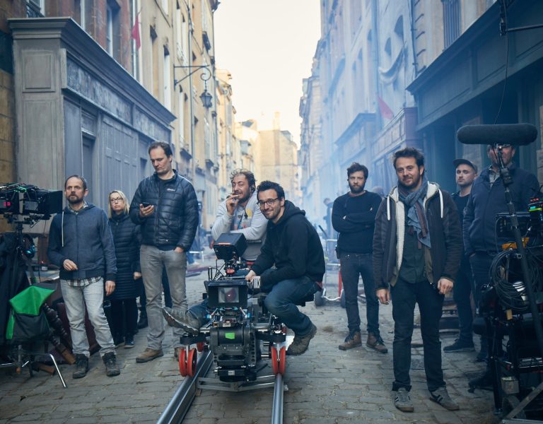
BRINGING A VISION TO LIFE
Selected filmography
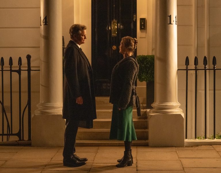
Brian and Charles (2022) in post-production
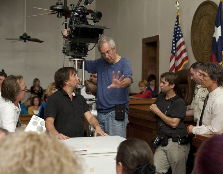
Santa Claus (2014)
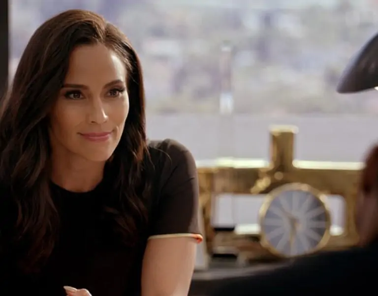
Mademoiselle C (2013)
What inspired you to become a colourist?
I was especially fond of music and played with friends in a rock band. this led me to want to join an audiovisual school to become a sound engineer. However, life had another path for me, and I found myself following the image route. It all started from there. During my first job, I experienced a telecine room, and it was a real revelation. The passion for this profession will never leave me.
How/where did you learn the craft?
I joined the Éclair Laboratory in Paris as an assistant, beginning with DI, longform colour grading. I met a lot of talented colourists and they advised me to start with assisting on a telecine. It was here I learned what colour grading was all about, and quickly progressed to working with clients on commercials and music videos.
What was your career progression?
I moved quite often in the early days of my career, progressing from assistant to junior colourist and then finally to senior colourist at Digital District. The role at Digital District was very exciting as they gave me the opportunity to develop a colour department from scratch. I spent two great years there before I got the call to join MPC’s colour team. I had always admired MPC’s work across film and advertising, and it was an absolute honour to be invited to join them. Now, after seven wonderful years, I have been promoted Creative Director of Colour at MPC London. I am so delighted to be where I am now.

What would you single out as your big break?
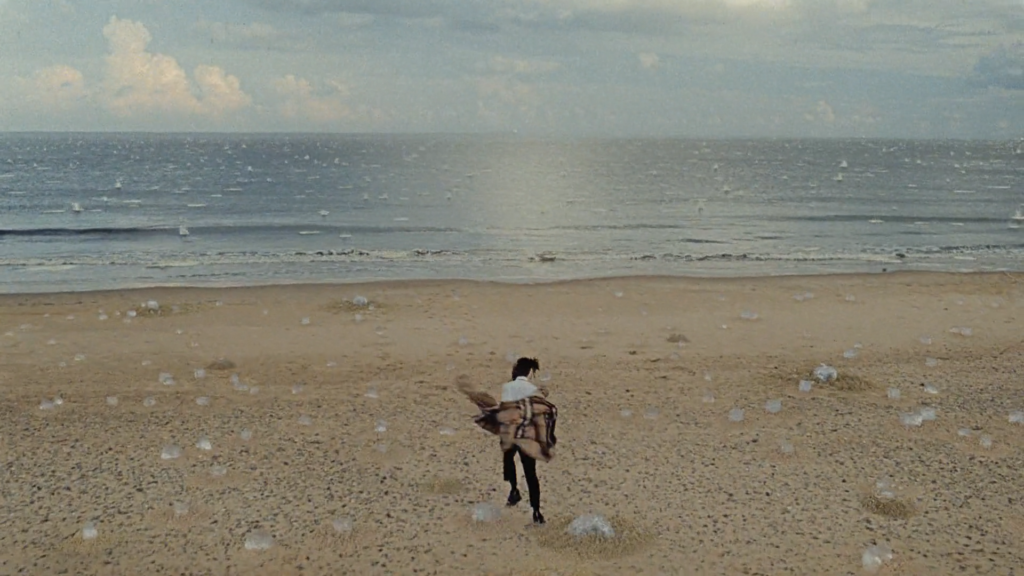
After a decade spent working in Paris, my move to MPC heightened the quality of projects I was able to work on considerably. Some of the defining moments of my career have happened during my time at MPC, especially being honoured with one of the biggest awards of this industry; my gold Lion for Best Colourist for the Benchmark Ad Burberry ‘Festive’.
Who or what are your biggest inspirations or mentors?
This person started as a colleague and now I can call him a friend. I’m of course talking about Jean-Clément Soret. He is one of the main reasons I joined MPC London. Since I started as an assistant, I had heard in France the talk about Jean-Clément, his talent, and his background. Since then, I’ve followed his work which has been a strong source of inspiration, he was in a way my virtual mentor. Now it’s an absolute honour to continue with what he has built at MPC.
What are the key qualities of a star colourist?
A good colourist is someone who listens to the expectations of the director and the DP, interpreting their needs in our colour language. I would also say it’s important to be patient and above all to always have fun and believe in yourself. Becoming a great colourist is a long road. It’s an eternal questioning that has no real limit. Always trying to work simplistically is the most difficult thing to achieve.
What are the fundamentals of a successful colourist/DP relationship?
The grade is about presenting the best possible versions to the DP, respecting what they have shot, and reaching the look and feel they are hoping to achieve or enhance. The most important and the most efficient detail is great communication between both.
A good understanding is also key to a successful relationship. Often when you get to know each other well, you can collaborate on a new dimension, understanding the specific tastes of each DP.
How would you describe your creative process?
The main thing is to bring a vision to life and give a true representation of what they have shot. Every job is a new challenge and has a new story which keeps me always looking for a new mood. I also research work via Instagram, it’s a great source for trends. I’m also into photography books and my favourite website, Filmgrab.
What role do you believe colour and the grade play in enhancing a production?
Colour is an important visual part of the storytelling process, and it has the power to influence how you feel emotionally. This can be seen in many of the great classics.
Red and warmer tones are often used for romantic films, desaturated colours are regularly deployed in a post-apocalyptic film, fluorescent greens are typical for sci-fi, blue cold tones are a classic horror trope, and for comedy you might expect to see more saturated and vibrant colours than usual.
A colour palette is primarily used to create mood and/or emotion, whilst also directing the viewer’s eye by emphasising different parts of the image. A nice grade could raise the production value of a project, whilst a bad one could lower it.



Which production was the most challenging and why?
A commercial for Postmates directed by The Sacred Egg and DP Alex Barber. The directors really wanted to achieve a very stylised grade in reference to the subway scene in Marriage Story but with bouncing burgers added to it. This famous sandwich was the most difficult goal to achieve because it needed to obviously look appetizing. Going forward, working a lot with CG sequences is evidently going to be an extended part of our skillset as colourists in both advertising and feature projects. On Postmates we worked as a team between 2D and 3D, whilst grading fluidly throughout the entire production and exchanging creatively daily which was a fantastic experience. This project emphasises to me that this approach is the most beneficial for optimum results and even if it is obvious, teamwork is essential.
Which production are you most proud to have worked on and why?
Without any hesitation, it’s Burberry ‘Festive’, directed by Megaforce and DP Katelin Arizmendi - Megaforce and Riff Raff’s re-invention of a Christmas commercial. I enjoyed colour grading this film from start to finish. The piece has richness and depth with a cinematic quality.
What is your favourite memory of working on a production?
Working on Madonna’s music video ‘Medelin’. I had the privilege to meet her, it was just unbelievable to be sat next to her when she came by for the grade approval. This type of moment makes my job so special.
What innovations have you been impressed by?
The main one for me was when Baselight arrived on the scene. Before that, only two systems were used (Poogle and the DaVinci). I remember spending one week of training before I made the choice to secure the right system for the company I worked for at the time. The innovation in Baselight had totally changed my working life, it gave me so much creative freedom, and even now it keeps evolving again and again.
What advice would you give aspiring colourists?
Practice and practice, find some looks you like and try to achieve them. Don’t be too impatient and above all, always have fun and believe in yourself. Everything you get the chance to grade, just make it as good as it can be with all the input from those around you who could be involved.
What are you currently working on?
It a very nice piece for British Heart foundation, directed by Ben Strebel and nicely lit by Benjamin Todd. It’s always something very special to work on a charity job, especially this one as it is an appeal for donations to make future technology for artificial hearts possible.


What inspires you outside of the world of film?
I love photography – I’m perhaps more of a collector than an actual photographer though. I really like mixing old lenses with new digital cameras. My favourite camera is my Diana F+ from Lomography. I love how easy it is to use and the imperfection you can create with it. I like to use it in cross-processing to get a strong contrast and vibrant colours.
What are the biggest recent changes you have seen in the world of colour grading?
Probably the challenges and changes of remote working since the start of the pandemic. I never thought it would be possible and to my surprise it was achievable, and the production is even better than I would ever have expected. Looking to the future, we’ll probably be working straight from a cloud system remotely with all departments of post-production working at the same time.
Cinematographer Ben Fordesman says:
“The role of a colourist is enormously important to my process. While shooting I am already planning how to bring to life in the grade. I’d heard good things about Matthieu through his stunning commercial work. Luckily, we teamed up to work together with directing duo DARYL and have since done many projects together. Matthieu is a wonderful and conscientious person. We got on immediately and he quickly became one of my go-to colourists. Even when I cannot attend the grade, I know I am in safe hands. His motif use of blue hues are truly spectacular. I think working together on so many projects, you build a great shorthand which affects the way I shoot, knowing how far Matthieu can push things in the grade. He has taught me a lot about what we can do in the grade, and he is a major asset to cinematic image making.”
Cinematographer Pierre de Kerchove says:
“Mathieu has a singular eye for colours. He can fill up an image with a large palette of distinctive colours and you barely notice it, such is the balance he is able to create. When you work with him, the conversation never drifts to more technical talk: “more contrast, less saturation…” It is all about how you feel the movie, where do you want the colours to drive the eye in a narrative way. It is about that pleasant feeling that you have when you look at an image, you can’t really tell what it is, but it feels good. That’s where the discussion stays. In the art, cinema, and photography sphere, you’re collaborating with a fellow artist, and it makes everybody’s work so much easier.”
