COLOUR CONTRAST
Ed Lachman ASC is known for seamlessly blending period lenses, film textures, and innovative techniques to create a rich visual style that authentically evokes the eras he portrays. In collaboration with director Pablo Larraín, Lachman explains his approach to their black-and-white film El Conde and their latest project, Maria, a tragic story told in brilliant colour.
As a cinematographer, I began my journey with film, immersing myself in its visual grammar and learning how to control it. This understanding of film’s tactile qualities became the foundation for my work in the digital realm, most notably the EL (Exposure Latitude) Zone system. The system emerged from a need to navigate the digital world using principles I used in the analogue domain—specifically, the control of the negative to achieve the visual look of the image.
Film creates a depth to the image. The three layers of red, green, and blue (RGB) in film are like microscopic layers of depth. When exposed and developed, they resemble an etching through which light passes, with the developer working through each layer. This depth endures even through a DI process.
One of film’s most interesting qualities is also its use of grain structure, a randomness that breathes life into the image. Highlights exhibit fine grain, while shadows reveal larger grain, creating a dynamic interplay between frames that feels almost alive—anthropomorphic, even. This “breathing” grain contrasts with digital’s fixed pixels, which exist on a flat singular plane. Film’s ever-changing grain gives motion and vibrancy to the image, akin to the way oil paint interacts with the texture of the canvas, influenced by the brushstrokes.
Another distinction lies in colour. Film captures a unique “contamination” of the inter-mix of colours—a confluence where cool and warm tones blend. For instance, when shooting at 3200 Kelvin indoors with daylight entering through the windows, film creates a blueish hue against the warm interior light that mingles with the cool daylight, creating a hue of green as seen in Maria.
This blending, reminiscent of the art of oil painting, produces hues that can enrich the image. In contrast, digital often isolates colours, lacking the interplay film achieves.
To manipulate this spectrum, I frequently experiment with colour temperature and gels, creating the palette of a visual identity. Yet, I find this process more challenging in the digital space, which tends to replicate colours as they appear rather than embracing the subtle interactions that film is able to achieve.
Film, for me, is a living medium. Its randomness in the exposure of the grain, affects the perception of depth and the ability to merge colours displays a painterly quality that elevates it beyond mere representation. It transforms an image into something greater— with possible soul and motion, where the frames breathe life.
Taking advantage
The way film’s chemical processes render colour is fundamentally different from how digital systems represent it and I’ve always preferred the flexibility and quality of film’s grain manipulation.
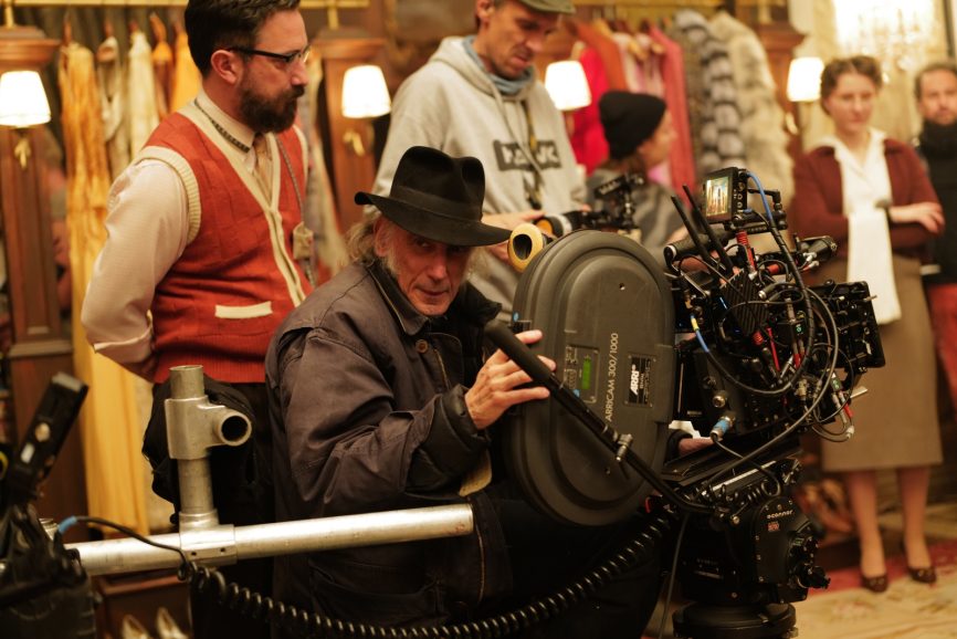
For my previous film with Pablo Larrain, El Conde (2023), we shot digitally using a monochromatic Alexa Mini LF. ARRI had never developed a monochromatic version of this model before, though they had monochromatic options for the Alexa XT series and the 65. I was fortunate ARRI custom-built a monochromatic LF camera for the project. Despite the company focusing on releasing the Alexa 35 at the time, the customised LF arrived just a week before shooting began, exceeding all my expectations.
What I found was that, by losing the Bayer pattern colour filter array, the exposure increased 3/4 of a stop. An ISO 800 image became 1280, and 1280 acted like 2000. Additionally, the monochromatic sensor provided more information in the mid-range, enhancing tonal depth.
Another advantage was the ability to use filters. By using my older black-and-white filters that affect different levels of contrast to the image, using yellow, orange and red, I affected the look on the set and location. While post-production offers some flexibility, it offers a more limited range than in-camera without creating artifact problems. Using the filters in-camera allows for a more nuanced control over contrast.

On El Conde, I also used lenses that were developed during the period of black-and-white photography— the original Baltar glass which I later used in Maria for both black and white and colour scenes.
The rehoused Ultra Baltars, covering full frame sensors, with glass originally made by Bausch & Lomb in the late 1930s, not to be confused with the Super Baltars from the 1960s, which were made for reflex cameras and were multi-coated with a more complex design with higher contrast. The original Baltars were intended for rack-over cameras, with a simpler design that featured six elements and single-layer coating, which creates a beautiful contour shape and falloff. This connection to lenses used during the black-and-white era is significant, as they were used in classic films such as Orson Welles’ The Magnificent Ambersons (1942) and A Touch of Evil (1958). Gordon Willis even used some focal lengths that weren’t in the Super Baltar range when he lensed The Godfather (1972).
Using older lenses is something I worked out with director Todd Haynes. We’ve always strived to use tools that are as close as possible to those of the period of the films we’re creating for the authenticity of the images.
While I can’t use the exact same film stocks, I primarily push, especially 5219, because it’s almost grainless today, allowing me to emulate more of the grain of older film.
With the EL Zone
For El Conde, which was in black-and-white, we used a monochromatic camera with specific lenses and filters, combining these elements with my EL Zone system, which I’ve been developing over the past decade. This system helps us understand the exposure latitude of the digital sensor by implementing 18% grey as a standard. The way ARRI places 18% grey may differ from Sony or RED. With the EL Zone system, you now have a standardisation between camera manufacturers to visualise and preserve shadow and highlight details while interpreting your exposure in a way that aligns with the analogue world. This method is being adopted more and more by manufacturers like Sony, Panasonic, SmallHD, Atomos, Sigma and many post houses. The problem with IRE as the standard for digital exposure measurement is that it’s based on linear measurement not log rhythmic, which is not consistent with our light meters, stops on our lenses or the way we communicate on set. The EL Zone System is a logarithmic measurement that aligns with the analog world that’s measures exposure by doubling the amount of light to increase one stop.
We don’t communicate with gaffers or the lab using IRE. In filmmaking, we speak in terms of stops. The issue with IRE is that every camera manufacturer interprets exposure values differently based on their sensor, which can be confusing. Most people don’t even know what IRE stands for. I found that it originated with the International Radio Engineers from 1895, who were interpreting lighting with radio signals. So, camera manufacturers were asking us to interpret lighting exposure through radio signals or sound waves, which never seemed like a great idea to me.
The EL Zone system restores the idea of exposure in terms of stops, rather than relying on inconsistent IRE scales from different camera manufacturers or relying on monitors which may be calibrated incorrectly…18% grey is 18% grey despite how a monitor is set up or whatever camera you are using. False colour is a false representation of exposure as it uses IRE values without accounting for the interpretation of what the stops represent.

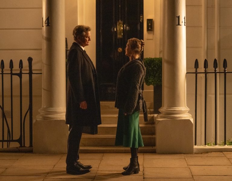
Creating a movie like Maria
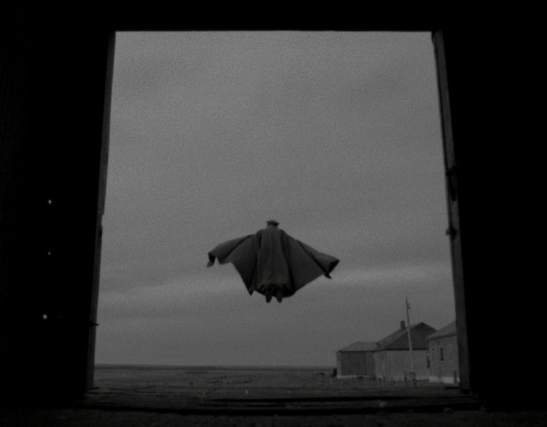
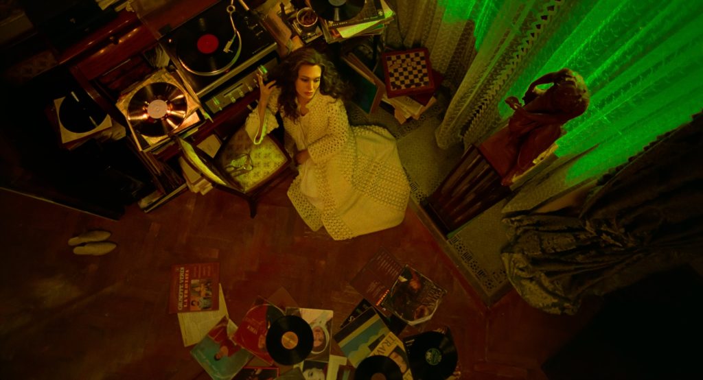
We used different textures of film: Super 8 representing her home movies of her private moments with the people that were closest to her, Super 16mm used by the documentary crew that she imagines that is documenting her life, black-and-white 35mm illustrating Callas’s past, and 35mm colour showing her present in the 1960s and ‘70s. I shot with various lenses, including Ultra Baltars and K35s. For the documentary crew that she imagined, I used my ARRI 416 and Aaton LTR with a Cooke 10.4-52mm zoom lens. For the Super 8, we used a Kodak Super 8 camera with the Angénieux 8-64mm lens. The 35mm camera was an ARRICAM 3 Perf.
I was inspired by filmmakers like Luchino Visconti, with his operatic use of camera and moving visual style, Max Ophüls, whose fluid camera movements in black-and-white films created melancholy narratives in nonlinear structures about the struggles and desires of women. Then, for the colour aspect, I turned to Douglas Sirk, whose lush Technicolor visuals created melodramatic narratives in a heightened sense of reality for women entrapped by their desires. For me, the style of Maria reflected the aesthetics, themes, and form of the operas in which she performed.
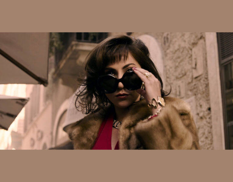
Although Maria is a film about one of the greatest opera singers, it’s more than a biography of her career, it’s structured like an opera about Maria’s life with its themes of betrayal, unrequited love and loss. These are the same themes often explored in her operas, and she experienced them personally. Maria was betrayed and manipulated by those closest to her—her mother and the men in her life. She tried to overcome this through the strength of her voice and music. Ultimately, however, when she lost her voice, she also lost the strength to survive.
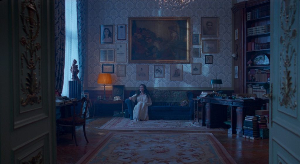
Visually, I wanted to explore two key elements. First, I used a moving camera to create an objective, reflective perspective—almost like placing the audience in the seat of an opera house, watching her life unfold. I call this a “moving proscenium,” where the camera itself represents the stage and places the audience in her world. The second element was the idea that opera is not meant to be representational; it’s an interpretation and a heightened reality. As such, the colours in Maria are not meant to be naturalistic but rather to create a heightened sense of emotion for the viewer.
I experimented with colour temperatures—daylight, tungsten, fluorescent lighting, and the use of colour gels—to evoke different emotions. Even in her apartment, which I consider a warm “nest” or cocoon, I used contrasting colours to evoke tension from the exterior world. I often had green light infiltrating her environment, knowing that green can be unflattering to flesh tones. This contrast between warm and cool hues was meant to mirror the inner turmoil she was experiencing, as well as to help the audience feel what she felt.
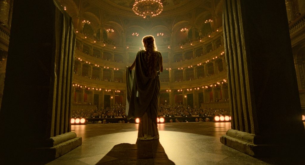
Lighting La Scala
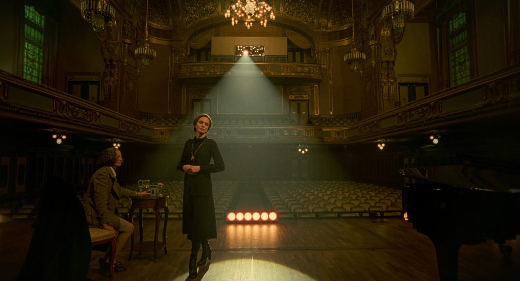
One of the greatest challenges was shooting at La Scala in Milan. We had only four hours to film, which was incredibly expensive and logistically complex. To make the most of that time, I worked with the lighting director of La Scala, who knew the stage best, and used their stage lighting. I brought in a stronger 4K HTI Juliat Lancelot Followspot and used lightweight, inexpensive Par Cans to bounce off the ceiling for a minimum ambient light level in the auditorium. We set up the lighting in 45 minutes and we shot Anna Bolena with the rest of the time.
This was a huge logistical challenge, but the Steadicam work, handled by our Chilean operator Diego Miranda, was essential in capturing the dynamic feel in the opera. He’s a long-time collaborator of Pablo and for me he became an important contributor to the visual storytelling of the film.
Another challenge was lighting Maria’s apartment, especially since we often shot in wide lenses, which didn’t allow for hiding lights inside. To create different moods and times of day, I used 18K lights on 90ft cranes outside each window to implement the daylight. I adjusted the height and color temperature of the lights to affect different times of the day’s tones.
The approach to filming across different eras—whether through the tactile depth of film, the interplay of colour and contrast, or the use of period lenses—is about more than just recreating the past. It was about the essence of what opera was for Maria Callas, without reason or logic but the emotional response for the audience, blending visual language and music.