
Hardy Perennial
Charlotte Bruus Christensen / Far from the Madding Crowd

Hardy Perennial
Charlotte Bruus Christensen / Far from the Madding Crowd
BY: Ron Prince
Far From The Madding Crowd was Thomas Hardy’s fourth novel and his first major literary success. It originally appeared anonymously as a monthly serial in Cornhill Magazine, a popular literary journal, where it gained a wide readership and positive critical notices. Whilst the 1874 novel has remained a favoured read, several films have been based on the book, the best-known of which is John Schlesinger's 1967 adaptation starring Julie Christie, Terence Stamp, Peter Finch and Alan Bates, lensed by Nic Roeg BSC.

Although being a hard act to follow, the romantic drama has been reworked once again for the big screen, with Carey Mulligan, Matthias Schoenaerts, Michael Sheen and Tom Sturridge in the leading roles, under the auspices of Danish Dogme auteur Thomas Vinterberg and young Danish cinematographer/operator Charlotte Bruus Christensen in charge of delivering the visuals on celluloid. Made on an estimated £12m budget, the BBC Films, DNA Films and Fox Searchlight Pictures production, includes Andrew Macdonald and Allon Reich amongst the producers, with the screenplay by David Nicholls.
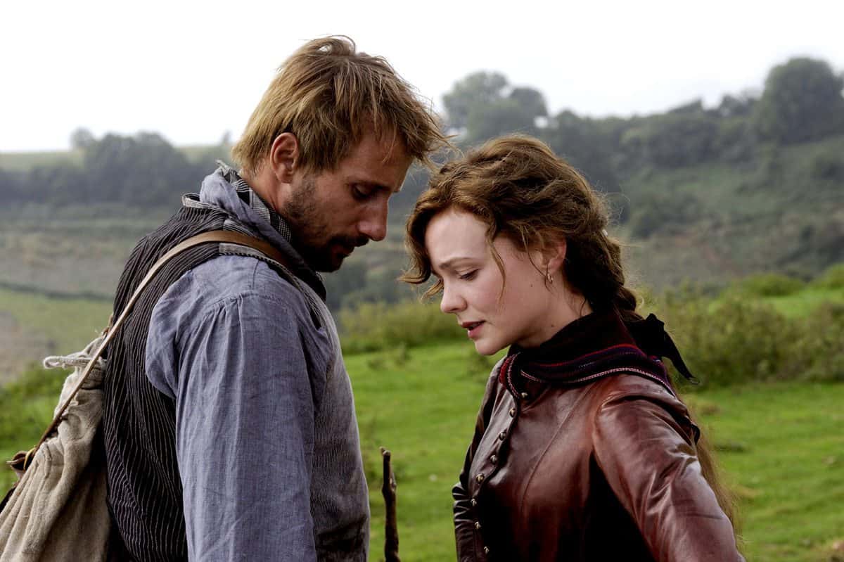
For those unfamiliar with Hardy’s tale, it is set in south-west Victorian England and revolves around the headstrong and beautiful farm-owner Bathsheba Everdene (Mulligan) who is attracted to, and buffeted by, three very different suitors: Gabriel Oak (Schoenaerts), a frugal but well-meaning sheep farmer; William Boldwood (Sheen), a prosperous, mature but lonely bachelor; and Frank Troy (Tom Sturridge), a dashing but reckless Sergeant. They each contend for Bathsheba's hand, and conflict is inevitable. By the end of the dramatic story, Bathsheba learns that romantic passion can be a dangerous, heartbreaking illusion. And that love can blind a person to defects of character, when what really count are honesty, steadiness and integrity.
Whilst the new production has been enjoying favourable reviews, the critics have particularly honed-in on the “ravishingly good”, “sun-soaked” and “lustrous” framing of Bruus Christensen’s work. The visual appeal of Wessex proved so great that one pundit remarked, “As soon as you leave the cinema, you want to pack a suitcase.”
A 2004 alumnus of the National Film & Television School, and recently listed among Variety’s ‘Top Ten cinematographers to watch in 2015’, Ron Prince caught up with meteoric Bruus Christensen over Skype to discover more about her take on the movie.
How did the script come your way?
CBC: It was through Thomas, as we have worked successfully together on two movies now – Submarino (2010) and The Hunt (2012). However, I think he may have had to convince the studio and the producers that a little blonde Danish girl could put a classic Thomas Hardy story on the big screen.
Did you have any reservations about shooting a remake?
CBC: Yes and no. Although I had never done a studio picture before, I had absolutely no reservations about shooting a period piece, a studio picture, and welcomed the chance to work with Carey and also with Thomas again. But, Thomas and I realised how very-much-loved the 1967 film is in the UK, and around the world, and knew it was a challenging project to take on in that respect. So we asked ourselves how are we going to tell the story for a 21st century audience? Thomas felt that we should be inspired by, and stay true to, the original story. That we should go with Hardy’s scenes and descriptions, keep it underlit, and not force any modern energy into the drama or the cinematography.
What were your initial discussions with Thomas about the movie?
CBC: As I have mentioned, we wanted to stay faithful to the book, the emotions, feelings and descriptions in the story, and not push anything unnatural upon it. At the very early stages of working on a movie with Thomas he often throws in words or lines to create a frame of reference. On this production the words were “sweeping romance” – which got me thinking. That said, Thomas is a Dogme 95 director with a robust, but simple, Scandinavian style about his work, and he also wanted to get to the bone of story – to the truth.
So there was a mix in our thinking – a combination of old-style and free-style; a merger of big, static shots that are allowed time to breathe, juxtaposed with intimate, more Bergman-like images, where the lighting in the eyes exposes the emotions in the soul. Nothing unnatural, no special focus on the beautiful costumes or candlelight – more of a simple documentary, if anything, of 1874.

What research did you do, and what creative references did you consider?
CBC: I read the novel a couple of years ago, when Thomas first started talking about the project, and also again when I was being considered as the cinematographer. I was struck by Bathsheba’s fragility, by the strong and powerful emotional currents that Hardy’s novel evokes inside the characters, and the backdrop of the English countryside he describes.
Along with the novel, we just had to see the 1967 movie version with Julie Christie. But, we also watched Fanny And Alexander (1982, DP Sven Nykvist), Doctor Zhivago (1965, DP Freddie Young), Gone With The Wind (1939, DPs Ernest Haller and Lee Garmes), and Days Of Heaven (DP Nestor Almendros). These are classic films that stay within themselves – their tales are simply-told, and are not affected by trends.
Along with the feeling of properness in these movies, we also liked the Technicolor look in Gone With The Wind and how it supports the sweeping romance. Obviously, we do not have the tools for that now, so Thomas and I invented the idea of a “Prime Colour” movie – that would play-up the strong, heavy reds in the costumes, the blues in the dawn and dusk lighting, and the natural green of the landscape.
Actually, there’s a lot of landscape Hardy’s book, and what you realise from reading the text is that he picks up on something specific in the views he describes – such as corn heads bobbing in the wind, sturdy trees in the landscape or scudding clouds. I underlined these descriptions when reading the book. So rather than just pitching-up with a camera and shooting a straight but beautiful landscape, I had something extra to consider that would bring interest to the frame. I also referenced a whole host of French and Danish landscape artists and photographers, and in the end I compiled a 300-page PowerPoint, scene-by-scene mood document.
How did you decide to shoot film vs digital?
CBC: Right from the start we knew this production must be shot on 35mm film, and to keep the visuals as simple and as natural as possible. Hardy is all about texture, the subtle quality of the texture, and the best way to achieve this was in-camera on film. We could have chosen to shoot digitally, and then relied heavily on the DI to give us the result we wanted, but we did not want to go on that detour. We wanted to create the movie on-set, in the camera, using different film stocks lights, filters and use only a short DI to help it come together.
With this in mind, and taking into account that the film takes place over many years and different seasons, meant me having to be meticulously prepared. For each scene I had know exactly the time of year and time of day it was set, to pre-plan the filmstock I wanted to use, plus the lens, filtration, colour palette, camera movement, framing and overall intention – all so that images would cut together nicely and minimise the time in the DI too. Whilst this is nothing new, it does take dogged determination and discipline. It’s very hard to keep things simple. But there’s beauty and romance in simplicity.

"I specially selected a 40mm UltraSpeed, which had the perfect balance of softness, warmth and rich blacks for working on low ASA stock."
- Charlotte Bruus Christensen
Can you explain the creative reasoning behind you choice of aspect ratio, cameras and cameras, lenses?
CBC: The camera and lens package came from Panavision. We shot open gate 2.35:1 Anamorphic, but with a set of spherical lenses. I wanted to shoot widescreen, not just to capture wilds of the landscapes but also for its compositional possibilities in support of Bathsehba’s romantic story. For example, when we see Bathsheba and Gabriel Oak, they are almost always on their own in the frame, with space around them, isolated from one another. But with Bathsheba and Boldwood, they are more often in the frame, close together, deepening the feeling of how he has forced himself upon her. With Sergeant Tory, to emphasise Bathsheba’s feelings of danger and attraction, I went more for a two-shot, where you can place one subject in the foreground and the other in the background, and play with distance and intimacy in the same frame.
I went with Panavision Millennium camera, and a set of Panavision Primos. The lenses are very colourful and helped to bring out the red, green and blues we wanted, without having to adopt too much filtration. There was also great colour consistency between the lenses in the set. To bring a richness to the close-up images of Carey, I specially selected a 40mm UltraSpeed, which had the perfect balance of softness, warmth and rich blacks for working on low ASA stock.

Which filmstocks did you choose?
CBC: I went with Kodak Vision 3 50/250 Daylight and 200/500 Tungsten. I used the 50D on all of the daytime exteriors and some interiors with bigger lights, as the contrast is good and the over-exposure is great. I wanted a richness of colour on the negative, and nice fine grain. I used the 500T on the fire and storm sequences, and several party scenes when lighting for 360º-handheld. It’s a beautiful stock too. I knew the 250D would be perfect for the many overcast autumn and winter scenes in movie. I employed the 200T to help keep things underlit, but keep subtle details in the shadows. For example, I used it on the opening shot to heighten the visual impact as Carey emerges from dark shadows and into the light, and also in some of the candlelit scenes to capture the natural fall-off of the light but without the image quite going to black. The film processing was done at i-Dailies in London, who did a great job for us throughout the production.
Who were your crew?
CBC: Oh, I really loved my British crew! They were all so experienced, committed to the project and very supportive. I connected with gaffer Alex Scott immediately – he knew what I wanted from the candlelight and made sure it worked. It was great to reconnect with focus puller Ashley Bond, having previously worked with him on Mark Evan’s Hunky Dory. Nothing was ever too much trouble for my key grip Simon Thorpe. On B-camera and Steadicam I relied on Anders Holck, and AC Rami Bartholdy, who I asked over from Denmark. Anders shot the gorgeous, floating Steadicam that concludes one of my favourite scenes of the movie, the ‘Hollow In The Ferns’ sequence, in which Troy seduces Bathsheba in the misty forest with a display of his swordsmanship.

Are there any other special mentions?
CBC: Thomas and I had an amazing collaboration with the extremely gifted production designer Kave Quinn, who was constantly offering options and creative solutions to all our needs and wishes. Her eye for atmosphere and creative mind certainly gave us the perfect settings to create the look of the film.
What was your shooting schedule?
CBC: I was in the UK for a total of 17 weeks. Apart from an exterior for the fire scene, which we shot at Warner Bros, Leavesden Studios, and a week in London at the end of the shoot, we were based entirely on-location in Dorset – Sherborne, Mapperton, Beaminster and the coast near Durdle Door. It’s a beautiful county, with rolling hills, coastline and wonderful light, and I absolutely fell in love with it. I could easily imagine myself living there one day. We started principal photography on September 16th 2013 and shot for seven weeks, mainly 11-day fortnights.
Were there any happy accidents?
CBC: The whole shoot was very tricky because of the changeable weather conditions. It rained a lot. I don’t know if you could describe it as a happy accident, but one morning, as we were setting up for one of the bigger shots in the movie, in which Gabriel's inexperienced new sheepdog drives the flock over the cliff, the weather turned in our favour. The combination of the sea mist and the rising sun gave me a wonderful, ethereal, silvery light that suited the moment, and provided wonderful cinematographic opportunities with dramatic silhouettes that are very pleasing on-screen.
Tell us about the DI?
CBC: We completed the DI with Adam Inglis at Company 3 in London. As we had created the movie in-camera, this was really a finishing and finessing point for the visuals. Although we had ten days booked, a fair amount of time was taken up doing other jobs, such as creating screeners for the studio execs, and checking the VFX. It all went very smoothly and we did fewer days of grading than we had expected.
Throughout the production, Thomas and myself were nervous about the final result. But I think we have delivered a simple movie about a fragile heroine in a powerfully emotional story with empathetic visuals, of which were are very proud.