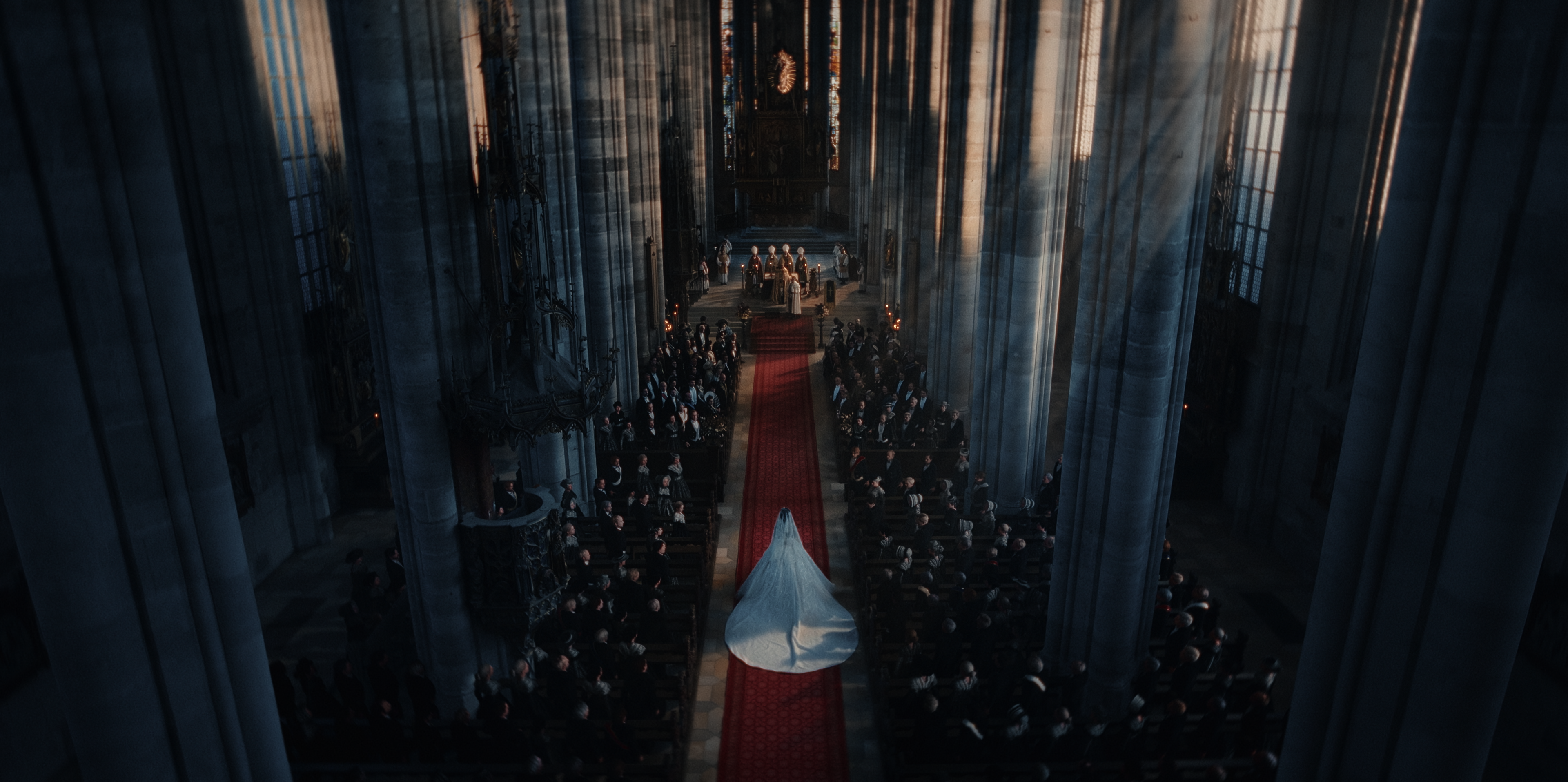
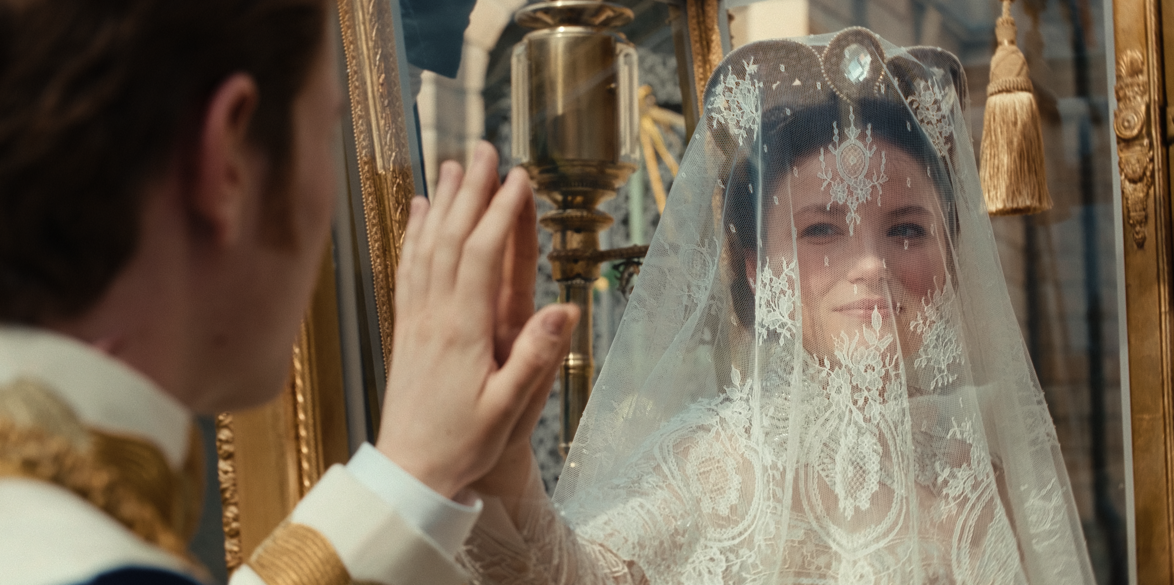
Netflix original The Empress, starring Devrim Lingnau and Philip Froissant, is shaped by 18th century events of Elisabeth of Austria. The mini-series follows the rebellious youth’s journey throughout her courtship, marriage and entry into the Viennese court as Empress.
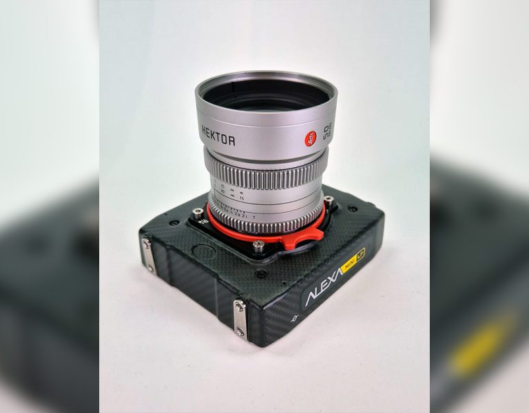
Katrin Gebbe and Florian Cossen directed the series working closely with cinematographers Christopher Aoun and Christian Almesberger, while Babelsberg based Rotor Film handled all aspects of post-production.
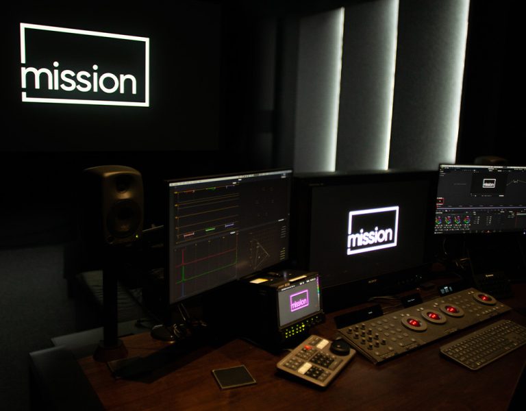
Conformed, graded and finished in DaVinci Resolve Studio, freelance colourist Marina Starke led the grade supported by Manuel Portschy. Marina became involved with editing on the series completed, bringing with her a fresh perspective.
Working with colour-supervising DP Christopher Aoun, Marina reveals to British Cinematographer how the show’s look was redefined in post.
Talk us through your preliminary conversations with the DP and Director.
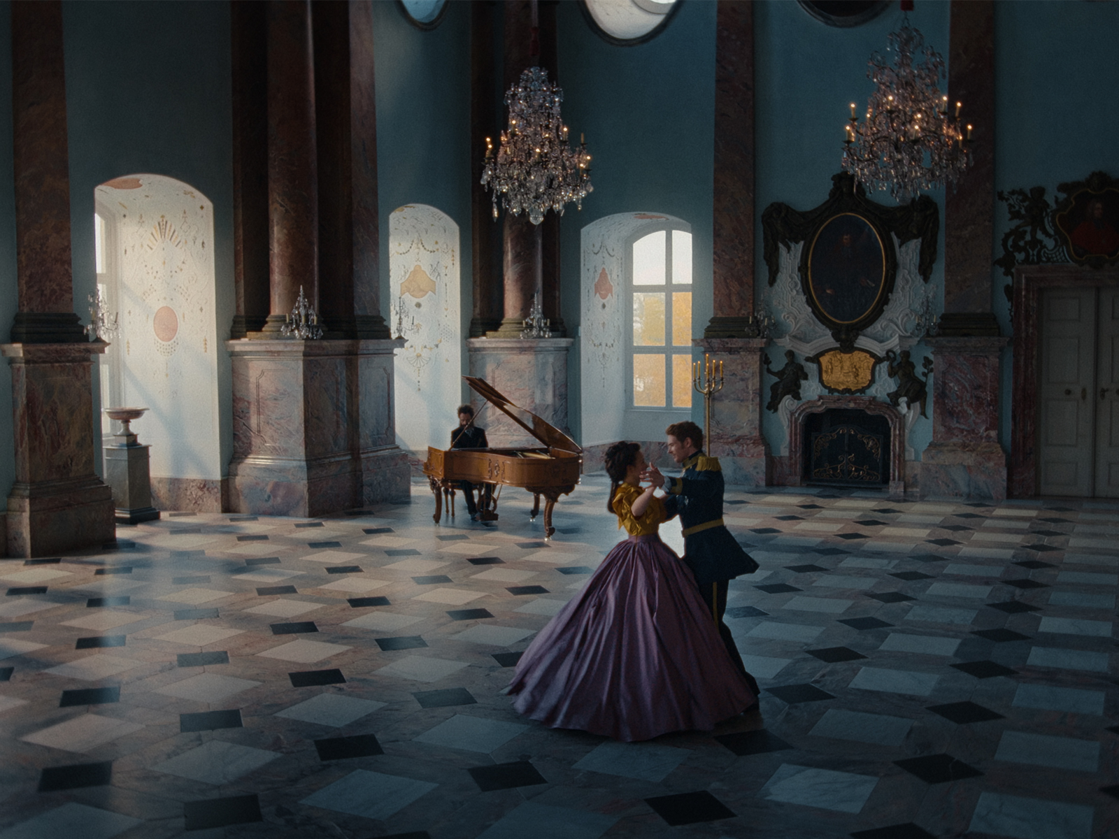
Everybody knew the series better at this stage with the edit done, and we felt empowered to go bolder to emphasize the story’s atmosphere. The stunning locations, the studio sets and the costume designs greatly inspired the look development. One of the main goals was to find a look that worked on all the episodes, gluing them together.
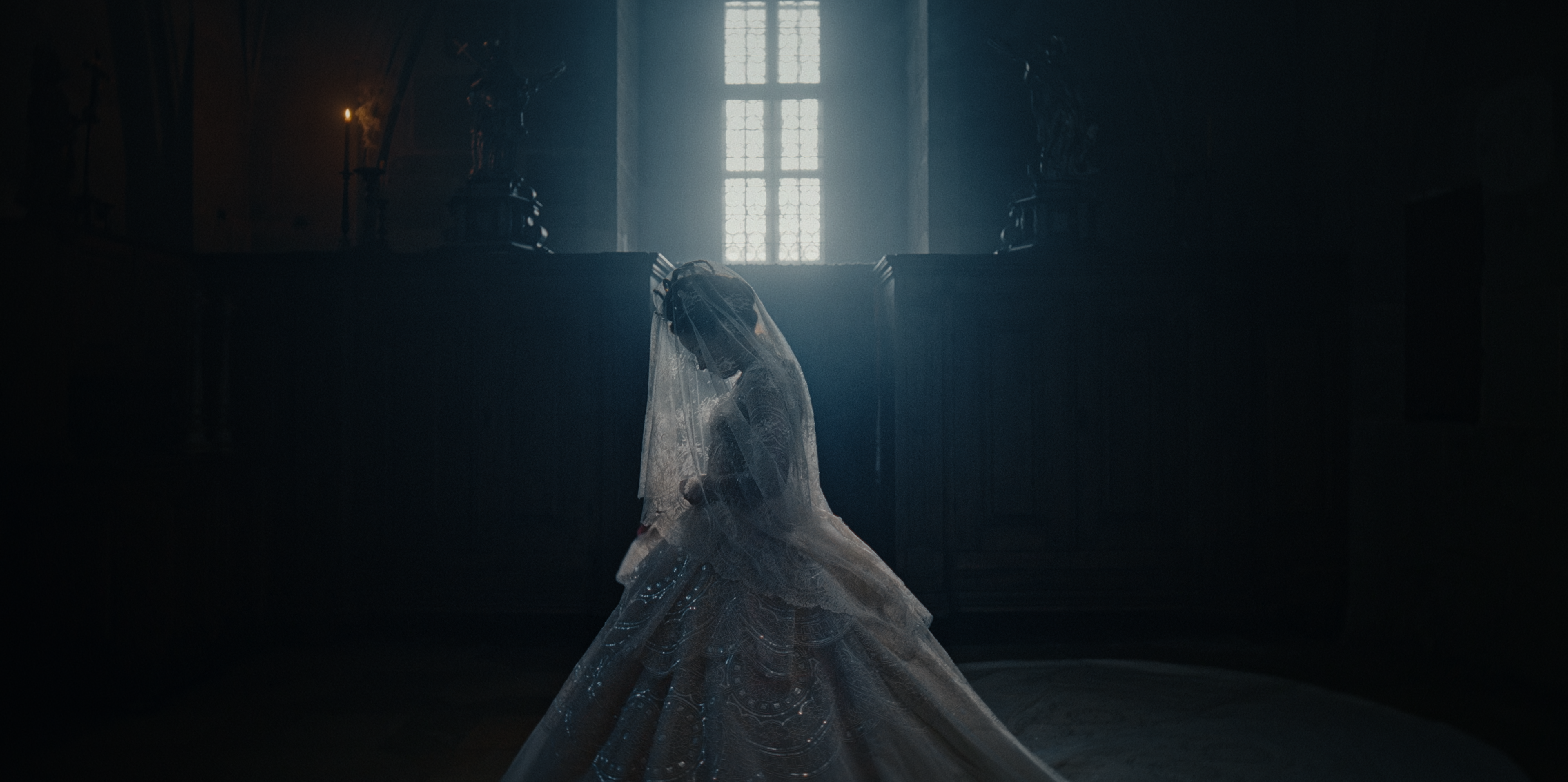
Since The Empress is a dark romance, it was supposed to be very different from the well-known Ernst Marischka movies. I worked closely with Christopher, showrunner Katie Eyssen and directors Katrin and Florian to develop an elegant, modern and confident look that wasn’t over the top.
What was your starting point for the grade?
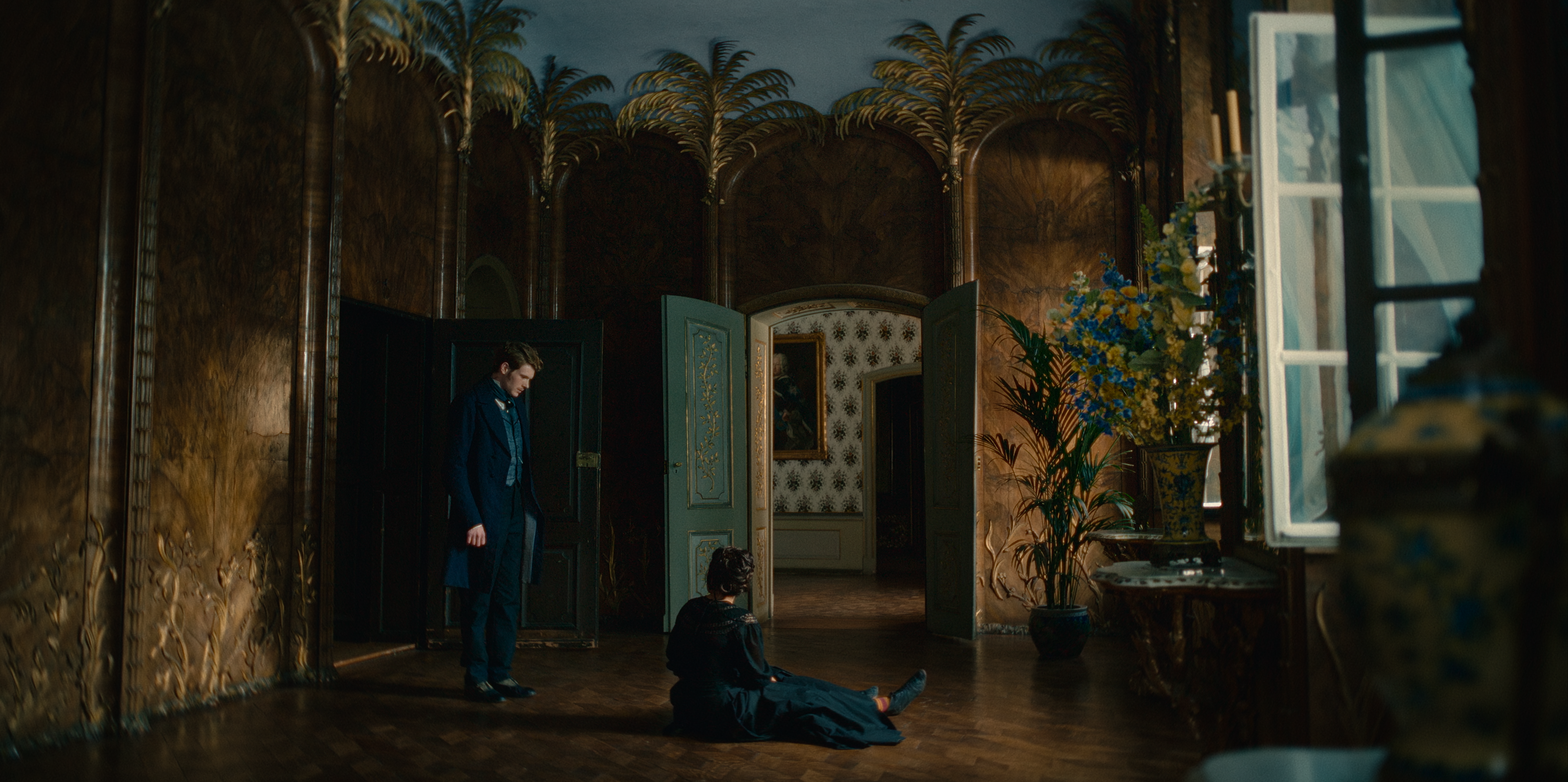
Settling on a combination of high gloss and gloom, we didn’t want to shy away from bold contrast and deep, rich colours. The sets and costumes already shaped a range of colours, and we brought out their subtle nuances and textures while suppressing other specific colours.
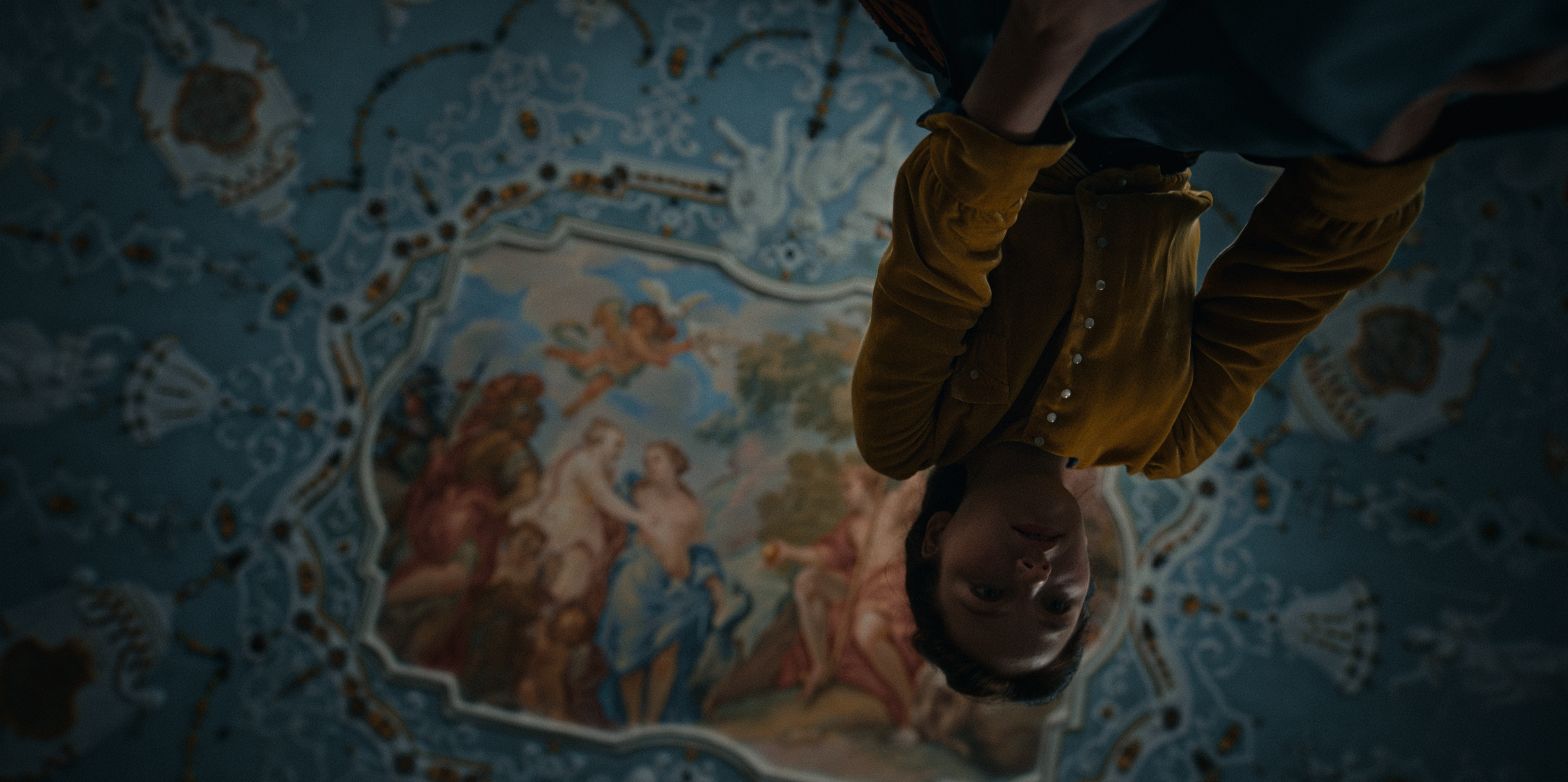
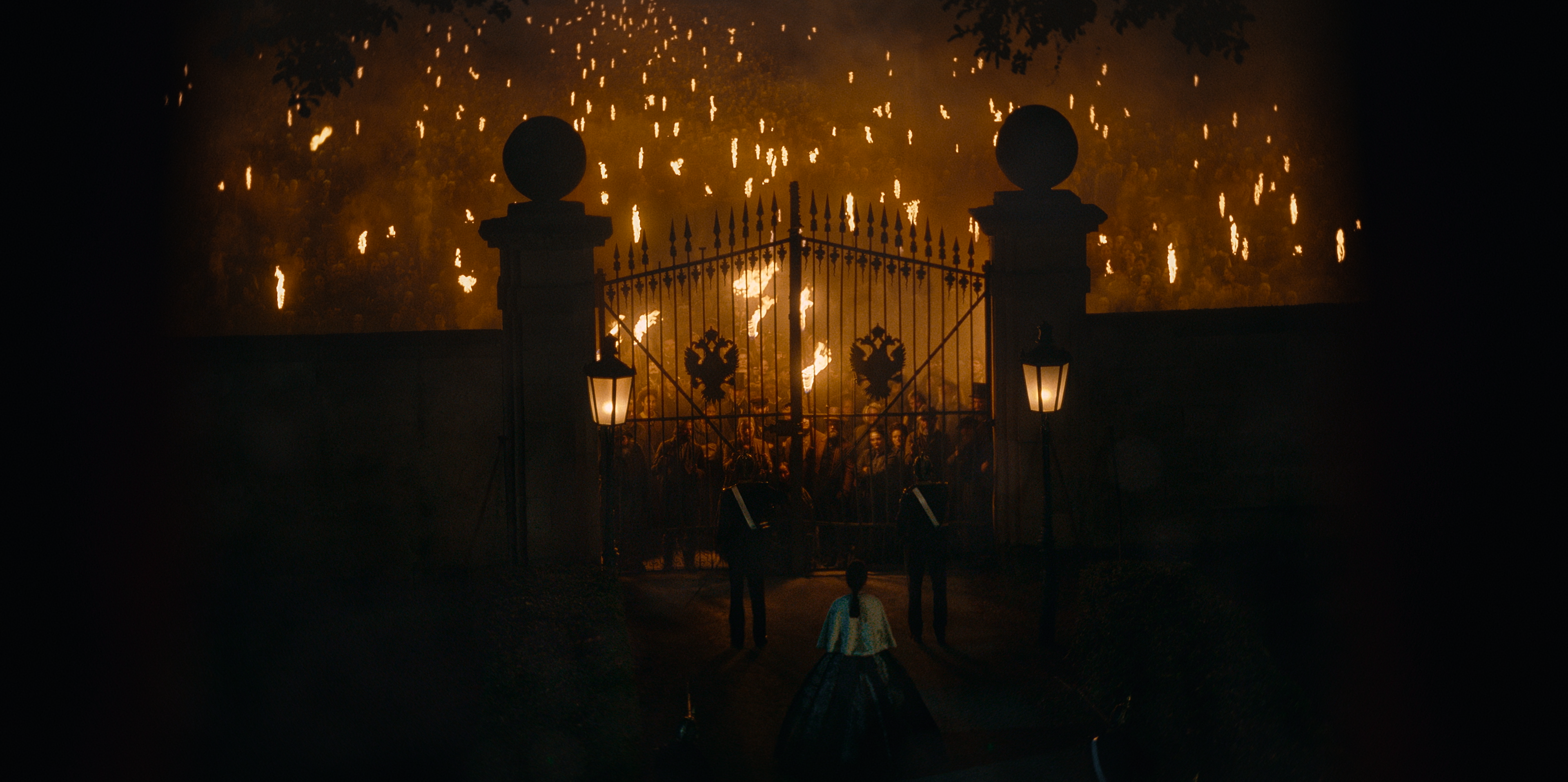
For example, to underline the criticism of an outdated class system we’d add dirty cyan or green to the scuffed wallpapers while the ochre castle has something broken, old and musty in its pompous disguise.
The series initial romantic, dreamlike look quickly evolves as Elisabeth navigates the tensions and intrigue at the Viennese court. Trapped in a gilded cage, we wanted to make this crumbling visible. It gradually becomes gloomier and steel-like, and we specifically used the foliage for this, which originally reflected Elisabeth’s wild free spirit.
What did the DI workflow look like?
The DI process took place at Rotor Film in Babelsberg, and they dealt with both the conform and finish. We graded The Empress in DaVinci Resolve using ACES, starting with the HDR and doing the Dolby Vision SDR trims afterwards. The final deliverable was 4K Dolby Vision IMFs.
Did you have a plan for tackling each episode?
At the beginning of each episode, I’d set scene looks with the director and the DP by selecting hero shots, marking those with a particular colour and then filter by that colour. This allowed us to work on our Resolve timeline with only the shots we intended to grade in that session without creating a whole new timeline. If we wanted to revisit a different shot, I could easily remove the filter, which was helpful.
By the end of the day, we had a solid guideline for the episode that Manuel could use as a reference for matching shots until I took over for fine-tuning. Sharing an edit of those hero shots with Netflix also ensured that feedback could be incorporated as we worked through the episode.
I designed a fixed node tree at the outset to give our work some structure. This way, all corrections had their specific place, and we could make the handovers easy.
I love sculpting images and enhancing details, so I always have nodes with pre-set windows and qualifiers prepared. We also grouped the scenes to be able to make global adjustments to them, with some scenes needing additional colour transitions.
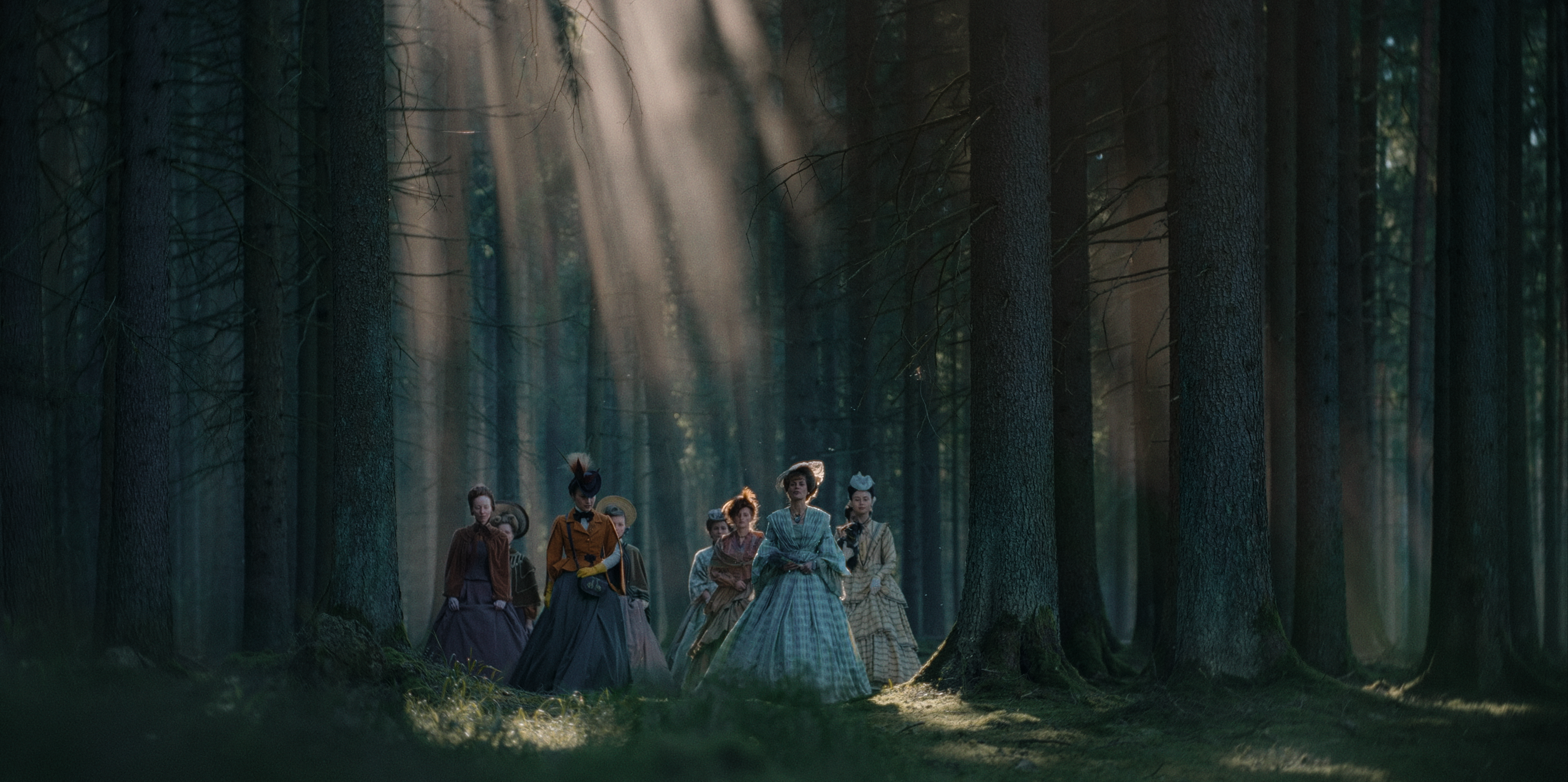
For example, in episode four, Elizabeth is alone in the forest with the Tsar’s son. We wanted the whole atmosphere to become gradually more unpleasant and gloomier. To achieve this, we placed an adjustment layer over the entire scene, on which we placed the darker grade and then slowly faded the layer in. This allowed us to create a smooth transition over several shots.
Was there a particular scene that challenged you?
One crucial element that ran through the entire series was the skin tones. The typical Habsburg pallor had to be just right, and especially in darker yet warm scenes, it wasn’t always easy to push them that way. The production team demonstrated incredible restraint in not meticulously retouching skin. The naturalness and authenticity of the characters are important and a great statement in the current time, in which unattainable beauty ideals flood the whole internet.
What did the review process look like?
For the first two episodes, all the creative decision-makers were on location for the approval sessions, which enabled us to evaluate the grade together. Unfortunately, due to the changes in timing, some of the creatives could only join some sessions in person. Luckily the trust was so immense after the first episodes that reviewing remotely wasn’t a problem using an Apple iPad Pro (5 Gen).