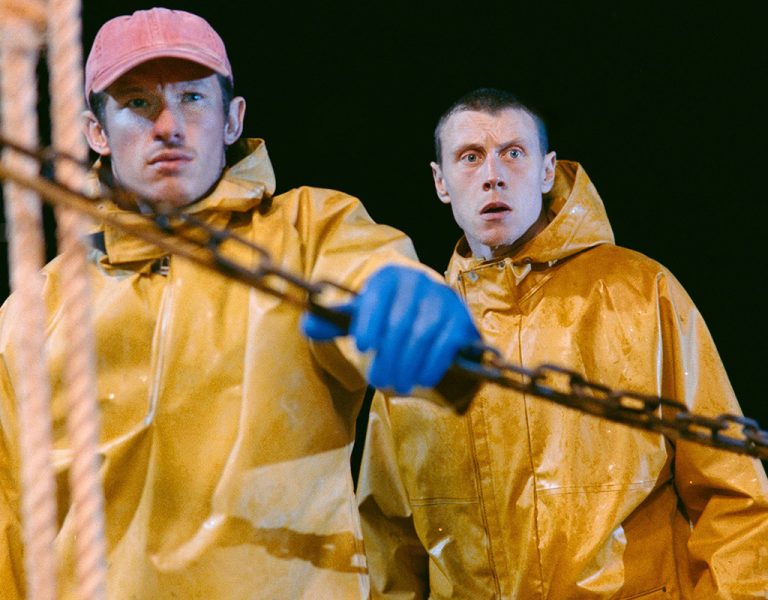
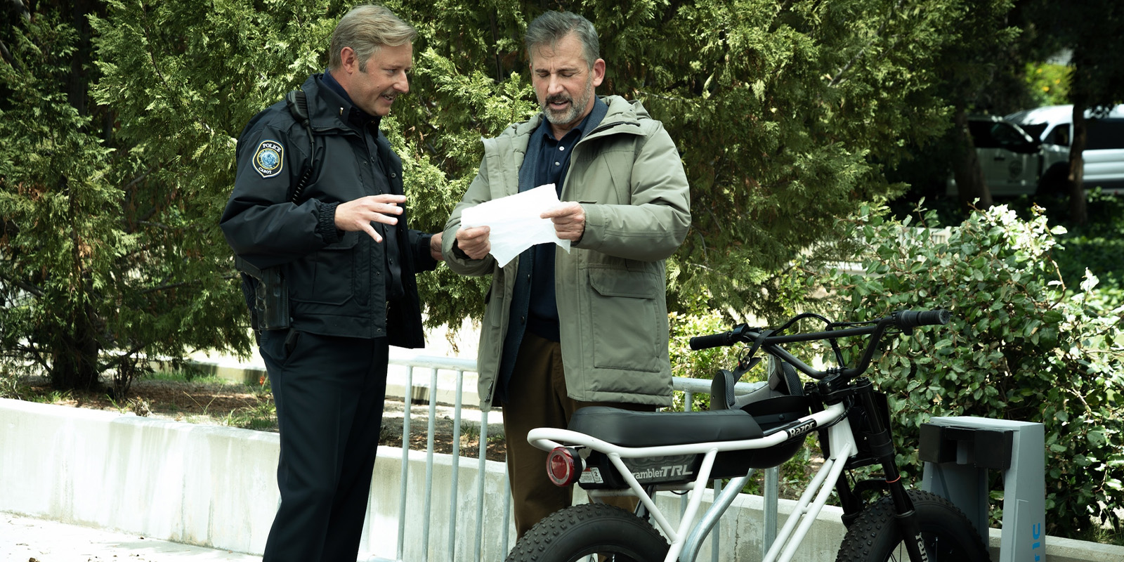
HBO Max’s Rooster was designed to look and feel like a wool sweater: comfortable, timeless, and not at all like a modern streaming show. The production forced senior colourist Josh Bohoskey to intentionally break the traditional rules of grading to achieve the desired visual dynamics.
Like many of his peers, Josh Bohoskey’s journey to colour grading wasn’t exactly ‘as the crow flies’. Moving to New York in 2007 to pursue his dream of working in film, he found work as a movie theatre projectionist where he learnt to thread 35mm film, before spotting a Craigslist advert searching for “chill interns” at a Soho edit house.
Answering that call would lead him to The Mill. “I got hired as an assistant threading film and still wasn’t sure I wanted to be a colourist,” he recalls. “It wasn’t until one of the colourists from the London office came over and showed me the intricacies and beauty of colour that I thought, ‘Wow! I definitely want to do this for a living.’”
His stint at The Mill saw him progress from runner to senior colourist up until the Covid pandemic, after which he relocated to Los Angeles, eventually joining Rare Medium, and some familiar faces. “It was basically the old Mill New York colour department creating its own company,” he says. “We have all the same colourists, producers and assistants. It feels like coming back home. What’s been cool about Rare Medium is that it’s all built in the cloud; it’s all virtual, so no matter where you are, you can log into a machine and have the job cached there.”
He explains that this sort of flexibility was also part of the team’s move to DaVinci Resolve. “We all grew up using Baselight, but Resolve is much more accessible and easier to integrate with other facilities. It makes collaboration much easier.”
“That’s how Rooster came about,” he continues, citing the remote collaboration options presented to him by Digital Film Tree, who handled the post for the series, and all of creator Bill Lawrence’s shows. Blake McClure ASC, the DP on Rooster, had previously worked with Bohoskey on Saturday Night Live.
“Blake was a big reason I moved to Los Angeles because he kept trying to put me forward for shows. Digital Film Tree was interested in partnering with me for colour work and it turned into a really collaborative set-up: very much a post-Covid workflow where work can happen anywhere.”
It’s all in the preparation
Another quality of McClure’s is his penchant for giving each project its own unique style. Never wanting to allow one show to look like the previous one, his policy is to always find something specific with which to frame each production.
“Rooster was a big push in that sense because he shot everything on the URSA Cine 17K 65s with ColorCon filters attached to the lens,” he explains. “These filters are essentially lights shooting directly into the lens, which destroys shadow detail and milks out the image. It pushes the camera right to the edge.”
The result gave the show a vintage filmic quality which proved extremely difficult to shoot and to colour. “If you changed exposure even slightly through those filters, the contrast levels would jump drastically.
“You’d have these super contrasty yet flat images, while also fighting very heavy vignettes created by the filters themselves and the lens falloff. Every shot had to be balanced before you could even start thinking about the actual look of the scene.”
Pre-production preparation therefore played a key role, with Bohoskey involved from early on. Before shooting started, the team tested footage and built a show LUT designed specifically to push through the ColorCon filters.
“I also worked with the dailies colourist to build a node tree that made sense for the workflow,” he says, describing that the goal for Rooster’s now confirmed second season is to start directly from the dailies set-up rather than rebuilding from log each time.
The team built a base correction that could get everything “into the right ballpark quickly”. That same structure carried into the final grade. “There was also a plugin workflow in Resolve that became really important,” he says. “The Color Diffuser tool was essentially developed around trying to replicate the look of these ColorCon filters. If footage hadn’t been shot through the physical filters, we could use that plugin to bring scenes closer into the same visual world.”
The filters ended up providing welcome imperfections which reminded Bohoskey of old film processing, and how ‘flaws’ added character to the image. “You’d get strange green pushes in the shadows or softness falling off in unusual ways. If you hadn’t physically seen that happen through the lens, you probably wouldn’t think to create it artificially.”
Maintaining continuity
The depth of preparation undertaken by the team would also help to manage the biggest challenge of the production’s grading process: continuity. With so many variables to consider and such an intensive edit required for each shot, it forced Bohoskey into new approaches. “Getting involved early really pays off, especially when you’re pushing a look this far.”
After a few episodes, Bohoskey tuned into exactly what the filters were doing and how to counteract them. “Even basic grading controls behaved differently,” he explains. “If I adjusted gain, the shadows would instantly become milky.”
Instead of grading conventionally, he had to add contrast first, then brighten the image while protecting the black levels, and then adjust the saturation which had jumped during the prior steps.
“It became an entirely different way of thinking about grading. At the same time, Blake wanted the colour to evolve with the story. As the series moves from autumn into winter, the palette gradually cools, but with a green-leaning quality that avoided the more familiar blue treatment of colder scenes.”
McClure’s goal for the visual language was to avoid it feeling like a modern streaming show, instead leaning into a more 1970s-inspired cinematic look. “He described it as wanting to feel like a wool sweater: warm, cosy, and timeless,” Bohoskey recalls. “We tried to let the natural colours behave naturally rather than heavily tinting the image toward teal or blue.”
Breaking convention
Despite his assertion that colourists are their own harshest critics, the grade on Rooster is something Bohoskey is very proud of. “It was one of the hardest projects I’ve worked on, but also one of the most rewarding,” he admits.
“We’ve already identified our favourite moments from season one that we want to carry into season two. Blake’s mentality is always about improving and pushing things further rather than staying stagnant.”
The project has certainly pushed Bohoskey’s approach to grading to new levels. “One of the biggest things was intentionally breaking traditional grading rules,” he says. “There are moments where we let the highlights go much further than you normally would. You’re usually trained to protect that detail, but Blake and I found that losing some of it actually served the image. On paper, it probably shouldn’t work, but it gave the film a really beautiful look.”
For Bohoskey, it reinforced the idea that once you understand the rules properly, you can start bending or breaking them intentionally. Especially with a production workflow that enables such creative freedom; something he plans to take into future work.
He explains: “One of the biggest enablers has been Resolve’s grouping system, particularly for episodic work. Now the LUT, grain and overall essence of the show can live within the post group structure, while clip-level work is focused only on individual shot adjustments.”
That makes the workflow far more fluid and efficient, he concludes, meaning that if someone wants to reduce grain globally, it’s one adjustment rather than touching every shot individually.
“It also fits well with modern camera colour science and keeping black levels and highlights consistent across the series.”