MASTERING MONOCHROME
Black-and-white cinematography continues to inspire striking visual storytelling, with filmmakers embracing its expressive power through digital innovation, historic references and bold photographic techniques.
Colour and monochrome cinematography was once considered so different that there were, for a long time, separate Academy Awards for each. In 1966, Haskell Wexler, ASC’s work on Who’s Afraid of Virginia Woolf? received the last Oscar ever awarded in the black-and-white category, but the creative possibilities of monochrome have continued to attract critical approbation.
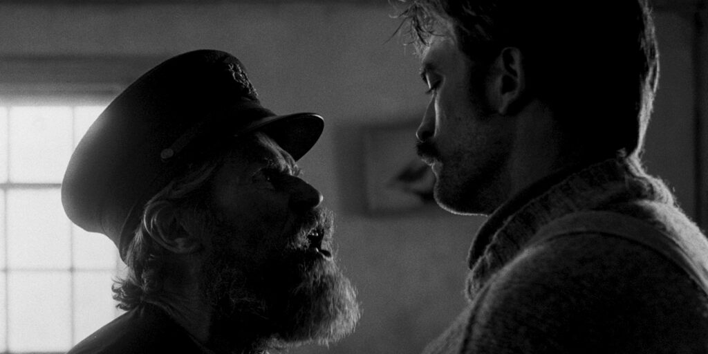
As recently as 2020, Mank, photographed in black-and-white by Erik Messerschmidt ASC, received the Academy Award. The work done by Jarin Blaschke, on The Lighthouse was recognised with the ASC’s own Spotlight Award.
Blaschke links the idea to some early experiences. “I feel like a lot of people in cinematography just look at other films, but there’s a much broader scope of photography that you can be inspired by – different techniques that didn’t make it over to cinematography. I used to work at a camera shop and they had [Ilford] FP4 and HP5 motion picture film.” Later, Blaschke would miss those options: “they will make Tri-X in 35mm, but we couldn’t afford it. Ilford does have an ortho film if you could persuade them to make that in thousand-foot rolls.”
It was, in part, the lack of an orthochromatic film stock that provoked Blaschke’s approach to The Lighthouse, using blue-green filters to create a look with a strong conceptual connection to the earliest days of photography. The politics of monochrome, meanwhile, can be tricky – though Blaschke credits his longstanding association with director Robert Eggers as oiling those particular wheels.
“An atmospheric director will have a tone before a story,” Blaschke says. “I hear about the tone before I hear about the story, and maybe I can contribute to the tone along the way. The Lighthouse was like that – it was a concept, it was a tonal and visual concept before it was a script – definitely black-and-white. Maybe that’s a gut response at first, then you can find out why you had that response.”
Shades of grey
The key to The Lighthouse – and to many other accomplishments in monochrome – is a simple photographic truism: there is more than one monochrome representation of any colour scene. “You can have radically different interpretations of a scene depending what band you decide to look at,” Blaschke confirms. “You could look at ultraviolet – that would be a lot different than wet plate photography, the earliest Daguerreotypes. Blue would look radically different. And green is not just between blue and red, it has its own look that’s different than looking at just the blue channel.”
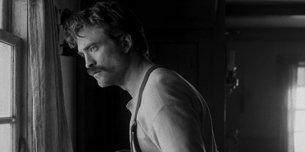
Making it practical to shoot an entire production through a dense blue filter, Blaschke says, took some special measures. “I use the broader photographic world as reference. So, I’m on the photo forum asking about filters – ‘is there a short-pass filter that would be more efficient than a [Wratten] 47 filter – that’s three stops, you can’t light a scene like that. I found these technical filters, but they’re tiny, you can’t put them on a movie camera.” Ultimately, the filters used on The Lighthouse were custom-made by Schneider.
Despite it all, the result was a camera system of decidedly modest sensitivity by modern standards. “I like a generous exposure and a gentle development,” Blaschke points out, “so I asked FotoKem to pull half a stop. Kodak says it’s ISO 250. Let’s say it’s 160, and we’ll call the filter a stop and two thirds, leaving you at 80. But that’s under daylight. The filter kills a lot of the longer wavelengths. We had stuff under halogen lamps, and your light meter is going to see a lot more red. I had to set the meter at 50.”
Shooting digitally – as we will see – can sidestep sensitivity issues, but Blaschke is keen to credit producers with an increasing level of tolerance for photography which is not necessarily targeted solely at “cosmetic concerns. We did [in colour] The Northman – even though it’s a grimy Viking movie, it’s ninety million dollars and there’s more of a commercial consideration. But other films I do with Rob, our brand is filth and misery! I’m finding that we’re tremendously supported in making people look most appropriate.”
That kind of visible success in monochrome work might have gone some way toward legitimising the technique for both producers and audiences, and The Lighthouse seems to have lingered in the awareness of those working behind the camera. Michal Dymek’s work on The Girl with the Needle, directed by Magnus von Horn, which premiered at Cannes 2024, was also much discussed at last year’s Manaki Brothers festival of cinematography and won the Golden Frog at Camerimage Film Festival.
Dymek describes his background as “a combination of photography and a lot of work in film school. I already knew Magnus’s work, and we did a film together called Sweat which was the first collaboration between Magnus and the production house, Lava Films. The Girl with the Needle was the second time I worked with Magnus, and whenever we talked about how this film should look, our feelings were that it should look like old photography, larger format.”
“I think it’s burnt into the script, the story,” Dymek reflects. “I’m used to thinking about those times in black-and-white because that’s the only way you could take pictures at the time. We tried not to be too tied to it, not creating very strict rules. But we never considered shooting in colour.”
With period technique in mind, Dymek chose Alexa Mini LF and Leitz M 0.8 lenses. “The 35mm lens was my discovery – I really love the bokeh and distortion.”
The production’s period-appropriate tone relied on familiar techniques. “I did exactly what Jarin did,” Dymek confirms. “We couldn’t afford to shoot this on film so we decided to use the same approach on digital. It was very handy, shooting in colour and doing grading in Resolve. We played a lot with the blue channel – I love playing with the blue channel because it has the greatest scale in what the skin tone is. I discovered in my first year in film school when we shot everything in black-and-white film, and the blue filter brings out this very visceral character of the skin tones.”
Working digitally, Dymek enjoyed better on-set previews than a film production might. “I had LUTs with contrast created by using different channels. We did a few varieties with different contrasts, and I had a simple colour picture where we put saturation at zero. Everything we tested with costumes, examples of wallpapers, colour of the walls.” The option to use that colour information for selectivity in grading, meanwhile, was a benefit peculiar to black-and-white: “Thanks to very strong colours we could manipulate them in post, pulling up and down brightness.”
Lighting, meanwhile, differed from colour photography perhaps more than Dymek had expected it to. “The character of light works differently than colour. Without hues, having only soft or hard light, I found that hard light has a completely different character in black-and-white. It’s much less harsh. You’re not afraid of using hard light so much. I was never so excited about direct light on actors’ faces than when I was shooting black-and-white.”
With different characters requiring different treatments over the course of the story, Dymek took care to embrace the right degree of historicity in his pictures. “When you overexaggerate it, everyone looks like monsters or zombies, especially when their eyes stay very white,” he warns. “They can look devilish, but we decided to use it sometimes, especially at the end of the film where we used even more of the blue channel. At the beginning of the film we were aware we couldn’t do it too much.”
Dymek selected the LF sensor’s largest imaging area for a squarer, more period-appropriate 3:2 aspect ratio, and to include the most characterful edge regions of the lenses, though framing was sometimes dictated by anachronistic location features and the sheer demands of a fast-paced shoot. “It was done very intuitively. That aspect ratio loves central composition – a lot of air above the head, a combination we used for building up the tension, the idea that something is suspended above the character. That was a tool which helped us to build tension.”
No colour, no problem
The opportunity to innovate is rarely as accessible as in short form and Diana Olifirova’s work on the music video for Ghostpoet’s “Concrete Pony”, directed by Thomas James, took full advantage of that freedom. Continuing something of a theme, Olifirova’s early experiences involved stills. “I come from Ukraine. Photography was my passion and there was no higher education in photography, so I had to find something else that was similar. Cinematography was the closest artform. I fell in love with it, and after five years studying I moved to London to study my masters at NFTS. My teacher in Ukraine insisted we work in black-and-white. We spent the last three years working on black-and-white photography – that’s how they get you to finesse your exposure skills.”
Bringing that background to a monochrome music video was, Olifirova says, a fairly instinctive process. “You start listening to the song, and hearing all these things which then appear in your head. That’s how I approach things anyway. I came to Thomas’s studio to talk about it and brainstorm about what we can do. One image was in his head, the upside-down woman coming toward the man, and it was his idea to do it in black-and-white.”
James’ approach, Olifirova suggests, adopted monochrome as part of an inclination toward minimalism. “I think he wanted to minimise other things. I remember my [instructors] from Ukraine saying that rather than using colour, you use the light – the brightest point in the image is where people will look. It comes from the history of photography – the sun. it sends our mind and memory into the beginning of the image making and things we know. You can pinpoint the textures with hard light and you can be bolder in terms of lighting.”
The resulting demand for equipment and people was refreshingly limited: “I think we only had three lights – parcans and fresnels,” Olifirova says. “I had one gaffer, and he didn’t even bring a spark – one trainee perhaps. It was Alexa Mini, and they gave us a Fujinon Premista 28-100mm zoom and I think we didn’t have anything else other than the dolly and sticks. In terms of composition, we were very solid on having this four-by-three ratio and making it very photographic, embracing the height, the floor and ceiling.”
With less of an inclination to reach for a deliberately historic look, Olifirova took full advantage of the flexibility of colour photography for a monochrome result. “All the geeky colourists have all the complicated ways of making black-and-white. I do not like [to just turn] the saturation down. It’s better to do it separately on each channel, then you have more control for sure. I always love when a colourist gets involved. They’re usually very respectful of the piece and they can do little hidden things.”
Beyond the photography, Olifirova most recalls the privations suffered by the cast – albeit in pursuit of an interesting image, involving being covered in an oily-looking liquid while hanging upside down. “It was some kind of really complicated liquid. [The artist] was really strong – I was very surprised, he could hang down and sing the whole duration of the song a few times. It wasn’t very comfortable, but he was fine! The gymnast was suffering a lot, she had to move as well as do all the tricks. It was really cold, because we were shooting in the cheapest studio we could find in Hackney, but I think once she saw the results she was fine. It was a very big challenge for both of them.”