Home » Features » Masterclass »
WHAT’S IN A FRAME?
Simon Rowling shares his framing and composition rules when crafting the visual grammar for eerie folk horror Lord of Misrule.
In autumn 2021 I was sent the script for folk horror Lord of Misrule by my agent. It was such an intense, spine-tingling read that I wasn’t able to put it down and I felt determined that I had to work on the project. Luckily for me, my ideas gelled with director William Brent Bell’s, and we hit it off straight away.
Lord of Misrule (starring Tuppence Middleton and Ralph Ineson) is set in a rural English village, where a new vicar, Rebecca (Middleton) has recently taken over the parish church. When her young daughter Grace goes missing at a winter festival, villagers and local police join in the desperate search. However, the closer they edge towards finding the girl, the more secrets emerge from the town’s dark past; soon Rebecca must decide just how much she is willing to sacrifice to rescue her daughter.
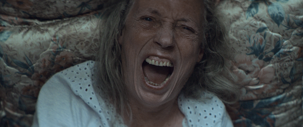
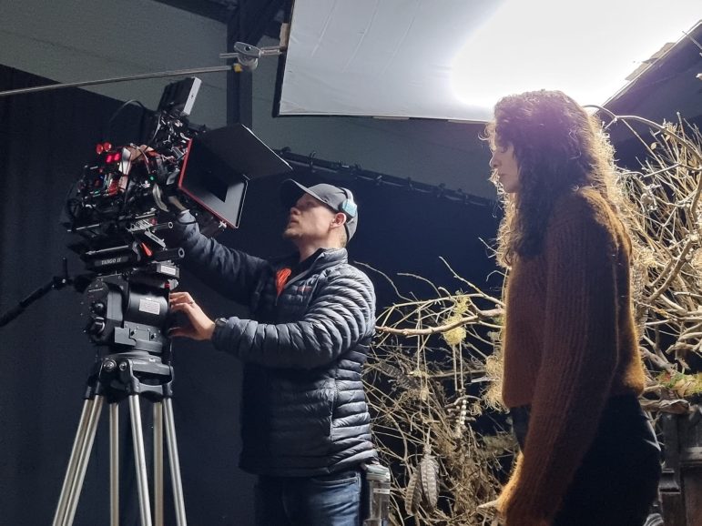
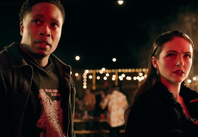
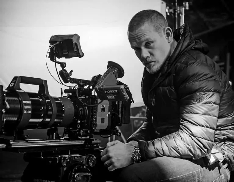
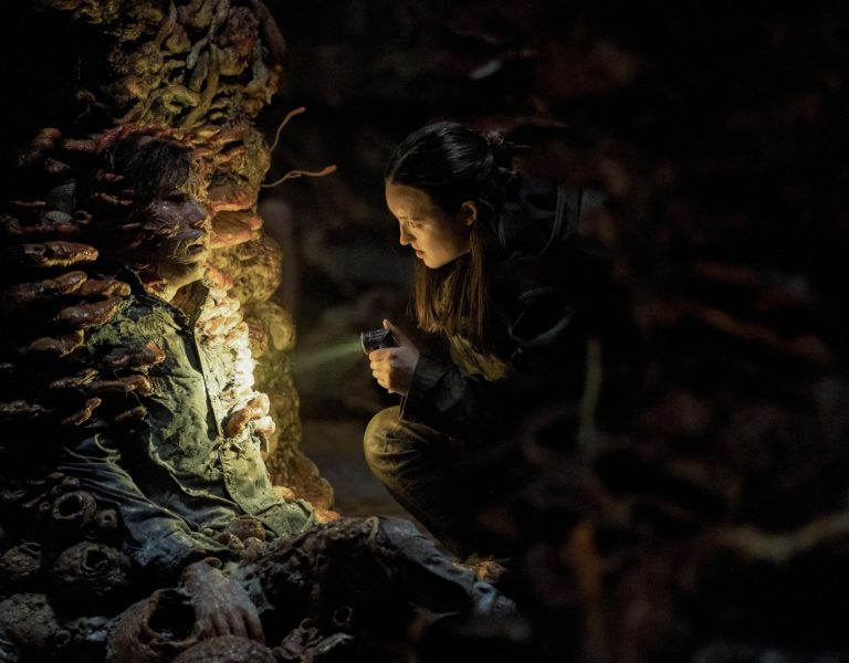
The story always gave us a lot to play with, due to its dark supernatural tones, psychological paranoia and sense of loss from the perspective of our protagonist, Rebecca. William and I really wanted there to be a shift in the look and style of the film from before the daughter disappears to afterwards. We decided to approach this on all creative fronts; these included camera movement, framing, lighting and colour choice. We shot on the ARRI Alexa Mini at 2.8K with a Cooke/Lomo lens set from Arma Cine and Manned Camera.
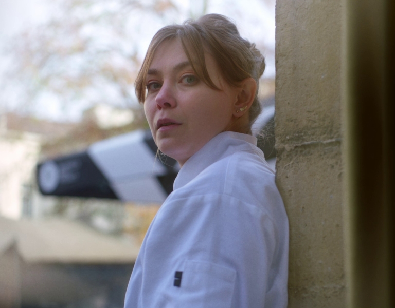
Before Grace disappears we had a warmer palette, with harder, sunnier lighting as well as lots of haze and the camera moving a lot more freely through the locations and village, mainly on Steadicam. Post Grace’s disappearance, however, all life had drained from the mother’s world, so we wanted to reiterate this in a multitude of ways, starting by creating a very de-saturated look. The lighting also reflected this, by no longer having any hard daylight, only soft haunting light, as well not allowing any practicals to be on indoors (reducing warm spill onto faces and keeping the cold-desaturated daylight look).
Another major thing we looked at was composition, camera movement and the framing for every single shot. For this to be effective we created a set of rules. This is something I always try to do on every project, if possible, so that the film has a certain look or style to it. If you create boundaries or rules for yourself, then you are less likely to stray into just resorting to standard coverage of a scene.
1) Purposefully constructed movement and heavy use of static frames
Always knowing what the movement will be, or in most cases not moving the camera at all unless absolutely necessary. This was because it can actually be far creepier just to have an uncomfortable static frame than one that always pushes in on someone, or to slowly pan over to something disturbing than to move the camera in an elaborate manner.
2) Focus in the foreground
Letting a scene play out in the background, even if it is soft, to show our full concentration is with Rebecca and her thoughts and nothing else. We are on this journey with her.
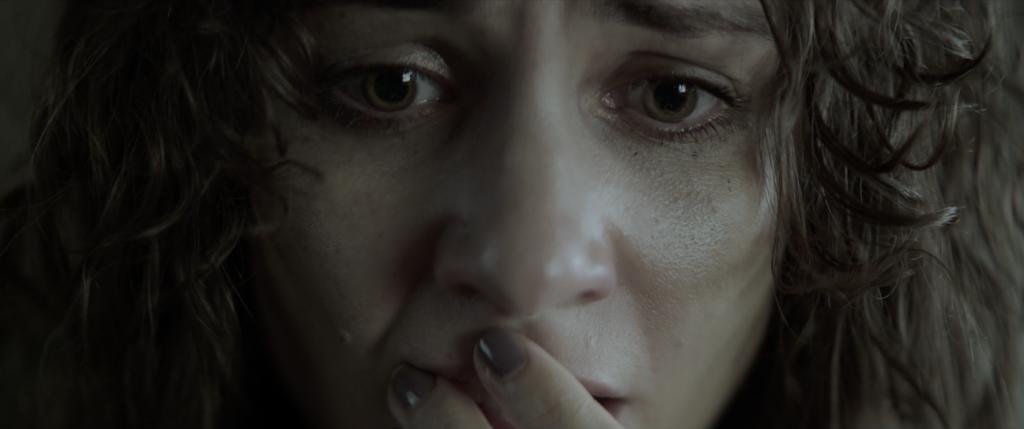
3) Super-wide angles, then jumping in to extreme close-ups
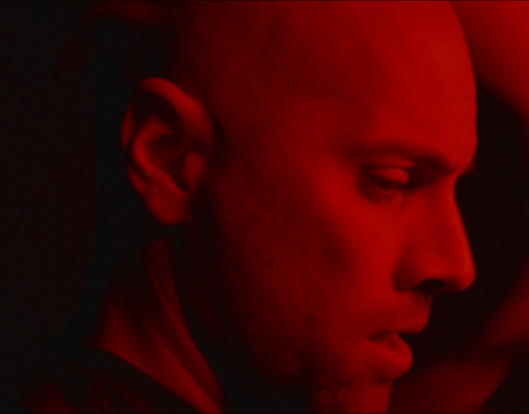
The wides showed the emptiness in the room that the daughter’s spirit has left and in the family’s life. The extreme close-ups captured the details in the characters’ faces, showing their anxiety and discomfort.
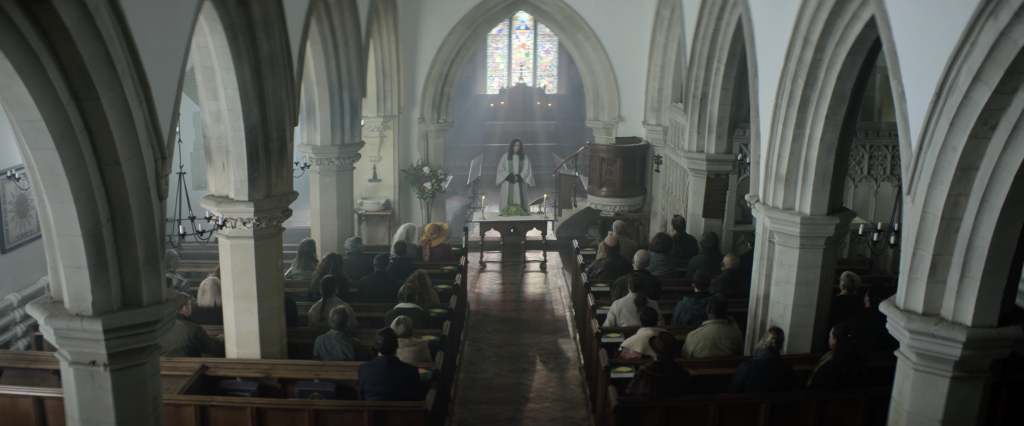
4) High-up camera angles, 3/4 looking down or bird’s-eye straight down
Giving the sense that both God and the locals were looking down on Rebecca at all times. Suppressing her constantly with a sense of dread.
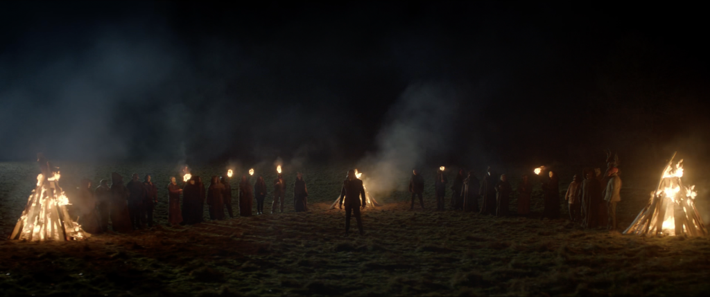
5) Symmetry
Always putting Rebecca in the centre of frame, to show that she is our protagonist, it is her journey and she is our focus. We also matched this with our antagonist (played by Ralph Ineson).
6) Singles of Rebecca, over-the-shoulders with everybody else
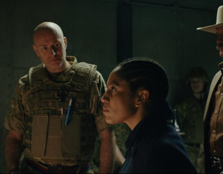
Rebecca is acting alone on her mission to find out the truth, and not even her husband is on her side at times. She is totally isolated from everyone. So, we would use clean singles on her but then counter this with over-the-shoulders onto others.
7) Shooting into mirrors, through objects and at odd angles
One idea of ours was that all the villagers would be filmed from low to high, looking up at them, which gave them a sense of power over the vicar. We countered this by always looking down on Rebecca.
8) Least amount of angles/setups to cover a scene
We wanted to limit the choices the editor had in post, so it wasn’t just coverage that was then made into a film in post. We wanted to make the film on-set and really be specific about what we needed to cover the scene.
9) Negative space
Throughout the entire film we were ultimately trying to create a sense of unease and unbalance. As the investigation by the vicar develops, things never feel quite right and there is always an uncomfortable undertone. Using negative space and odd angles helped us achieve this.
10) Long lenses
Whenever we saw Rebecca in the village, we shot it with a long lens, usually through a villager’s window, to show that the locals were always watching her.
It was always hard to apply these rules and stick to them, but ultimately they were a brilliant guide for us to work off and to produce the look and feel of the film that we set out to create.
