The NFTS Graduate Showcase 2026, supported by BBC Studios, celebrates the culmination of over 500 students’ work towards over 80 inspiring and original short films, TV shows, commercials and games.
The showcase is an opportunity for members of the screen industries to see firsthand the work of NFTS’ graduating students and to meet the next generation of film, television and games makers that will be shaping the industry for years to come.
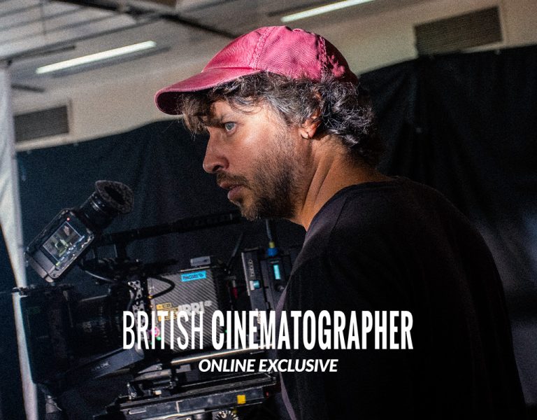
British Cinematographer takes you behind the scenes to explore the 10 films screened at the Fiction Graduate Showcase, including interviews with the cinematographers, stills and shots taken during filming for each incredible production.
Here, Max Brunner explains how he exercised restraint to tell a story of identity, defiance, and the moment in your life when you decide to stand up for yourself in Motorbird.
Please can you share an overview of your film?
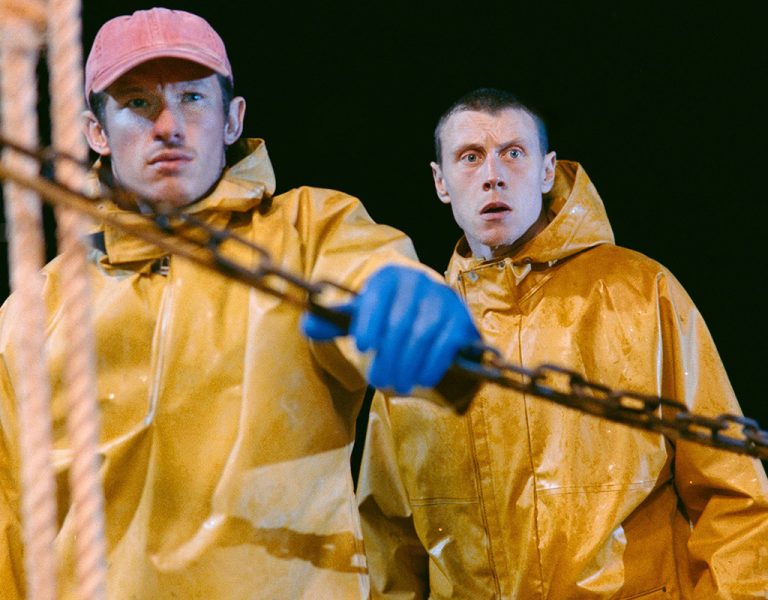
When the daughter of a former beauty queen discovers an explosive love for stunt riding, she must shatter her family’s expectations to pursue her bombastic dream.
Motorbird is ultimately about fighting for who you are and having the courage to pursue what you truly believe in. It’s about identity, defiance, and the moment in your life when you decide to stand up for yourself, even when that choice fractures the world around you.
What were your initial discussions about the visual approach for the film? What look and mood were you trying to achieve?
From the outset, we knew the film had to feel ambitious in scale. When Cass first said “’70s” and “motorbikes”, I knew we were reaching for something bold.
Although the film is set in 1976, Bree’s character felt incredibly immediate and contemporary to me. From the beginning, I was keen not to let the period dominate the storytelling. The sun hasn’t changed, and neither has the struggle many girls face when pushing against a male-dominated world. The emotional core felt modern, and I wanted the visual language to honour that.
We wanted the film to feel messy, chaotic and exhilarating. Cass Virdee, the director and writer, described it as the hottest summer ever recorded in Britain, which instantly evoked texture. The period became secondary to Bree’s emotional journey. What mattered most was feeling with her, her excitement, her disappointment, her stubborn joy.
The mood needed to be visceral and subjective. I wasn’t interested in presenting the world objectively. This is Bree’s experience, it’s her exhilaration, her humiliation, her stubborn joy, and thus ours. The period details sit around her, but they are not the point. The point is the emotional temperature of that moment in her life when she decides not to shrink.
There are two opposing worlds colliding: stunt riding and the beauty pageant circuit. But for me, it was important not to caricature either. Both worlds matter deeply to Bree. The tension doesn’t come from dismissing one, it comes from her having to choose between the two.
What were your creative references and inspirations?
Cass and I had worked together before, which gave us a head start. When collaborating with directors of her calibre and passion, I begin by listening carefully. I try to understand the emotional core of the story and how she wants it to feel. My role as a cinematographer is to enhance and support the director’s vision. It’s vital to me that I shoot the director’s film, not my own. I don’t want to impose, I want to amplify. As prep evolves, so does the script, and the cinematography must remain fluid enough to evolve with it.
We started broadly, often looking at art and watching films that weren’t necessarily related to the project. Consuming art together builds a shared language. I find it extremely useful to build a visual vocabulary through shared discovery.
For colour and tone, we started by looking at the work of Martin Parr, particularly his saturated, playful depictions of British summers. When I discovered the work of Paul Graham, I knew I had found an even better way of how I wanted the image and locations to feel in colour. But for emotional grounding, we referenced black-and-white photography from industrial working-class Britain, which carried a raw honesty that felt closer to Bree’s world. Those references influenced the feeling, spirit of the time we wanted to reflect. We mainly looked at photographers like Chris Killip, Pogus Caesar and Tish Murtha.
Cass also shared several films that weren’t strictly period references, reinforcing our instinct to prioritise feeling over aesthetic nostalgia. For example, Rodeo (2022), Little Miss Sunshine (2006) and Zola (2020). This Is England also became quite a strong visual and world building reference for me as our prep progressed.
Toward the end of prep, I printed everything and pinned it around our production office. Being physically surrounded by our references created a subconscious cohesion across departments. With production design, costume and camera all feeding off the same imagery, the world began to feel.
What filming locations were used? Were any sets constructed? Did any locations present challenges?
The film was extremely ambitious for its scale and budget. We had 17 sets across an eight-day shoot, which meant set builds weren’t financially feasible. Most locations were used for only one or two scenes.
Our production designer Chell Young did an extraordinary job unifying these spaces into a coherent 1970s Kent. Constant company moves meant very limited pre-lighting time, but it also gave the film an energetic pace and scale.
Sittingbourne in Kent was a big location, so difficult to move around. There were a lot of elements that had to fall into place. Constant strong wind also meant that I could barely use big frames outside and had to resort to smaller bits to shape the exterior locations.
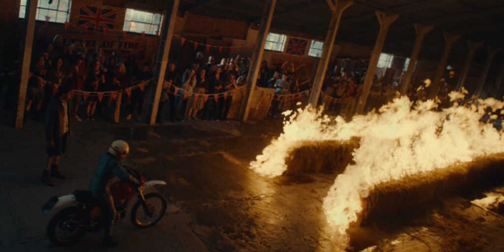
The stunt warehouse was also huge, and with a short film budget we had to be precise to have enough ambience in the room to balance against 40ft of flame bar.
The pageant hall and bar was another extremely fun but challenging location. A long, developing tracking shot meant rigging the ceiling with numerous small, highly localised sources. Greenkit supported me massively, allowing access to a wide range of lightweight LED fixtures, including the Astera Hydra Panels. These were ideal for picking out details in the wooden panelled walls or adding subtle backlight exactly where it was needed.
Can you explain your choice of camera and lenses?
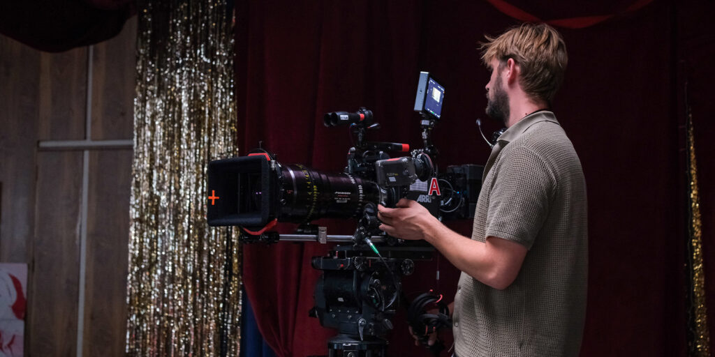
From the first read, I knew I wanted to shoot on Panavision glass. Particularly Primos, which I’d used before. They provided a subtle vintage quality appropriate to 1977 without feeling overtly nostalgic. They have character, but they don’t shout. I like them because of their organic look, whilst being pretty sharp and having good contrast. I love the way they render skin tones – the 40mm and 65mm close up to faces are stunning. I found myself using those focal lengths most, especially for close-ups.
I tested C-Series anamorphics as well, but ultimately decided with Cass that going spherical and Super 35 was the right choice. We felt that anamorphic might romanticise/elevate the world too much. We wanted grounded intimacy. It was very important that her story didn’t feel larger than life. I wanted audiences, and especially young girls today, to be able to emotionally connect and identify with her character.
We initially considered shooting on film. However, the fire stunt required multiple cameras, and I knew we’d need flexibility. Particularly for riding sequences where the camera had to be physically on or extremely close to the bike. After extensive testing, I was confident we could achieve the colour depth, density and texture I wanted with the ARRI Alexa Mini and a carefully constructed grade.
I avoided wide spectacle. This is Bree’s story. When she rides, we ride with her. The camera stays close. Often on the bike or near her face. The exhilaration needed to feel subjective.
What role did camera movement, composition and colour play?
The film is highly subjective to Bree’s experience. Movement was driven by her emotional state. I was conscious not to drift away from her perspective or use any unmotivated camera moves.
We used a lot of tracking work. The confrontation scene in the pageant bar became a pivotal visual moment. Cass and I felt it needed to escalate beyond static coverage. We blocked it almost like a tug-of-war, with mother and daughter pulling in opposing directions along the length of the bar. We laid 80 feet of dolly track and tracked parallel in a wide frame before switching to the Primo zoom. Zooming while tracking created a frantic atmosphere. This visual tension, paired with focus buzzes, matched the emotional volatility and hopefully translated their emotional state.
Steadicam also played a vital role in maintaining fluid subjectivity, particularly during transitional moments where Bree’s world begins to shift. I worked extensively with Steadicam operators Archie Muller and Austin Phillips, who brought incredible sensitivity to the subjective movement. Austin also joined us to operate a normal B-camera for the big stunt.
Colour was fundamental. Working closely with Chell (production design) and Delayla (costume), we embraced the textural richness of the ’70s while maintaining emotional coherence. Cass’s background in art direction meant locations were already visually expressive, which allowed us to build a strong photographic language.
What was your approach to lighting?
I wanted the lighting to feel naturalistic but sculpted. Textured, messy, dirty and dimensional. I wanted to create a world that feels like a pressure cooker.
Rather than flooding spaces, I localised light sources to create depth and shadow. It was a real challenge to do this at the same time as allowing for long developing takes and giving the actors freedom to move around. Bree is layered and complex; the lighting needed similar dimensionality. The atmosphere was essential. We wanted to feel the smoke-filled air of a ’70s summer without air conditioning.
I tried to shape faces with directional key and allowing backgrounds to fall into layered shadow. I aimed for a three-dimensional world where light felt motivated but heightened.
Balancing interiors against bright Kent exteriors was one of the biggest challenges. At the speedway, I was determined not to blow out windows, that outside world is Bree’s freedom. The interior of the office and cafe had to be insanely bright because the outside was so hot. When I looked out from both windows the speedway and industrial vista was heavily front lit. I did everything to preserve that view out the windows as it felt so essential in building Bree’s world and environment.
In contrast, her home and the pageant environment were designed to feel claustrophobic. There, I embraced curtains and allowed windows to overexpose to compress the outside world making the spaces feel more oppressive. Reinforcing emotional claustrophobia felt like the right choice here.
What were you trying to achieve in the grade?
We aimed for an organic palette with strong colour density and subtle film emulation. Though I hesitate to use that term. The goal wasn’t to mimic film, but to achieve emotional texture and richness appropriate to Bree’s world.
Licorice Pizza (2021) became an important tonal reference, particularly in how it made the ’70s feel youthful and immediate rather than nostalgic. I feel like this film really gave me an understanding of the vibe and mood of the ’70s. I wanted to achieve something similar with our film and this film instantly struck common ground between the whole team.
Which elements were most challenging?
The fire stunt sequence was by far the most complex. Technically, financially and logistically. managing exposure, relationships, safety constraints, and schedule pressure simultaneously was a major challenge. Set in a warehouse near High Wycombe, the scale, the stunt, the extras, and the fire itself made it incredibly complex. We had extensive previs work done, which helped, but there were constant logistical and budgetary hurdles. At one point, the quote for the flame bars nearly equaled our entire budget. But our wonderful line producer Sam Buckler went above and beyond to secure great deals and help Cass and me make all our wildest ideas come true.
We initially planned to shoot at Sittingbourne Speedway exterior, but wind conditions made it unsafe and prevented us from achieving sufficient flame height. We pivoted late to an interior warehouse location. Walking into that space, I immediately recognised the key problem: how to maintain ambient consistency between setups with active flames (extreme highlights and room ambience) and clean passes without fire. For some panning shots I had to do big iris pulls from like 2.8-11 within one shot.
My gaffer Elliot Morris and his team worked tirelessly to build enough controllable ambience to balance against the flames. It was a significant learning curve, especially in managing dynamic exposure relationships between practical fire sources and overall ambience.
What are you most proud of?
The parallel tracking shot in the pageant bar remains a standout moment for me.
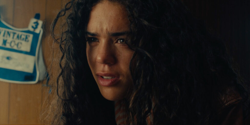
I’m also incredibly proud of the riding work. Budget and time meant we had limited access to a low loader and no tracking vehicle. Safia [Oakley-Green] couldn’t ride helmetless at speed, so we committed to keeping everything subjective and close.
Action 99 cars, my grip Alex Kelleher and I designed a rig on the low loader that allowed the bike to shift dynamically rather than sit rigidly. I placed the camera on a 4ft slider, enabling subtle relative movement. This meant the bike could drift ahead or fall behind frame. That slight parallax shift helped sell speed and reality.
For POV shots, I was strapped to the front of the tracking vehicle, which was both terrifying and exhilarating. But essential to selling acceleration and the feeling of riding. I shot these shots at 16fps as well, in order to make it feel even faster.
One of my favourite shots is between the handlebars during the stunt. We strapped a Sony FX3 with a 12mm lens to the tank, capturing raw vibration. In the grade, Pete matched it beautifully to the Alexa footage.
The visor reflections in the tunnel of fire were another battle. Using the volume wall allowed us to create controlled fire reflections in her eyes. Managing unwanted reflections on the helmet was painstaking, but the final result feels intimate and immersive. It was really quite tricky to match the volume to what was shot on location, but a great learning curve and invaluable to the outcome.
I’m incredibly grateful for the support and guidance of my tutors, Stuart Harris BSC and Oliver Stapleton BSC, and our course coordinator Duncan Bruce.
What lessons will you take forward?
Fire exposure was a major learning curve. Particularly managing dynamic highlight values against skin tones and room ambience. Working with a stunt coordinator and stunt doubles was a game-changer and properly introduced me to sophisticated stunt sequences, something I hadn’t done before on this level.
I also learned that while multi-camera setups can be necessary – I prefer single-camera intimacy where possible. If shooting with two cameras, I’ve realised the importance of staying at the monitors to protect proper oversight over both frames, thus using two operators.
Most importantly, this project reaffirmed that emotional clarity must drive every technical decision. When the emotional intention is clear, even ambitious technical challenges become solvable.
Most importantly, this film reaffirmed that with strong collaboration across departments, even ambitious ideas can be realised at scale.
Story is king. With so many great locations and stunts it’s often easy to get carried away, doing beautiful or cool stuff. I think it’s really important both for budget and the film, to stay strict with ourselves as directors and DPs, to only focus on what’s necessary to tell the story.
It was also humbling to see how much the film continued to flourish long after we’d wrapped, and I’m grateful for the talented post-production team that made everything we shot into such an exhilarating and dynamic final piece.