MULTIPLE LOOKS IN ONE SEASON
Coming on board Apple TV comedy Loot for series three, DP Jason Oldak pushed to evolve the visuals alongside the evolution of main character Molly Wells – here, he explains how.
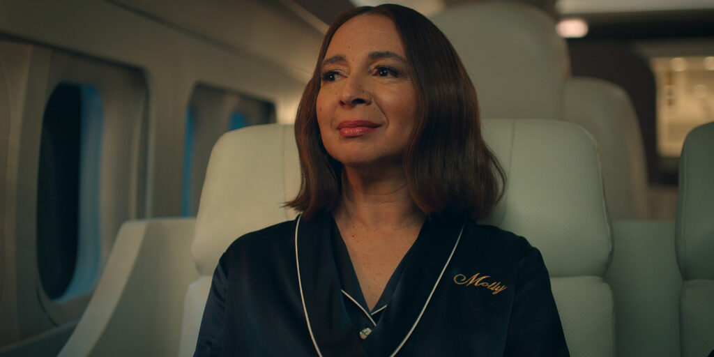
I was hired onto the third season of Loot for Apple TV. This is a show that has already had an established look for two seasons. However, as I started to read the first few scripts for season three, I found that Molly Wells (Maya Rudolph) is becoming very clear with who she is and her direction in life. She has decided to separate herself from the billionaires who, in her words, “are hoarding their money and don’t want the world to change. They want all the power!”
This change in our protagonist’s outlook sparked conversation with my producing and directing team about adjusting the look of our show to adapt to Molly’s mindset for the season. Because of the clear-headed nature Molly is now embodying, I wanted to present a cleaner, more sophisticated image minimising the contrast and making sure our colour was bold and pronounced.
I conducted an extensive lens and camera body test at our camera house in Los Angeles (Camtec Camera) to see what might be the right palette for the season. That resulted in later applying a show LUT with our final colourist (Tim Stipan at Pictureshop) to narrow in on this changed approach. The entire producing team was in full support of this vision and it was a great first step toward the direction of our overall visual arc of the season.
More looks
Loot is not your typical comedy. Molly is a billionaire and lives a very stylish, flashy, lavish lifestyle. Our writers are continually reinventing the wheel and creating scenarios and locations you might not find in your average comedy. I soon realised that the re-design was not going to be the last look I would need to create for our season, which opened doors for us to create additional looks that felt different enough but were still part of the Loot universe.
Super Bowl ads
In episode two, “Would Hit”, Molly is fed up with the billionaires and heads to the airwaves to speak the truth. She pays for two Super Bowl commercials that she stars in which we had open our second episode of the season. Each spot felt unique and required a look of their own.
Claire Scanlon was our director for episode two. She and I discussed channeling our inner ‘over the top’ commercial spot approach. I felt that utilizing an anamorphic lens would immediately differentiate from our spherical master primes that are used throughout the season. We landed on the Cooke anamorphics. The first spot takes place in her living room and I wanted subtle flares and aberrations on the edges. However, they couldn’t be so jarring that we feel like we’re in a sci-fi movie. These lenses gave just enough distinction, colour clarity, bokeh shapes, and changed softness on our edges of frame to feel this heightened slick big game spot you might see on game day.
The second spot was written with fast cuts, quick throws of dialogue, and whips and turns in a Mini Cooper. Claire and I were inspired by Edgar Wright’s brilliant quick cut montage and driving shots in Baby Driver. I overly stylised the lighting, utilising more pronounced edge light creating larger than life flares through our anamorphic glass. I love the distinct looks of each of these spots and how they really separate themselves from our Loot reality.
Now, let’s flash back
Episode five, “Joy Ride”, gave me a different opportunity to experiment with a look within a look once again. Directed by Rebecca Asher, “Joy Ride” tells the origin story of Nicholas and Molly’s friendship that took place in 2011. Although we are not tracing back multiple decades, it was 14 years ago, and I felt we needed to differentiate the time periods. Molly is younger and John, her then husband, has just gone public with his company’s IPO. She is suddenly surrounded by immense wealth but feels so foreign and out of place in this world. She doesn’t even know how to dress herself for an event.
I spoke with Rebecca and our showrunner, Matt Hubbard, about wanting to try and create this flashback in camera. I will always opt to create our look on set rather than rely on a post effect if I can. I wanted an image that felt unrefined. I wanted to create a world with lower contrast and blooming highlights, that had inconsistencies in its portrayal and its flaring to echo her subconscious.
Through some testing, we landed on the Zeiss standard speeds. Although these lenses originated in the ’60s, the contrast of both lenses allowed for an easy transition back and forth between our time periods. In the final colour pass, we added a subtle layer of grain to 2011, which you won’t find in our present-day world.
A show within a show
In episode seven, “Billionaire, Beautiful & True”, Molly flies to Korea and discovers Nicholas has been producing his own Korean drama based off of the Wells Foundation, but with the set reimagined and filled with Korean actors. While in prep, we learned that our showrunner, Matt Hubbard, was inspired by the Netflix K-drama Extraordinary Attorney Woo. Extraordinary Attorney Woo is a South Korean show that visually goes heavy on the desaturation and utilises cooler tones. This was a nice jumping off point for our teams to run with.
Once Molly enters the sound stage and discovers the taping of Nicholas’ show, our camera pushes into the director’s monitor and we are now completely engulfed in the Korean drama look. We stay in this world until Molly disrupts filming. We then pull back to a wide shot revealing the Korean production team bringing us back to our established Loot look that we’re accustomed to seeing.
Without having a DIT on set, I needed to create a look that would immediately differentiate each of those scenes for everyone on set and in the post process. Through testing, I opted for a subtle cyan and low contrast filter cocktail to be used in front of the lens when we are inside Nicholas’ Korean drama series. Jennifer Dehghan (production designer) and her team pulled most of the colour out of the Wells Foundation set and replaced the office design with more muted tones that would work in unison with my filter cocktail. That really rendered a changed visual design for a show within a show.
In summation
Before I was a cinematographer, I was immersed in the fine art world as a painter. I always loved the feeling of stretching a new canvas, painting the gesso onto the muslin fabric, and staring at that blank canvas in my studio, wondering what I was going to create next.
Every time I am given the opportunity in the filmmaking process to create the look of a new show (or looks within a show in this case), I always think back to my studio; contemplating what my brush will do next. It’s a glorious feeling, and it’s a part of the creative process I love most!