Callan Green ACS NZCS, the award-winning DP behind hits like Nobody 2 and The Gentlemen, explains why he became a judge for the FilmLight Colour Awards, what makes a good colourist and what he’s working on next.
What appealed to you about being a judge in the FilmLight Colour Awards?
I’ve always believed that colour is one of the most powerful tools we have as filmmakers to shape story and emotion. Being part of the FilmLight Colour Awards gives me the chance to celebrate the artistry of colourists, whose work is often invisible to the audience but absolutely vital. It’s also an opportunity to learn from other practitioners and see how colour is being pushed in new and exciting directions across the industry. And honestly, I love grading sessions—they’re the reward at the end of the long, hard slog of shooting, when you can finally enjoy the fruits of all that work with a strong coffee and a few laughs.
What will you be looking for in entries?
I’ll be looking for work that feels honest and emotionally connected to the story. It’s not about the biggest grade or the boldest look, but about how colour supports the narrative and characters. I’ll be drawn to work that shows restraint where needed, but also the courage to take risks when the story calls for it. And if I get the sense that the team enjoyed themselves in the process, even better—because you can feel when the creativity came with a bit of fun.
What makes a good colourist, in your opinion?
A good colourist has both technical mastery and an intuitive sense of storytelling. They listen, they collaborate, and they understand the intent behind the images. The best colourists are those who can elevate the material without imposing themselves on it. But for me, the really great ones are also fun to be around. The grading room is my favourite part of filmmaking—partly because the hard graft is behind us, and partly because that’s when the jokes and little experiments start flowing.
What are the key differences between shooting and colour requirements for music, commercials, TV and film?
Each format has its own rhythm and expectations. Music videos often allow for bold experimentation, while commercials usually demand precision and consistency across brand guidelines. Television needs efficiency and cohesion across episodes, whereas film gives you more space for nuance and subtlety. My approach shifts to suit those needs—but colour is always central to shaping the audience’s emotional experience. And across all of them, the grading suite is where you can take a breath, have a laugh, and really polish the work.
Have advancements in colour grading technology impacted your work as a cinematographer–and if so, how?
Absolutely. Advancements mean we can do more and take less time doing it. When I first started out, we only had one power window to work with—so you had to be incredibly decisive about how and when you used it. Now the tools are virtually limitless. AI tracking, for example, has turned what used to be a huge time killer into something that feels almost like cheating—shapes just lock on instantly, leaving us free to focus on more creative and nuanced colouring. It’s gone from hours of painstaking finessing to, “job done, let’s try something fun”. That’s why I love the grade: the pressure eases off, and there’s always a laugh while we push the images to their fullest potential.
What advice would you give colourists for a successful collaboration with their cinematographer?
The best collaborations are built on trust and openness. I’d encourage colourists to ask questions, share their instincts, and not be afraid to suggest bold ideas. At the same time, it’s important to understand the emotional intent behind the images, not just the technical aspects. And keep it light—the grading room doesn’t have to feel like a courtroom. If we can laugh, bounce ideas, and still get the work exactly where it needs to be, that’s the perfect collaboration.

How do you think colour grading enhances storytelling in film and television? Can you provide an example from your own work where colour played a crucial role in conveying the narrative/emotion?
Colour grading can be as subtle as a shift in warmth to make a moment feel intimate, or as bold as a stylised palette that defines an entire world. It’s a way of guiding the audience’s emotional response without them even being aware of it.
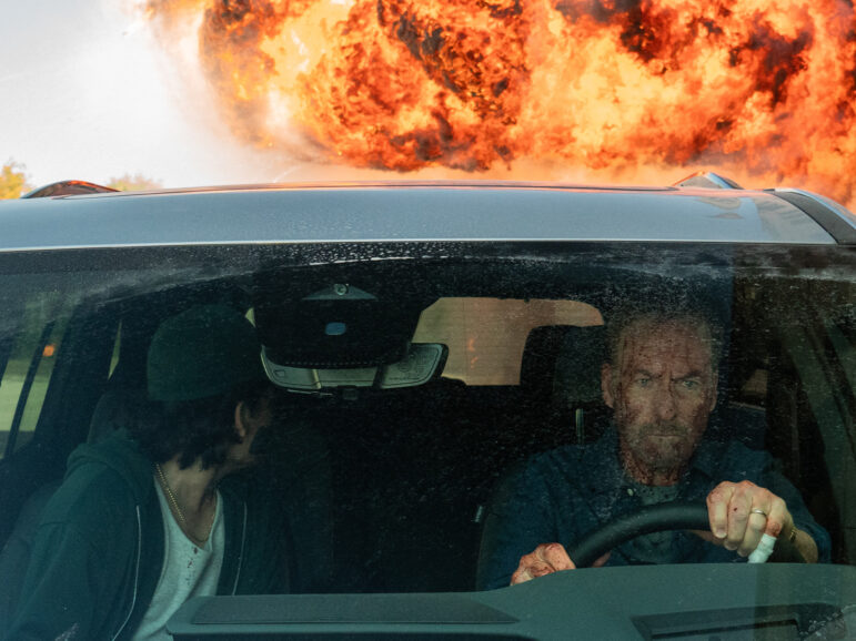
On Nobody 2, the palette was key in shaping the world Hutch—played by Bob Odenkirk—inhabits, one where the everyday blends with an underworld always lurking beneath the surface. The grade helped give the film its duality: grounded in reality but always tinged with that sense of danger.
On Guy Ritchie’s The Gentlemen series, the LUT became the backbone of the show’s identity. It gave us a consistent, cinematic texture across episodes and really reinforced the swagger and attitude of the world the characters lived in.
And with Ponies, a series set in 1977 Moscow that is set to be released early next year, we deliberately avoided the usual cold blues and greys often associated with Soviet-era portrayals. Instead, we went for a more saturated, split-tone palette that felt fresh, distinctive, and emotionally richer—a way of showing that world in a new light.
The best part of all these projects is that those discoveries happen in the grading suite, when you’re experimenting, bouncing ideas around, and suddenly you land on something that just works—and that’s when storytelling really comes alive.
And finally, what are you working on now/what’s next for you?
I’ve just finished work on Ponies, which comes out early next year, and before that I shot Nobody 2. Right now, I’m in prep for The Beekeeper 2, which starts shooting in London from late September through December. I’m so happy to be working in London, where we live, as it means I get to see my wife and our three-year-old daughter every day after work—which is a real gift in this industry.