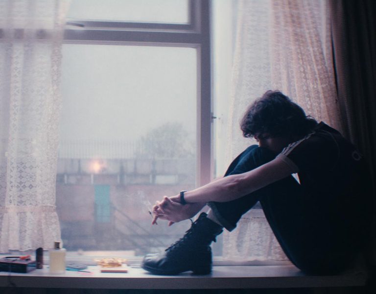

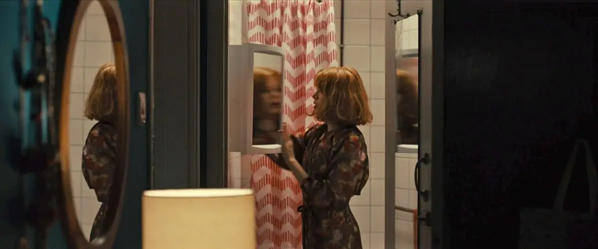
Cinematographer Adam Scarth wrote in with details of his work on Peter Mackie Burns’ indie-drama Daphne, starring Emily Beecham.
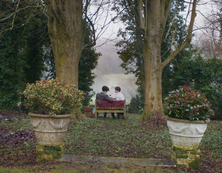
The movie follows a young woman negotiating the tricky business of modern life. Caught in the daily rush of her restaurant job and kaleidoscopic nightlife of new faces, Daphne is the life of the party, but too busy to realise that deep down she is not happy. When she saves the life of a shopkeeper, stabbed during a failed robbery, the impenetrable armour she wears to protect herself begins to crack. Daphne is forced to confront the inevitability of a much-needed change in her life.
“Production began in January 2016, shooting predominantly around Elephant & Castle in London. Peter and I began talking about our visual approach and style early-on. Both of us agreed that it was vital that we put the performance first and foremost – creating a visual language that was restrained and didn’t draw overt attention to itself, yet complementary and reactionary to Emily’s performance, giving her agency over her space and the images.
Referentially, we were particularly influenced by the simple but not simplistic visual language of ‘70s cinema, along with Woody Allen’s work with Gordon Willis ASC. We decided to reduce our camera movement to the minimum and restricted ourselves predominately to working from a tripod and simple panning of the camera, unless there was no other option. This forced the importance of where we placed the camera, making nuanced decisions about the placement and the size our characters are within the frame, putting the onus on blocking and character interaction.
With this in mind we opted to shoot predominantly on a 40mm lens, with the objective of making the camera as invisible as possible. The 40mm allows the camera to drift into the background and not draw attention to itself.
In terms of look, we were influenced by early colour photography, with photographers like Saul Leiter and Tony Ray-Jones. We wanted to create a palette that utilised colour but without screaming saturation. The early colour film stocks had a muddier, less-defined texture to the negative, and a vibrancy without delivering ostentatious, poppy primary colours, and this was something we were interested in exploring. A lot of credit has to go to our production designer, Mirren Maranon, for building a rich and sophisticated use of colour into the design of the film, along with Nigel Egerton’s fantastic costumes.
The production was served by Panavision London, who were very generous with their time and equipment. I did a day at Panavision looking at lens options that would serve as a good basis for our look. I then did a day at our primary location, doing make-up and costume tests with Emily. This was also an opportunity to explore the lighting design with gaffer Tim Jordan. Tim and I opted to build our lighting package around two 4K Alpha HMIs. The Alphas are versatile lamps and can give great spread from very close proximity. This facilitated my preference for lighting predominately from outside, and to light spaces for the character to exist in, rather than light the characters themselves.
From the tests, I opted to shoot with Panavision’s Ultraspeed lenses, as they supplied the muddy and soft texture we were looking for. I also spent a day at Technicolor with colourists John Claude and Peter Doyle, working with the location test footage to develop a basic show LUT. The LUT was built from reference photos and some 35mm stills that I had taken on the test on 200ASA Kodak Colour Plus. John then developed LUTs for different lenses that would counteract some of the colour inconsistencies in the older glass and would allow us to keep a consistent look in the dailies and edit.
One of my favourite quotes on cinematography, which also defines the general approach to Daphne, is from Michael Chapman ASC: ‘Cinematography doesn’t have to be beautiful. It has to be appropriate’.”